COLORBOND® Steel
Explore our collection of COLORBOND® Steel
featured on Lunchbox Architect.
COLORBOND® Metallic steel in Galactic®. A simple play of light is all that’s needed to bring out the signature metallic finish on new COLORBOND® Metallic steel.
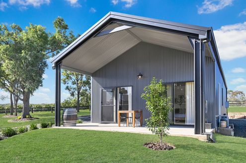
Explore how stylish sheds can revolutionise Gold Coast backyards, blending aesthetics with practicality.
A powerful, modern grey with a neutral cast, Basalt® deliberately lacks the green tones that would soften its impact when used in ultra-modern designs. Exuding the strength and solidity of the rock after which it is named, the use of Basalt® lends buildings a feeling of being anchored to the earth.

Extending your home can feel overwhelming. A Colorbond shed could be the answer: a versatile, durable, and stylish solution.
A warm, earthy and natural mid grey, Wallaby® has a softness that allows it to be paired with a variety of both traditional and contemporary building materials ranging from glass and steel to timber and stone.
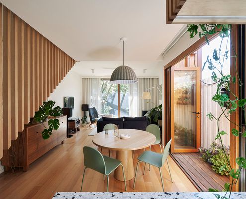
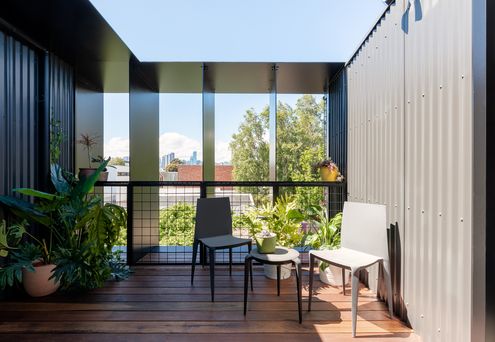
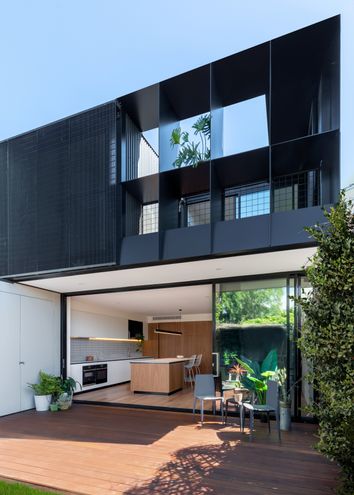
Despite a seemingly impossible set of constraints, this terrace has been transformed into a light-filled and sustainable family home.
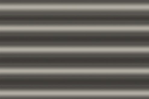
Dune® is a warm, pale grey that invokes feelings of balance and neutrality. It is associated with the dusty earth of the Australian bushland, the soft pelt of native marsupials, and the textured landscapes of granite rock and stone.
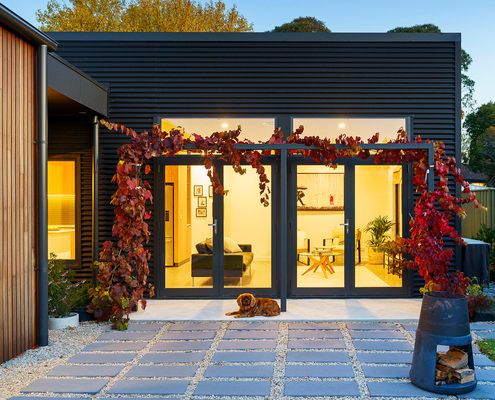
You don't envisage a townhouse when you think of country town living, but this architect's own home is perfect for her family.

Neutral, sophisticated and strong, Night Sky® is ideal for emphasising strong lines and sharp reliefs on both contemporary and traditional homes. As a defining tone, it’s the perfect contrast to paler building materials and colours.
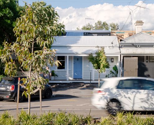
From the street, all you can see is a sliver of the stunning new addition, designed to protect the heritage value of the original home.
Woodland Grey® is inspired by the depth of cool green forest, the canopy of eucalyptus on a rugged mountain plateau, the twisted bark and deep olive green leaves of teatree along the coast, the mossy boulders and ferns found in mountain crevices.
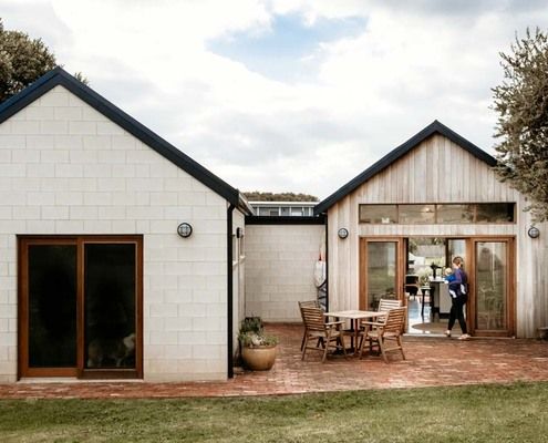
Passive solar principles, high-quality yet affordable materials and thoughtful design brings high-quality housing within reach.
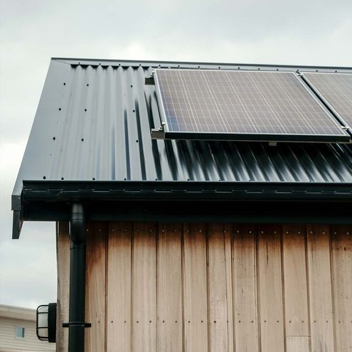
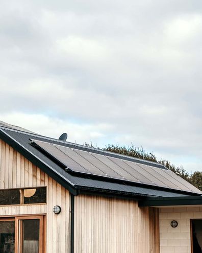
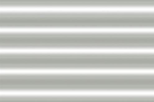
Shale Grey™ is evocative of Gulf coast mud plains, pale grey pebbles reflecting the sun, the ethereal grey mist rising from a surf beach, the silver grey leaves of native flora and the shimmering outcrops of rocks on the Great Dividing Range.
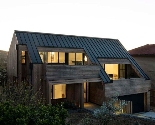
A beach house doesn't need to feel like a glass box on stilts, this home feels intimate while still celebrating the views.
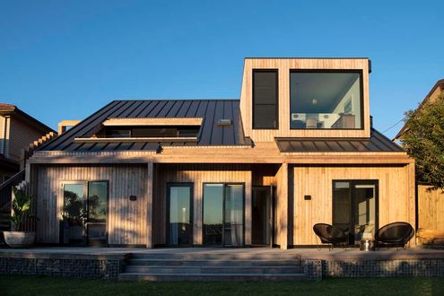
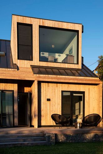
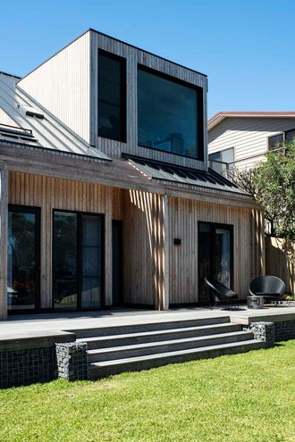
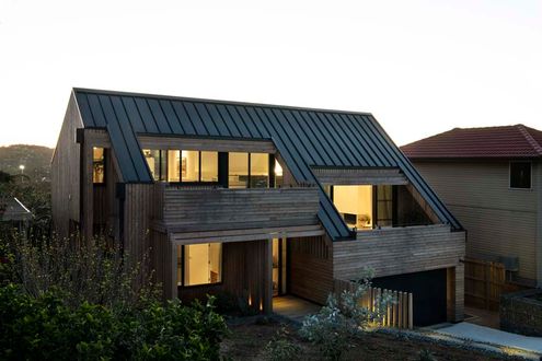
Windspray® is mid-strength, neutral grey with a blue undertone that brings to mind a gentle breeze, soft shadows and the misty sea on a cloudy day.
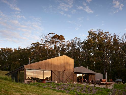
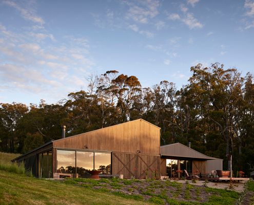
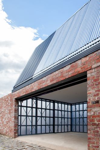
An avid collector needed a place to display and enjoy his assortment of quirky objects. Enter Über Shed 2, a shed/rumpus room/gallery.
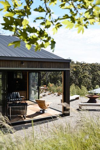
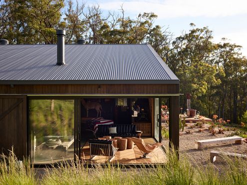
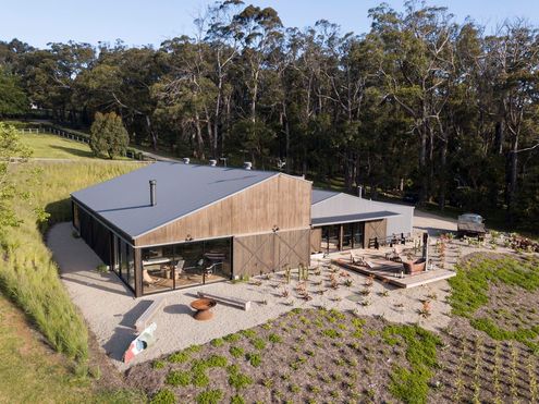
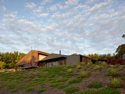

Surfmist® embodies qualities of freshness, purity timelessness and independency. Snow, the mist from the sea and surf, pure white sand, and the billowing sails of yachts all remind us of this colour.
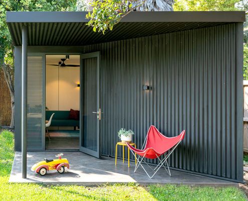
If you're squeezed for space but can't justify the disruption and cost of either moving or renovating, this might be the answer...
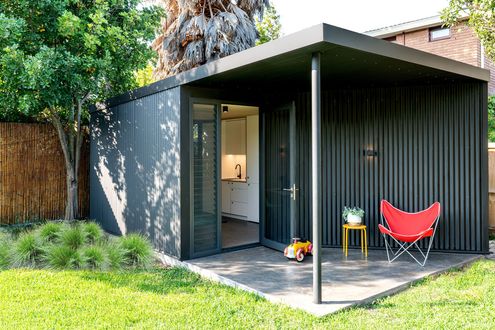
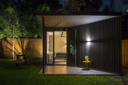

Deep Ocean® is a conservative yet appealing colour that mimics the richness and depth of the ocean, and the vast blue haze of a distant mountain range.
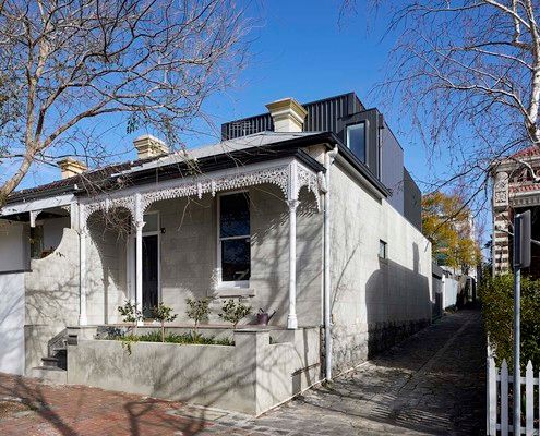
With a block of just 117 square metres, this inner-city reno required some creative thinking to make the most of all available space...
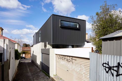
Inspired by the purple-grey hues of distant mountains, stormy skies and the natural beauty of our coastal regions, Ironstone® has captured a new mood for COLORBOND® steel colours.
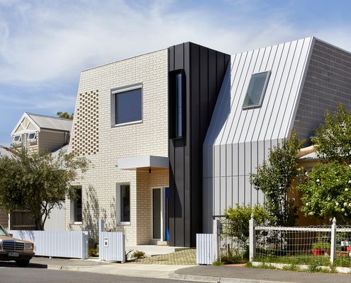
This family home was designed with best-practice sustainability and Passive House standards to be a comfortable home for years to come.
Monument® is unashamedly a city colour. It will emphasise the modernity of today’s architecture. It is a strong, confident, neutral colour adding depth and strength to the colour palette.
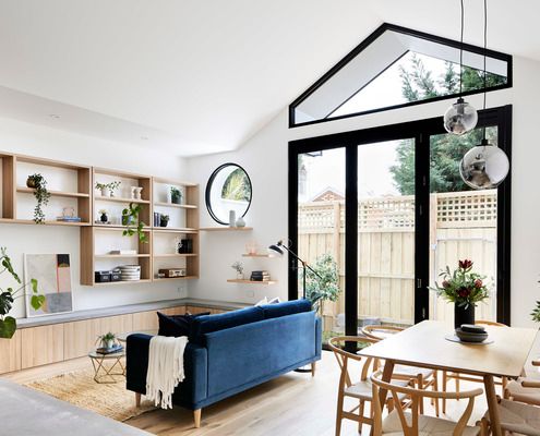
Architecture isn't about the bells and whistles. It's about creating spaces which help to improve your lifestyle. Like this home!
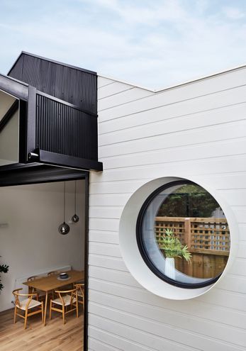
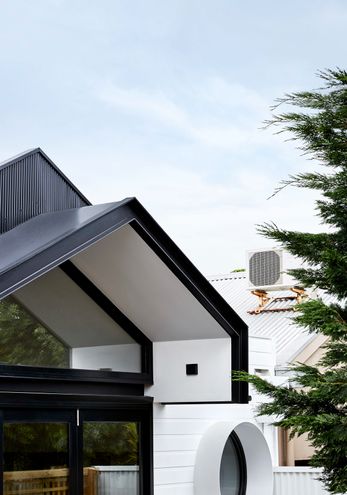
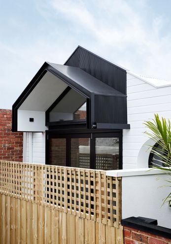
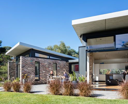
This granny (and gramps) flat is the perfect place for a retired couple to call home: close to family, yet private and comfortable.
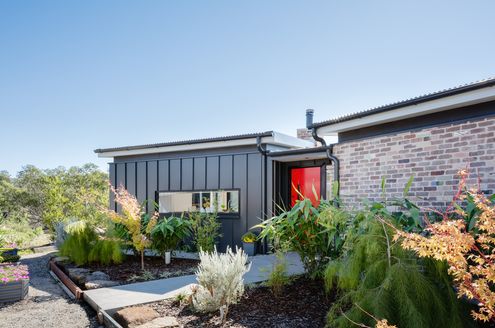
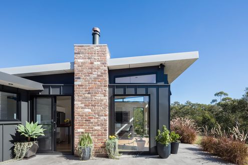
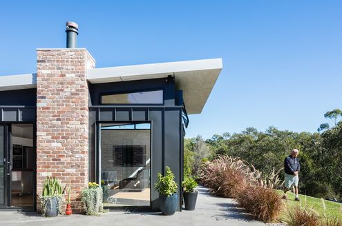
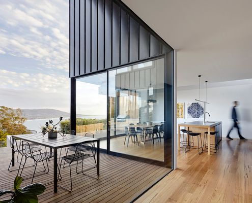
This retired couple wanted an intimate home for themselves, but what happens when extended family visit? Enter the 'connected plan'...
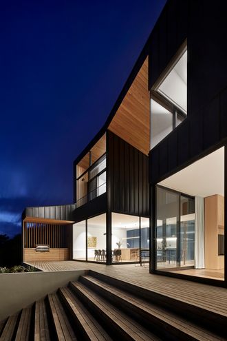
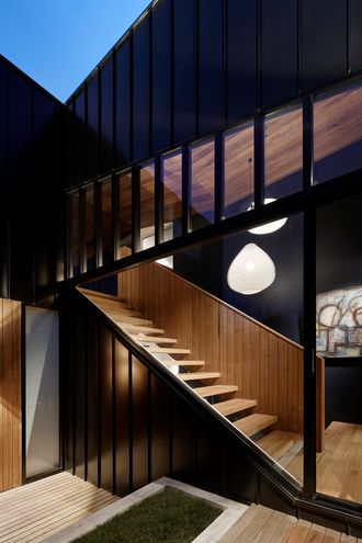
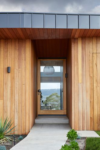
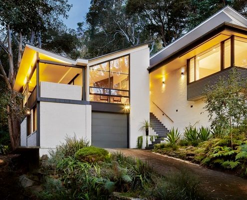
This 1960s home originally designed by Peter Johnson is updated to take advantage of its location without losing what makes it special.
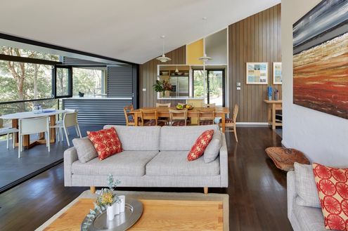
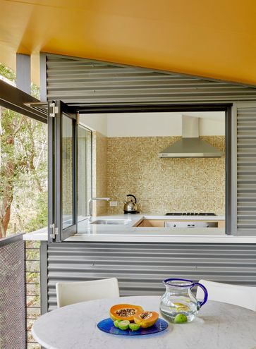
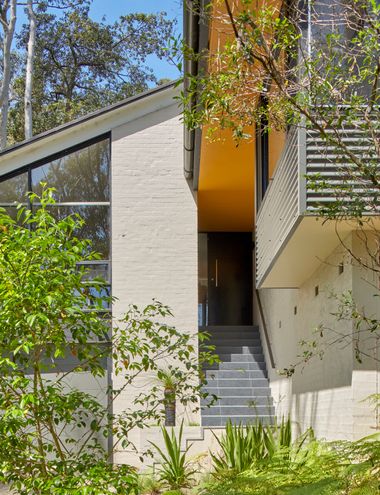
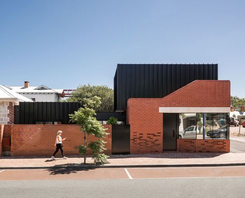
Renovating a heritage house the right way means you can enjoy the benefits of a modern home while respecting the house's history.
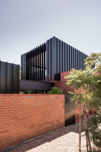
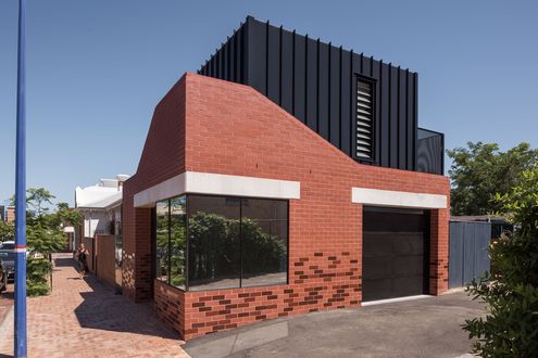
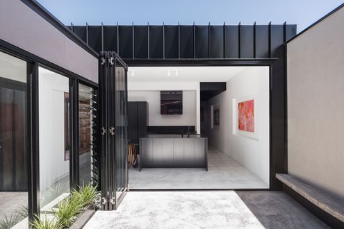
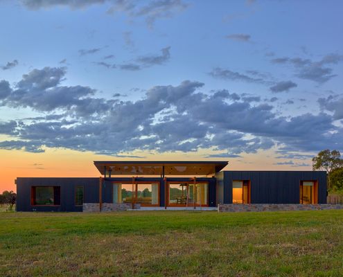
Looking for a simpler lifestyle and to indulge their passion for horses, this modern home for their acreage is perfection.
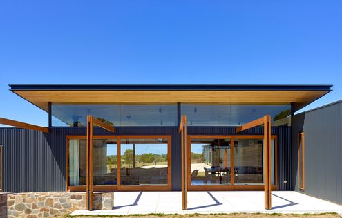
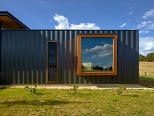
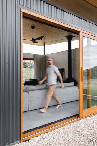
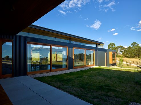
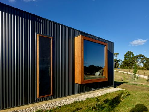
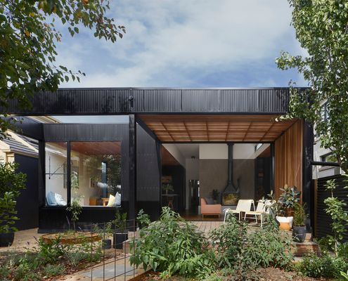
Three distinct options and three years later they settled on a design, but when you're building forever, take the time to get it right!
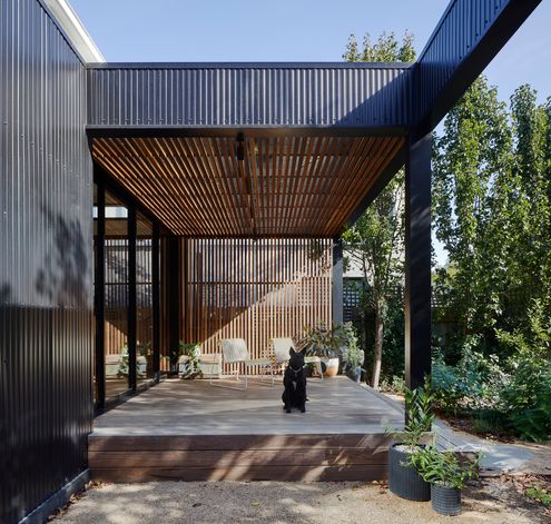
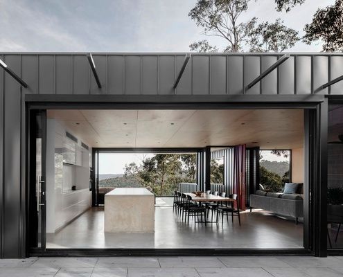
The clever design for this challenging site allows the home to deal with the threat of bushfire, while still taking in the views.
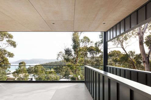
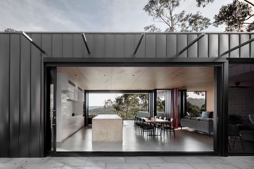
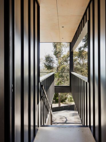
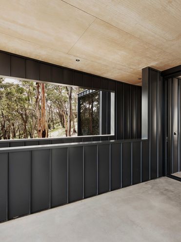
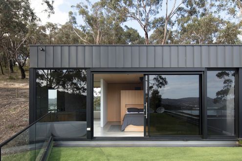
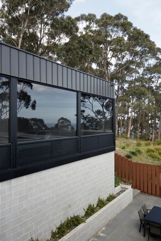
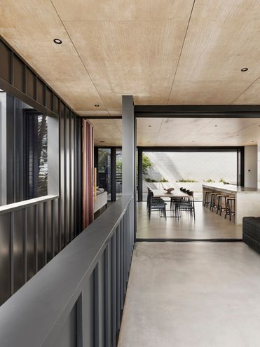
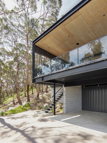
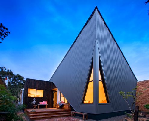
A surprising, angular addition pops out of the rear of this home, but it does more than just look dramatic...
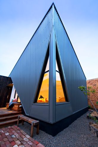
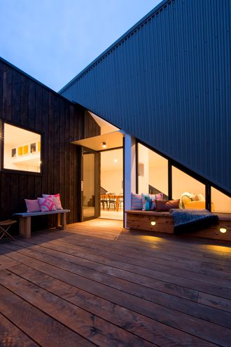
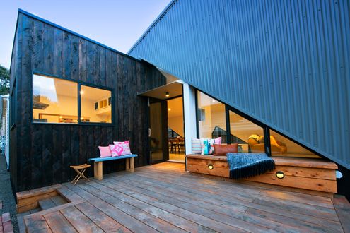
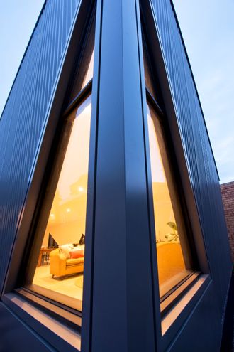
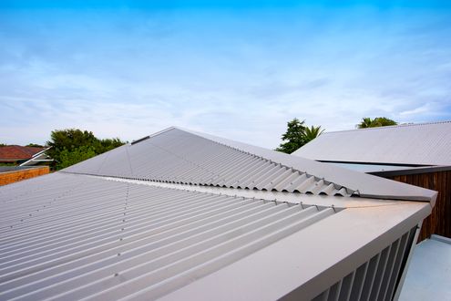
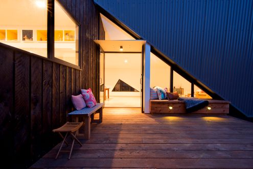
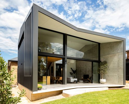
The good qualities of both old and new are highlighted by creating an addition which is the binary opposite of the original.
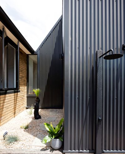
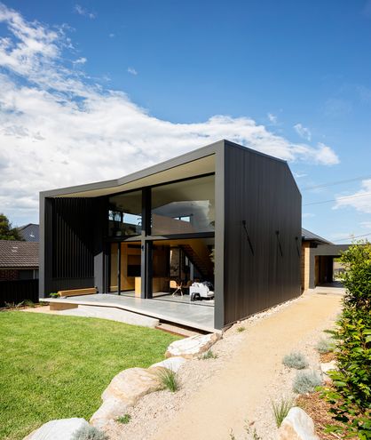
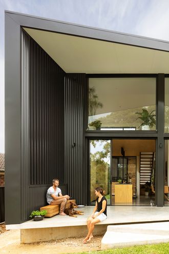
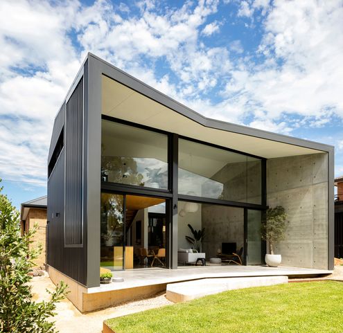
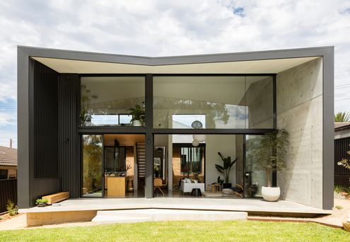
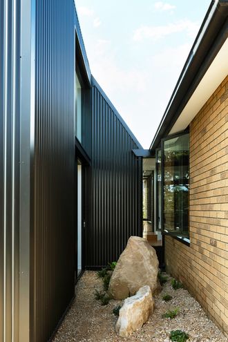
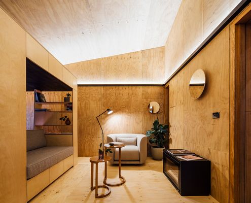
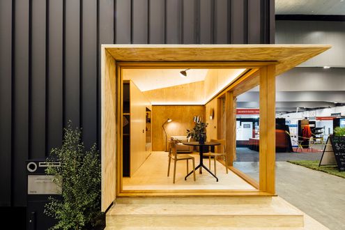
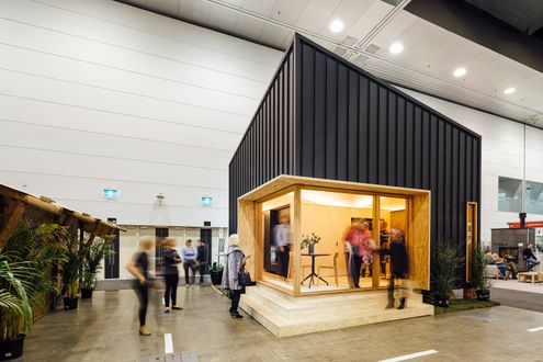
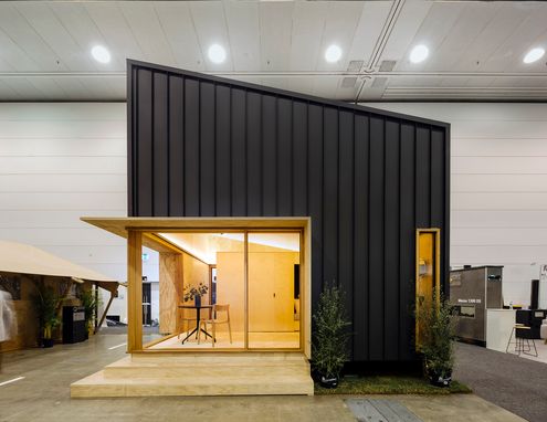
Just because this tiny house is affordable, sustainable and socially responsible doesn't mean it's not stylish to boot...
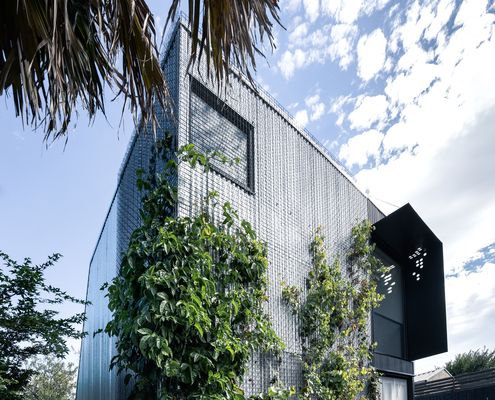
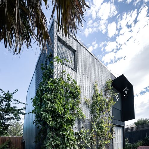
Instead of sacrificing their productive garden, plants are encouraged to grow up the walls of this clever backyard studio.
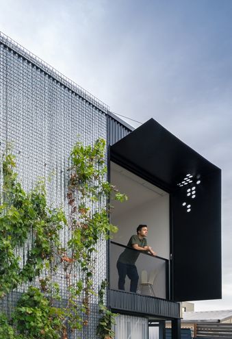
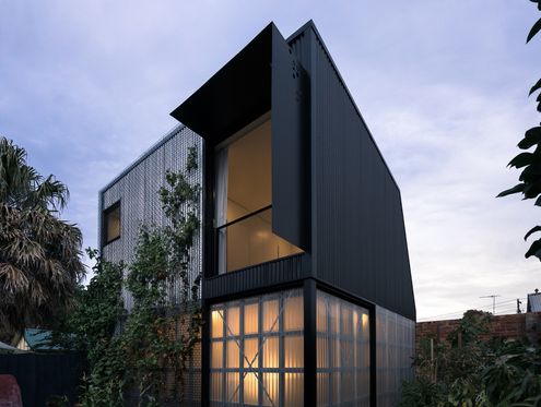
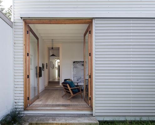
Inspired by the spaces and ornamentation of the original home, this home plays with light and space to create a dramatic addition.
