With a block of just 117 square metres, this inner-city reno designed by de.arch required some creative thinking to make the most of all available space...
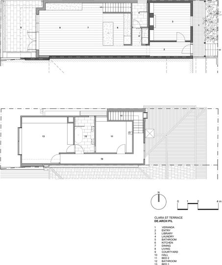
When the client first approached de.arch the brief was to update a neglected and dark single-fronted terrace in South Yarra into a bright and light-filled home for a young professional. Three years later, that renovated single-fronted terrace became a family home, housing a fiance, a new baby and two dogs! Luckily, flexible planning meant the home stood up to the challenge.
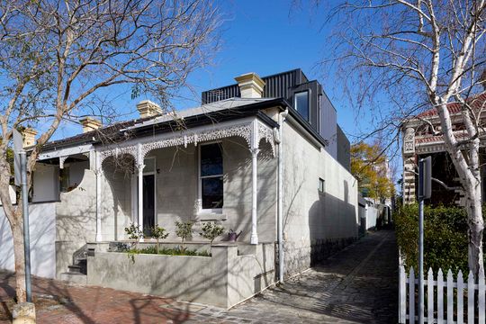
The overall site was just 117 square metres, meaning every square millimetre needed to be put to good use. The client wanted to maximise the floor area by increasing the amount of natural light, increase the storage space and create an open-plan living area that opened onto the outdoors. The home needed to have two bedrooms plus an additional study/flexible space and an off-street car space! "The complexity was not so much the brief but more how to be smart about the approach", explains the architect. "Good thing the clients were trusting in us with their vision as much as they were brave."
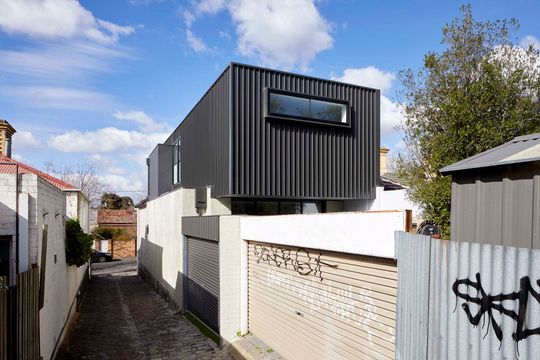
A second storey, perched at the rear of the heritage home houses two new bedrooms and a bathroom. The addition is clad in COLORBOND® steel for a low-maintenance finish; the dark grey Monument® colour selected helps the addition to recede and hover over the original home.
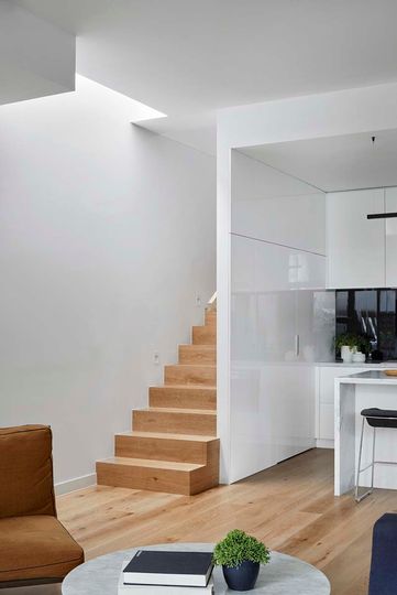
The design creates the illusion of space thanks to plenty of natural light, high ceilings, windows opening onto framed views of treetops, city views, sky and the outdoor space. Skylights let in even more light.
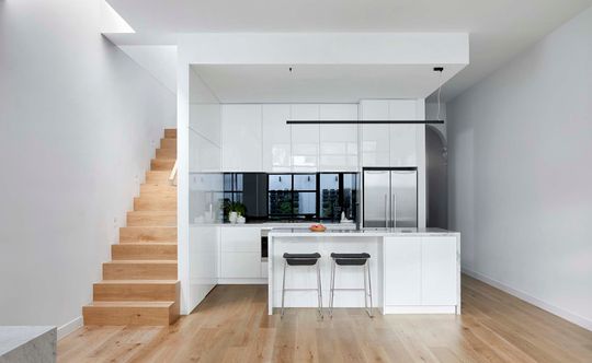
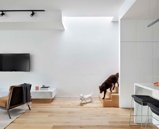
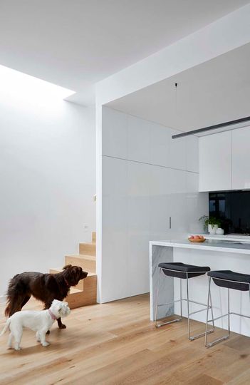
"All joinery was purposely selected to be white to blend with the space and walls rather than divide it so rooms and spaces could flow openly." The high-gloss joinery finish even wraps around the end wall of the kitchen to conceal under-stair storage and reflect the kitchen to enhance that illusion of space.
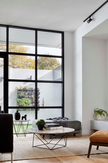
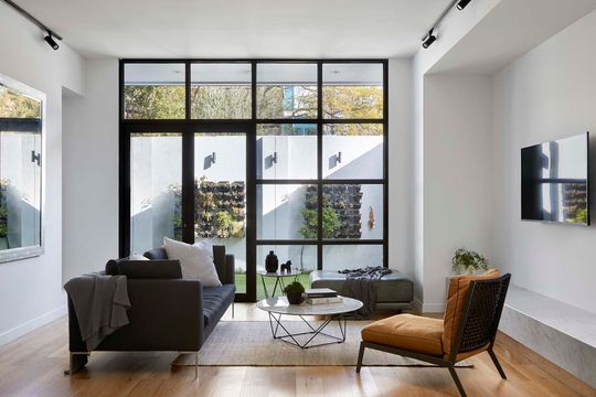
The off-street car park doubles as a courtyard. Expansive glazing to this courtyard lets in natural light while also maintaining privacy for the living areas.
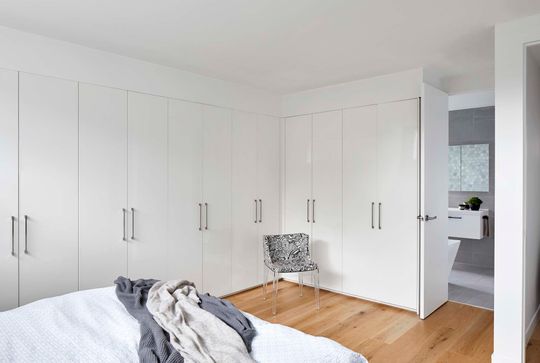
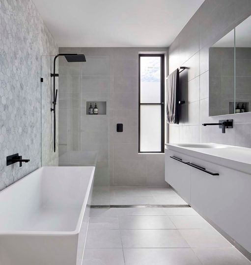
The main bedroom has wardrobe space lining two walls to maximise storage space. A door linking the bathroom to the main bedroom makes it feel like an ensuite, even though it's shared.
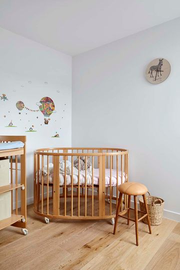
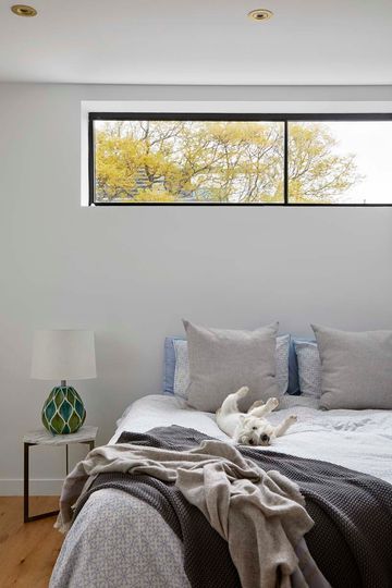
"We love these tiny sites because they have so much hidden potential and literally every millimetre counts so the design has to be clever with no wasted or single-use spaces, consider flexibility for now and the future." - de.arch
