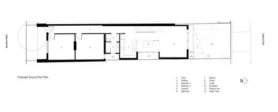
Tight, narrow site. Heritage overlay. Planning restrictions. Sustainability ambitions. A desire for light and a sense of space. All of these requirements and constraints sound like a nightmare to balance, but for Drawing Room Architecture it was more like, 'challenge accepted!'
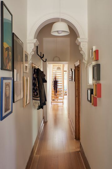
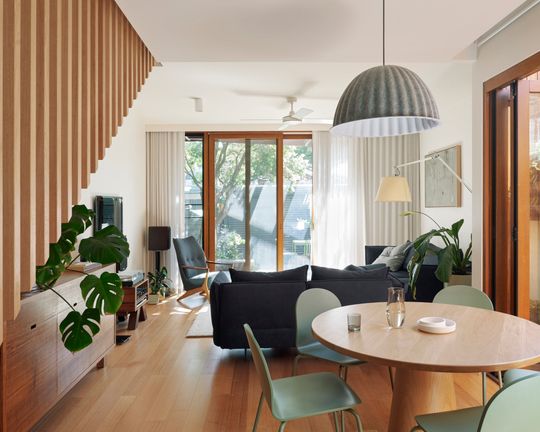
The owners had lived in their home for several years, but it was time to expand their two-bedroom Victorian-era terrace into a three-bedroom home with an ensuite bathroom and a study for two. They wanted more light, more storage and easy access to their north-facing backyard. As they work in the sustainability industry, they also wanted their renovation to reflect their beliefs and be as sustainable as possible. But, given the narrow site built to the boundary on both sides, a heritage overlay which meant any addition couldn't be visible from the street and planning regulations which meant the addition couldn't reduce daylight to the neighbour's existing windows, it would be a juggling act!
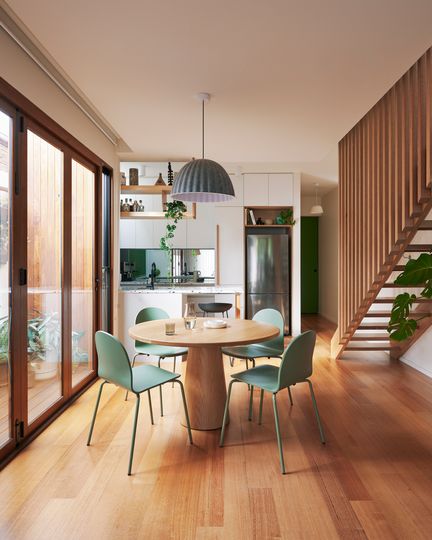
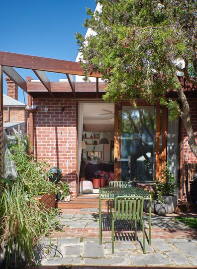
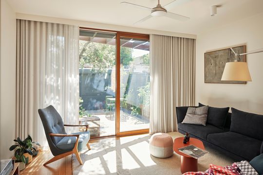
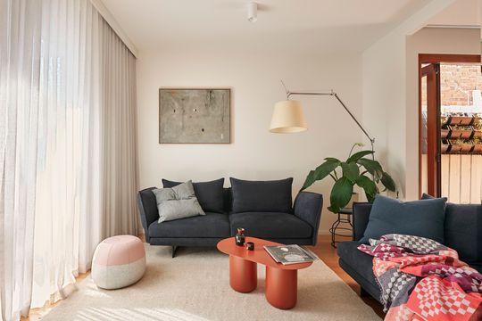
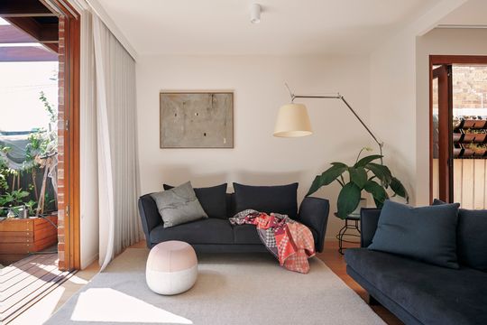
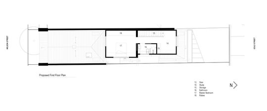
To help the home feel light and spacious in spite of the narrow site and deal with the planning constraints, Drawing Room Architecture included two courtyards along the eastern boundary. This ensures natural light and air can enter all rooms of the home and continues to let light into the neighbour's windows. Designing the home for good orientation to the sun, with living areas to the north, external screening of western sun and no western windows on the upper level combined with good insulation throughout and double glazing means the house is naturally light-filled while staying cooler in summer and warmer in winter.
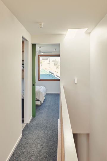
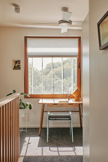
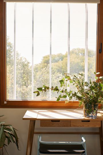
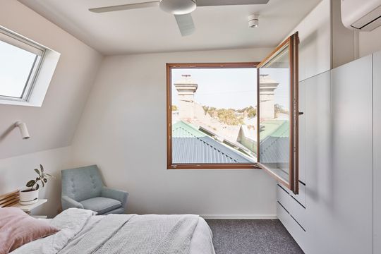
A second storey, tucked well behind the original home's facade so it can't be seen from the street, contains the main bedroom, ensuite bathroom and study. The study is placed to take advantage of the northern light, while the bedroom has a picture-frame square window overlooking the rooftops of Brunswick. The window swings inwards to let in breezes and gives the bedroom a whimsical feel.
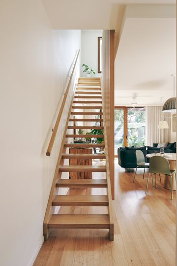
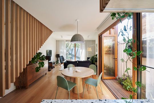
Even the staircase was used as an opportunity to make the home feel lighter and brighter. With open risers and a skylight above, the staircase lets light down into the living area and doesn't block site lines, helping the home feel more spacious.
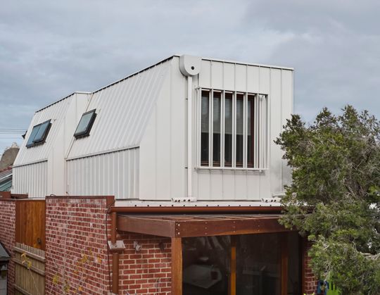
The ground floor is built from recycled brickwork while the upper storey is lightweight and low maintenance, clad in COLORBOND® steel. This light colour, Surfmist®, was chosen to reduce heat load, keeping things cooler in summer. Water tanks feed the laundry, toilets and garden and the home has been disconnected from gas. With a heat pump for hot water, split systems for heating and cooling and an induction cooktop, the home is energy efficient and 100% powered by renewable energy.
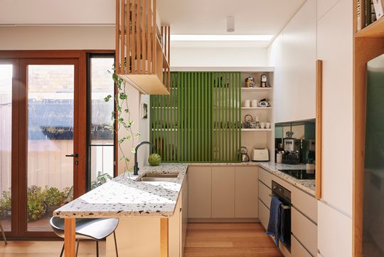
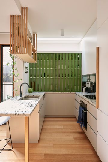
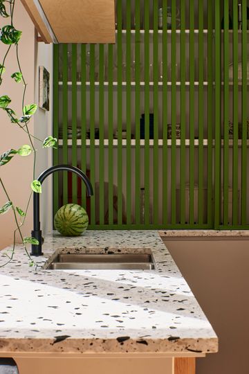
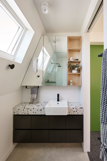
"Materials and details were kept natural, simple and playful so spaces maintained a sense of being calm, warm and open", explains the architect. "Terrazzo was used sparingly (2 slabs used fully in different rooms) as the accent material. A complimentary salt and pepper carpet was used upstairs to continue the black and white pattern. Asparagus Green, a Dulux colour, was used as the only colour throughout, on all sliding doors and on the kitchen pantry joinery."
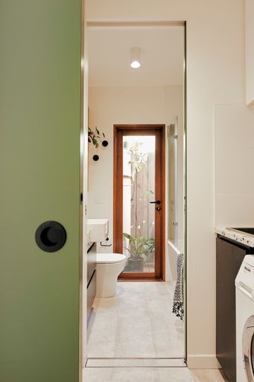
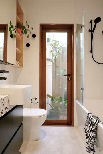
"A home that was originally dark, cramped and cold is now light, bright, cosy and highly efficient", explains the architect. Brunswick Green is the result of a seemingly impossible set of requirements and it demonstrates how architects thrive with challenging constraints.
