The owners of this Thornbury home loved the area, but they were outgrowing their Edwardian-era home which constantly felt dark and constrained. Would they be able to create a light-filled family home, perfect for entertaining with their south-facing backyard? Of course!
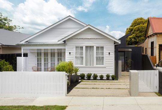
"The young family came to us after slowly outgrowing their underperforming old home", explains C.Kairouz Architects. "They loved the vibrant suburb of Thornbury and their character-filled street, so moving wasn't really an option." This busy family, both professionally and socially, wanted a home that could enhance their everyday lives while also standing the test of time as they planned to stay here pretty much forever!
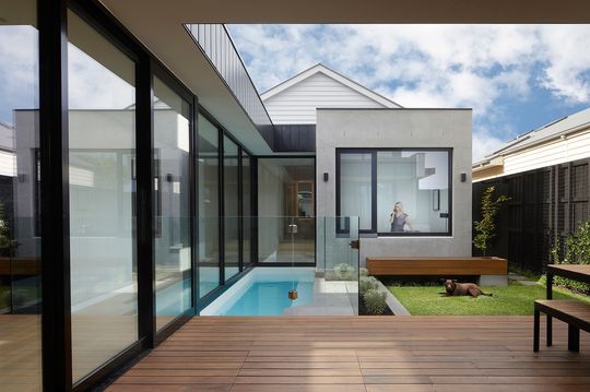
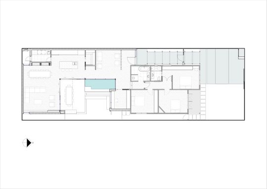
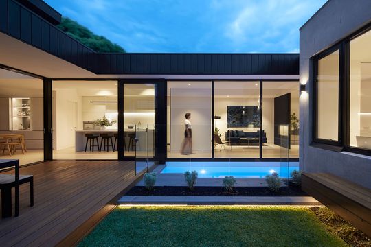
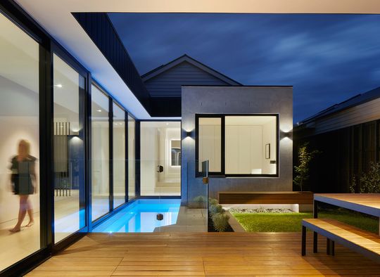
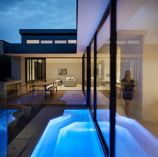
The solution was an addition that doesn't follow the standard script of a simple modern living pavilion to the rear opening up to the backyard. This would have left the living areas facing south and struggling for light. Instead, a U-shaped plan maximises the light to the new living areas and creates a sheltered courtyard at the centre.
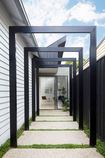
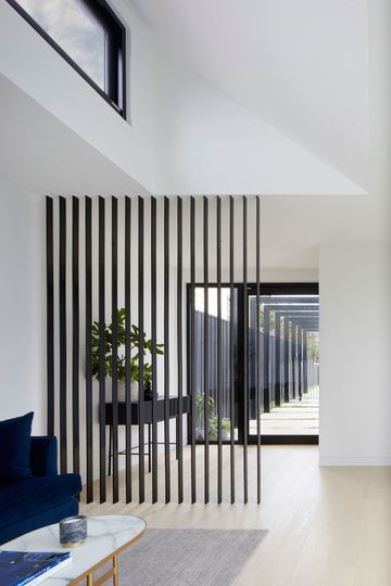
A new entryway was created down the side of the home, entering right in the heart of the new living spaces. This minimises corridors through the original home and meant the existing building could be dedicated to bedrooms and bathrooms. Set back far enough from the street so that privacy wasn't an issue, a beautiful glass door acts as the new front door also bringing additional north light into the home. A series of fins further protects the home from the street and creates a defined entryway separate from the rumpus space without blocking light and views.
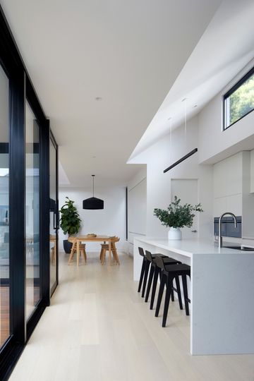
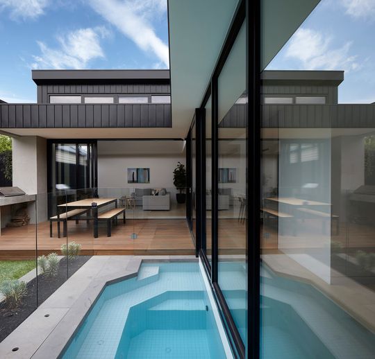
A new kitchen, pantry and laundry then straddle the western boundary, with the new dining area and lounge hard against the southern boundary. This maximises space in the central courtyard and means views and light can enter every space. A deck, pool and strip of greenery complete the sunny courtyard, with large sliding doors opening on two sides so that the interior and exterior become one large space.
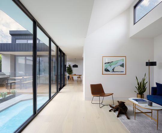
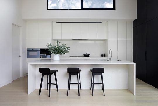
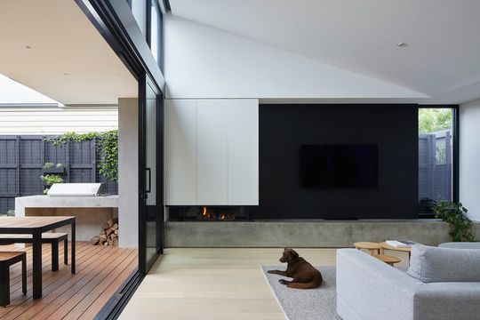
The roof above the entry and kitchen kicks up, angled at the same angle as the original home. Clerestory windows in these areas as well as in the lounge let even more light into the new living spaces.
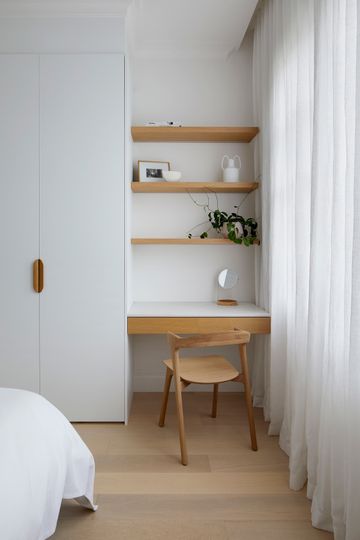
"The good bones of the existing home were perfect for reuse and retaining heritage charm", explains the architect. "A careful approach was taken to preserve as much as possible, keeping the exterior as is with just a fresh coat of paint, additional skylights and adjustments to the internal layout within the original footprint."
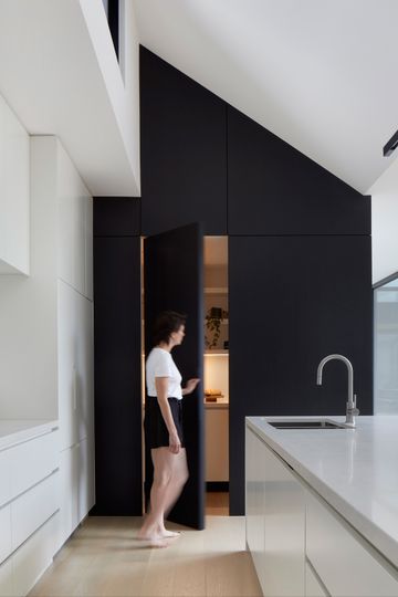
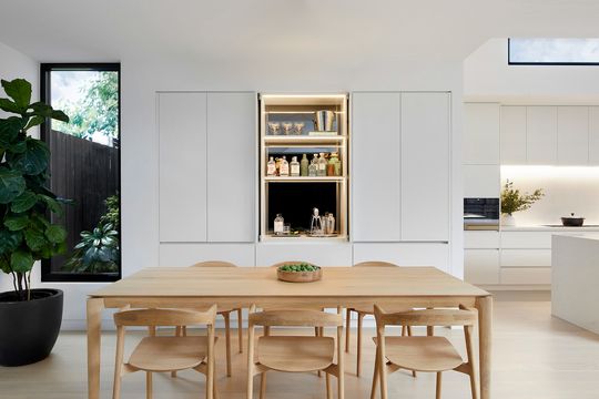
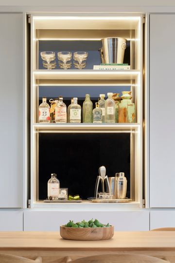
"Other internal features such as the generous office which peers across the courtyard and into the living, the integrated bar in the dining room, the hidden pantry, and the concrete credenza in the living room (including fireplace) which flows continuously into the BBQ and outdoor deck, are reminders of the attention to connectivity and function in the home." - C.Kairouz Architects
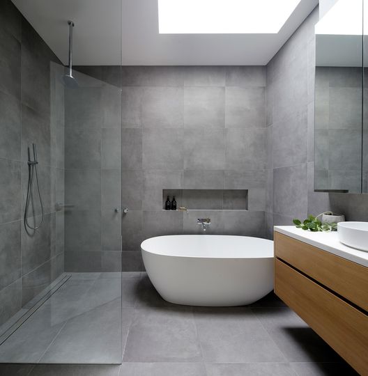
Clad in low-maintenance COLORBOND® steel and rendered brick, the new living areas complement and contrast with the weatherboard of the original home. The original home is painted in all white, leaving glimpses of the black addition to the rear feeling like a shadow or silhouette of the original. "Internally, materials are mostly light, with black and white contrasting features reflecting the exterior and emphasiz[ing] the feeling of space and height."
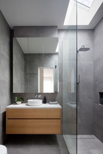
So, if you've got a south-facing backyard and you're wondering whether that means you have to sacrifice light in your renovation, think again. Creative solutions can always be adopted to bring more light into your home.
