1911 was a pretty significant year for Australia. For one, the Australian Capital Territory was established in the windswept sheep field we now know as the home of our Federal Parliament (now with wind of a different variety). The Northern Territory became a thing. And the Commonwealth Bank Act 1911 ensured that school children all over Australia get free hologram rulers with cute little 'Dolamites' on them (at least I'm pretty sure that was the intention of the act). It's fascinating the way these events, from so long ago, endure and impact our lives today.
Meanwhile, on the site of a former quarry in Tempe, a gritty, industrial suburb in Sydney's inner-west, a stone-mason was completing work on a series of sandstone cottages, including this one, 'Markinch'.
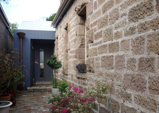
Owners Fiona and Leigh fell in love with the heritage listed cottage and snapped it up. Fiona, a cultural corporate who moonlights as an artist on weekends and partner Leigh, a film editor, loved the cottage's history and character, but they weren't so enamoured with the insensitive addition tacked on at some point during the home's history. Plus, the creative couple wanted to add their own layer of history to Tempe House.
So they contacted an architect they met several years earlier on an architectural walking tour of Sydney. The tour was led by Architect Eoghan Lewis.
“They thought I would be cheap (which I was) as I was an 'up-and-comer' (their words)“ says Eoghan, “One thing led to another…”
Taking a punt on that “up-and-comer” proved to be a great decision.
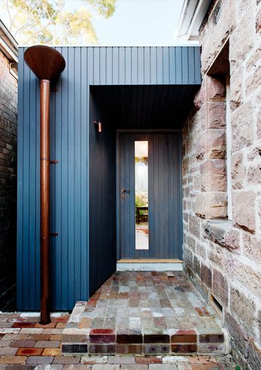
The architect skilfully dealt with the existing site conditions, taking into account the need for indoor/outdoor relationships, the location of adjacent buildings and, of course, the heritage constraints. He managed to add a bold (and beautiful), ecologically responsive layer for Fiona and Leigh.
“There were heritage issues from the outset but Marrickville Council were very supportive of our general approach and understood, I think, that our clients had a lot of love for the old cottage and were only interested in new work that would keep the qualities they fell in love with in the first place.”
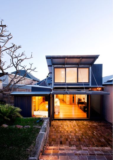
The unsuitable add-ons were removed, their bricks recycled as a series of deep courtyard steps which strengthen the connection to the garden and create a space to linger.
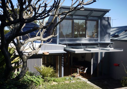
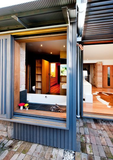
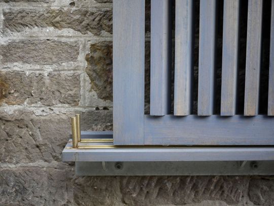
Materials were chosen to age gracefully (just like a good bottle of red). Recycled bricks, spotted gum cladding, black butt external sliding doors and windows, copper, polycarbonate, black butt plywood and black slate will become richer and more character-filled as time passes - a poetic response to an historic home and a weathered old-industrial neighbourhood.
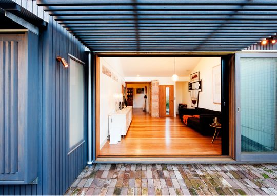
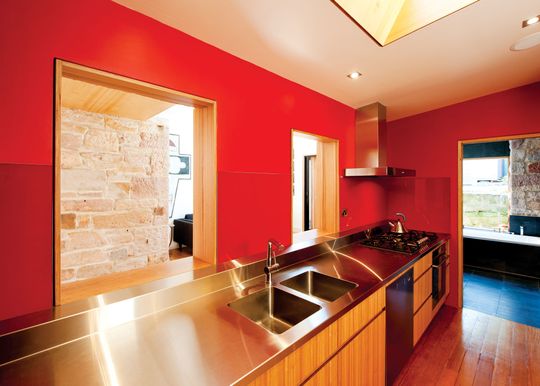
Internally the spaces were reorganised to give the living spaces better access to sunlight and the outdoors. The kitchen becomes the heart of the house, while what were once external openings in the original home are reimagined as internal openings to connect spaces visually. This link to the past proportions of windows maintains the original building's character without resorting to imitation.
High-level windows catch the cooling summer and warming winter north-easterly breezes. Carefully considered openings capture a variety of specific views and sunlight across the colder months of the year. In the depths of winter an efficient in-slab gas-boosted solar hot water hydronic heating system keeps the home warm.
The existing chimney, a feature of the old cottage is now the focus of the kitchen, framed by joinery. A sculptural skylight void centred on the chimney reinforces the significance of this element whilst bathing it in afternoon sunshine.
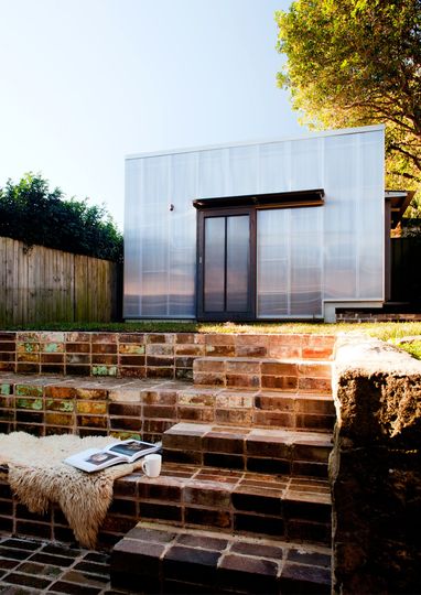
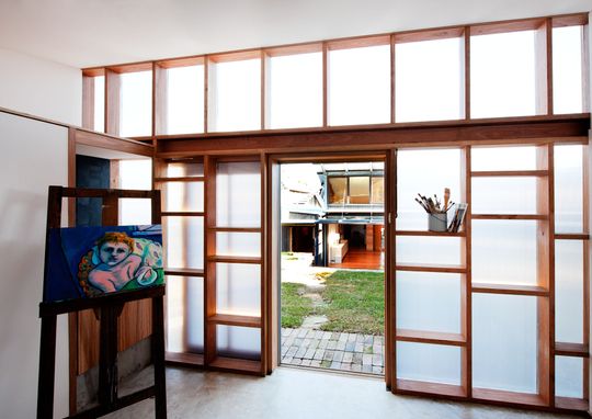
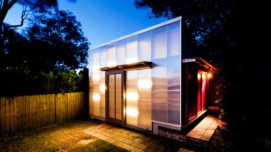
A second pavilion, a studio space, is perched at the back of the yard and screens an unsightly neighbour. The studio is clad in translucent Danpalon multi-cell polycarbonate sheeting which was chosen for its gentle lighting, UV protection and insulation properties. The cladding filters southern light by day and transforms into a glowing lantern by night.
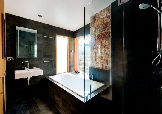
The brooding black bathroom tiled in Montauk Black Slate is reminiscent of a Japanese bathhouse or 'onsen'. While it might feel like everything is on show, external sliding screens can be rolled in to create a private garden refuge.
The size of the extension (45 m2) and the house itself (112 m2) is modest, but well-designed connection to the outdoors and quality of light creates the illusion of space. The smaller scale design also fits both the architect's and the clients' philosophy towards sustainability:
“We believe in building smaller but better as the most important move towards sustainable architecture.” - Eoghan Lewis Architects
And we couldn't agree more.
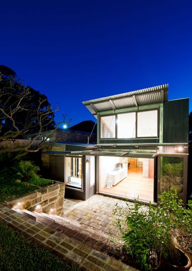
Eoghan describes what he's most proud of at Tempe House:
“The place feels so relaxed. It's all about living. It feels warm, intimate, nurturing, understated. It's weathering beautifully. [The] clients love it. They describe it as their first and their last home.”

How a home feels to live in is not easy to understand before construction. It's hard to express in plans and elevations. But it's something that good architects consider at every step of the design process. Key design decisions like, say, the inclusion of clerestory windows might seem like just pretty pictures on a page until you feel the cooling breezes they encourage in summer, or sip your morning coffee in the warming winter sun as it streams deep into your living area. It's those undefinable qualities that makes good design worth investing in. Because, in the same way those events that took place over 100 years ago still have relevance and implications today, design - both good and bad - affects your life for a long time to come. Especially if, like Fiona and Leigh, this is your first and last house.
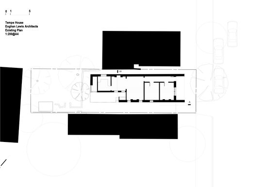
Above: Existing Floor Plan
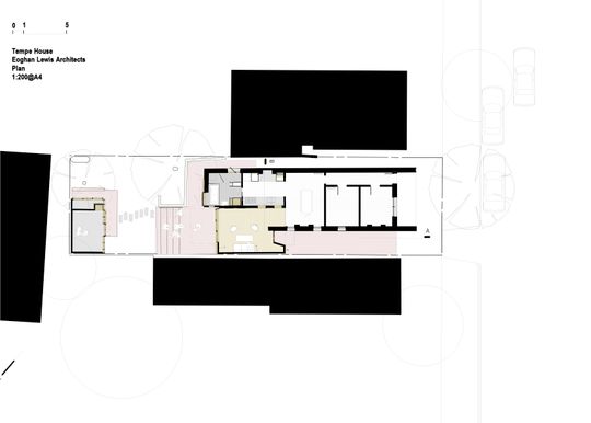
Above: Floor Plan
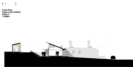
Above: Section