An alteration and addition is a balancing act. It's tempting to touch virtually everything, leaving little of the original home and its wealth of accumulated history. At the other end of the spectrum, leaving the existing home untouched and tacking on an extra room or two can be equally problematic and misses the opportunity to improve problem areas. This considered alteration and addition to a 1960s-era home in Melbourne's Rosanna by Nest Architects capitalises on the home's good qualities and fixes the less than ideal. What can be saved in your addition?
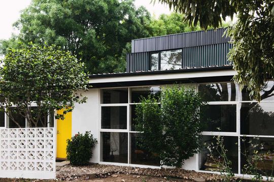
Rebecca and Scott, a young couple with two kids and a family cat bought a 1960s era home. They loved the home - Scott had studied architecture, so he apprciated its mid-century modern design - but given its age it was out of touch with our modern expectations. While Rebecca and Scott wanted to keep as much of the home as possible, they wanted to improve the kitchen, laundry and bathroom while creating a home suitable for a growing intergenerational family.
The house had some clear assets: floor-to-ceiling glass created a sense of openness in the North-South oriented spaces. Plus the large block of land and generous setback from the street helped the home feel more like a pavilion in a garden than a typical suburban house.
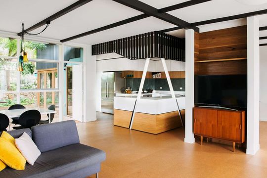
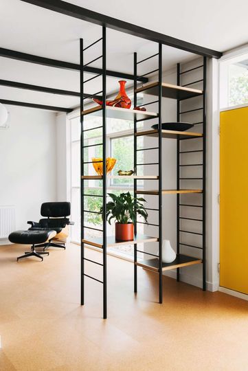
Internally, exposed roof beams, pendant lights and structural window frames were key to the era and deserved to be retained and celebrated. The established garden was yet another asset that Nest Architects identified in their investigation of the home.
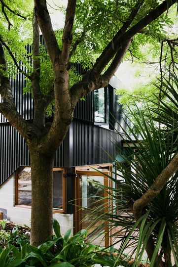
The addition comprises two bedrooms located in a new second storey. The new lightweight second level is clad in Night Sky® (black) COLORBOND® steel which helps to visually distinguish old from new. The upper storey feels like it's built to slide carefully on top of the existing home. An undulating aluminium screen wraps around this space, revealing glimpses of sea green underneath and creating a playful and dynamic facade. The owners will never tire of looking at this facade, it's designed to take on slightly different appearances depending on the viewing angle, time of day and quality of light - it's ever changing. And it's fun!
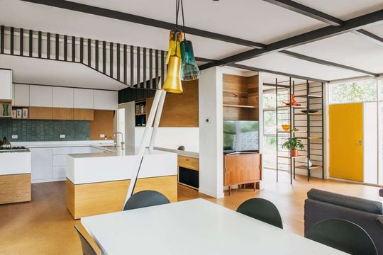
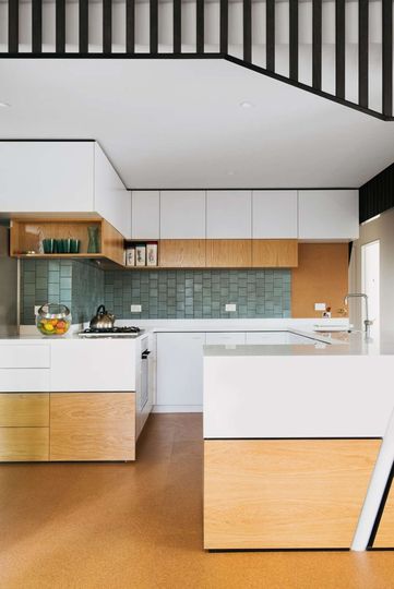
Downstairs has undergone a reconfiguration to create a central core containing the kitchen, laundry, staircase and storage room. Flowing off this services core is the living, dining, study area, master bedroom and two generous bathrooms.
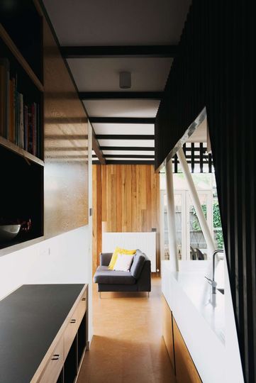
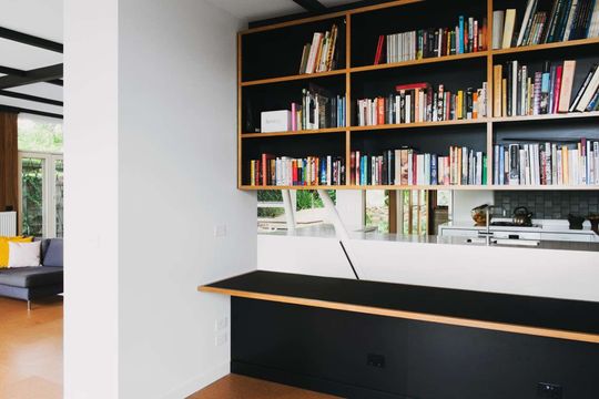
The main living spaces are open-plan, but they are subtly defined by part walls and joinery units. This overcomes a common problem of open-plan spaces feeling cavernous and ill-defined, while ensuring the home feels spacious and open.
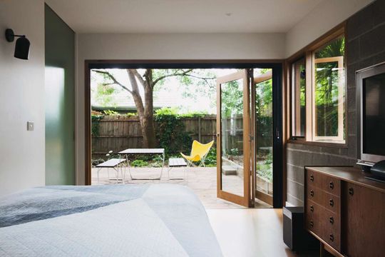
A new multi-purpose room provides flexibility for the family. It has the potential to serve as a rumpus, guest bedroom or second living room. Close to the main bathroom you can see this room being used as a semi-permanent bedroom for visiting parents or returning children in the future. Sliding doors give the space flexibility to be opened as a continuation of the living spaces or closed off from the rest of the house for privacy or acoustic separation (handy when the kids are making a racket)! Built into the site, with the South-facing block wall acting as a retaining wall for the garden, the room has the sense of being sunken and protected.
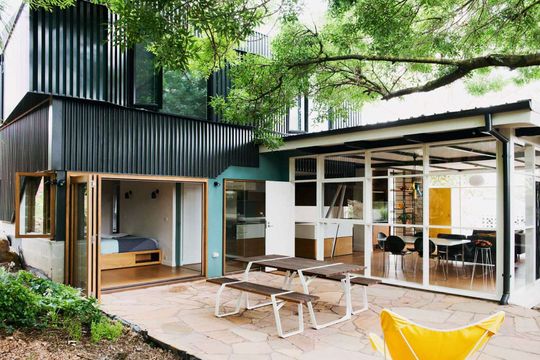
The dining area and multi-purpose room wrap around a southern courtyard. By enclosing this outdoor space on two sides it immediately feels more protected and intimate, making it a natural place to gravitate towards. The courtyard's generous proportions make it versatile enough to handle any gathering from a relaxed summer evening's BBQ to an extended family Christmas.
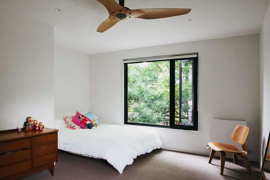
The internal material palette is understated, subtly referencing the era of the home. A cork floor is soft and natural underfoot, while spotted gum timber lines sections of the interior, brining its warm, caramel tones. Crisp white benchtops, timber veneer joinery and black shadow lines give the home a contemporary twist.
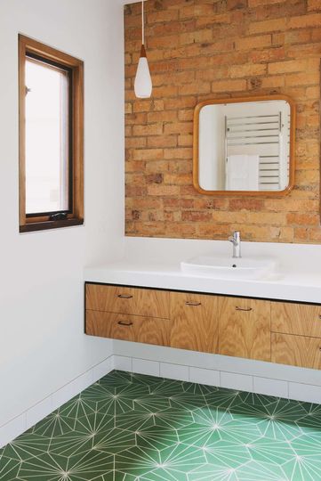
The original cream bricks are exposed in the bathroom. When combined with a green geometric tile and the veneered cabinets it's a tasteful homage to 1960s style, but white subway tiles and benchtops keeps the look fresh.
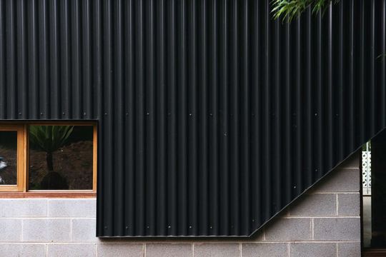
The concrete blocks, COLORBOND® steel cladding and timber windows are humble, but timeless materials. Blending the best parts of a 1960s home with a sensitive modern addition has given the project a renewed sense of vigour, but one which feels right. The balance of retaining what works and improving what doesn't is perfect here at Rosanna House. What do you think?