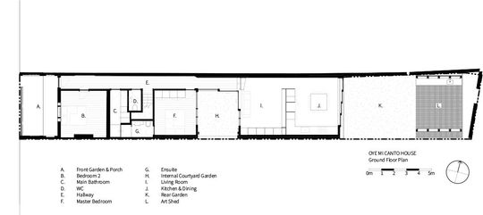
City dwellers are no strangers to long, narrow blocks. But if you've lived in a traditional terrace, you'll know how dark and stuffy they can be with little access to natural light and breezes. Luckily, just because you have a terrace (or a narrow site) doesn't mean you need to live like a mushroom. Oye Mi Canto House, designed by CplusC Architectural Workshop shows us how...
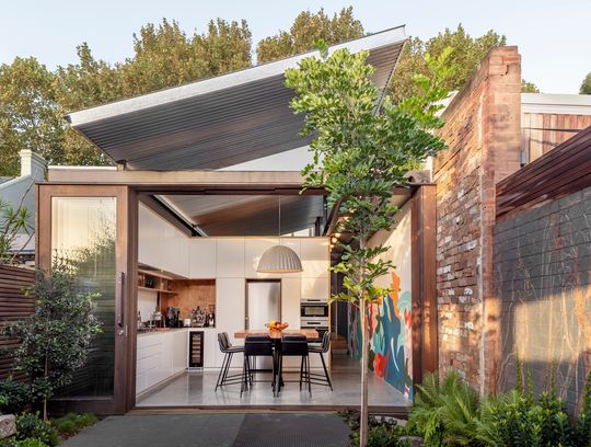
"Oye Mi Canto House is an alterations and additions project on a terrace-house located in the leafy suburban streets of Sydney’s Newtown, nestled into a narrow site backing onto the Carriageworks cultural precinct", explains CplusC Architectural Workshop.
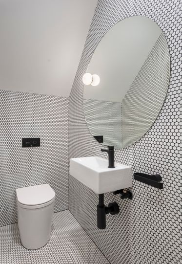
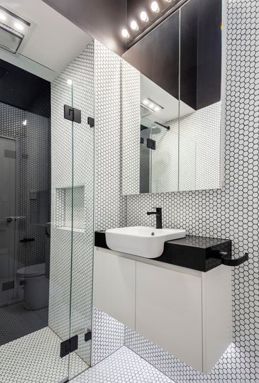
The answer to more light and breezes on this narrow block was dividing the home into three distinct pavilions. The heritage facade and front bedroom remain intact. Beyond this original front room, CplusC has fitted three additional bedrooms and two bathrooms. The main bedroom's ensuite bathroom dovetails perfectly into the family bathroom and stair, creating a space-efficient and economical wet area. Upstairs, tucked behind the original gable roof are the two additional bedrooms, providing space for the family of five.
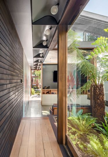
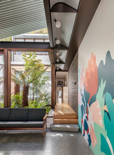
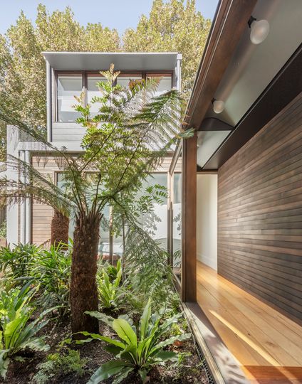
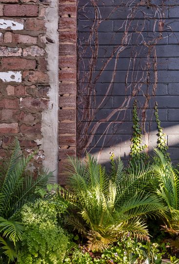
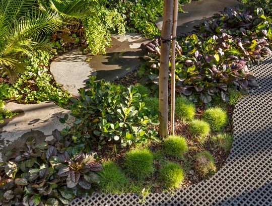
The living areas are given their own pavilion, separated from the dormitory portion of the home by a lush internal courtyard. "The courtyard provides both a vital burst of natural light to the centre of the site as well as screening windows to the neighbour’s home through native Australian vegetation", explains architect Clinton Cole. Sliding glass doors on two sides of the courtyard slide open to draw in cooling breezes and help the home feel connected to the outdoors.
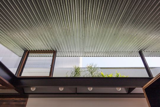
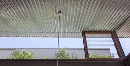
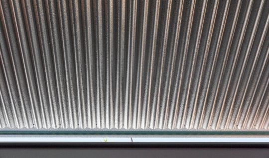
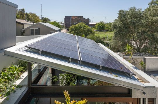
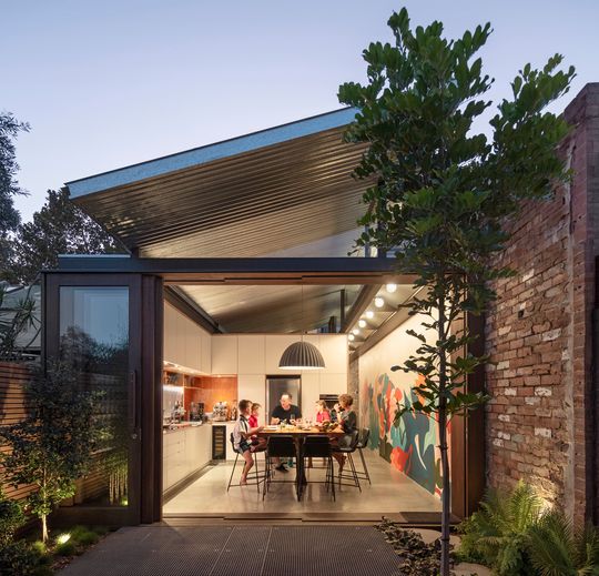
The new living spaces sit under a striking skillion roof of galvanised iron which, surrounded by clerestory windows, appears to float above the space. The skillion roof lets even more light into the living spaces, while the silver, reflective surface of the corrugated iron bounces light all around for maximum illumination. Enhancing the effect even further, there's even a sliver of glass on the roof's lowest end to complete the illusion.
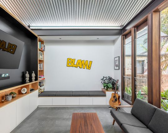
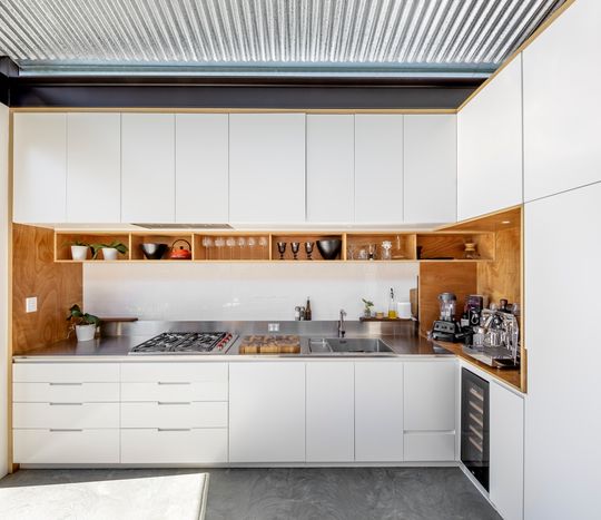
The lounge area is divided from the kitchen and dining to create a more intimate relaxation zone and give the family the option of separate spaces, but light is allowed to spill between the two spaces as the roof sails through above. A built-in seat, as well as the cabinetry, make efficient use of the compact space.
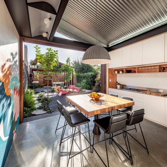
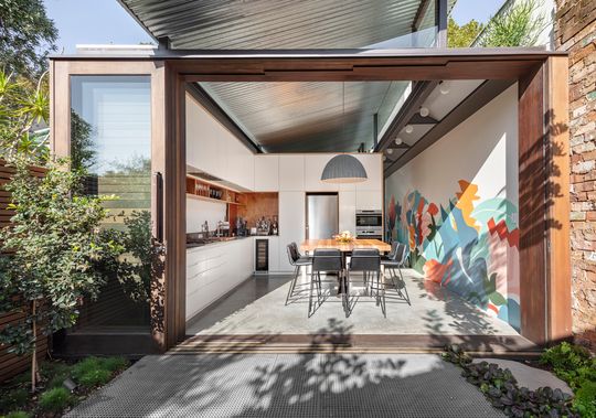
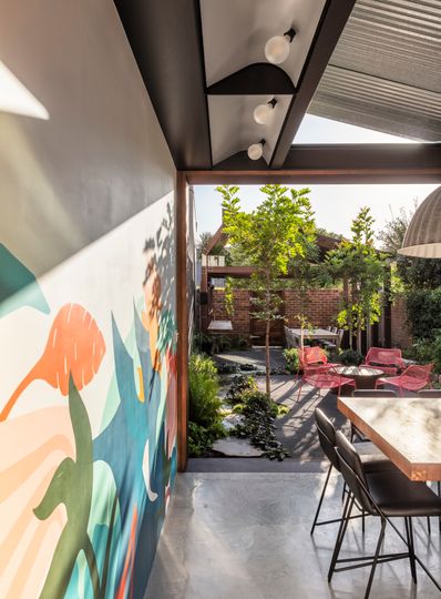
A sliding door from the kitchen and dining area opens fully to let the home spill into the backyard.
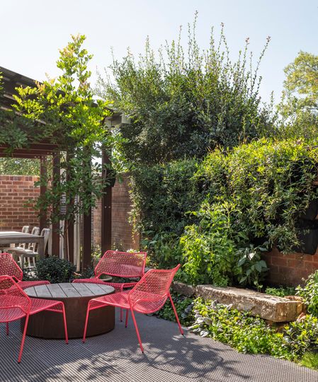
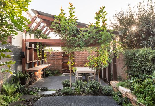
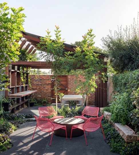
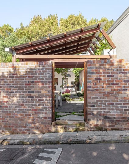
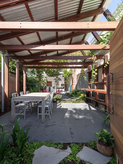
The third pavilion is for outdoor living and doubles as artists' studio. Matching the materials and form of the living pavilion, this third space draws you out through the beautifully landscaped garden and also provides access to the rear lane. "Functioning as an open-air artists' studio as well as a covered outdoor space, this Art Shed becomes a conduit for both creativity and entertaining for the family", explains the architect.
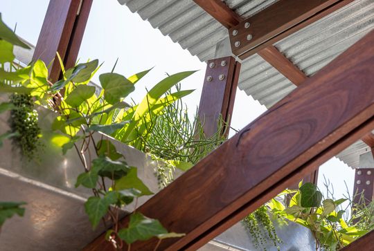
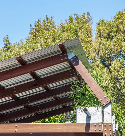
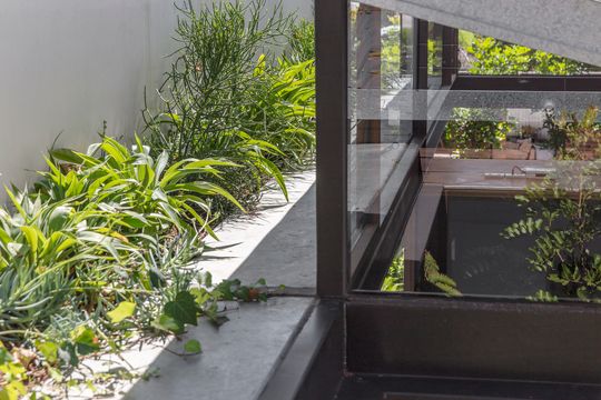
Planter boxes along the northern edge of the pavilions catch stormwater, provide a cooling effect and a beautiful, lush outlook from upstairs and the garden pavilion.
By creating a central courtyard and designing a roof that maximises light, this narrow home defies its constraints and is instead full of light and energy. The pavilion-style design also helps the home make use of the entire site, making it feel much larger. It goes to show that a clever design can make even narrow inner-city sites feel like an oasis.

