With a triangular block and a dated and dysfunctional lean-to addition, this home was feeling a bit cramped, but as the architect and owners discovered, less is more...
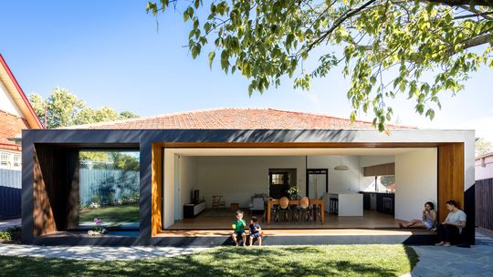
Open House in leafy Hawthorn East is the renovation of an existing brick home. The existing house was in great condition, but a dated 1970s lean-to addition at the rear left the home feeling awkward and had a poor connection to the backyard. To make matters worse, the triangular-shaped site and a large, imposing shed in the backyard made the backyard feel squeezed.
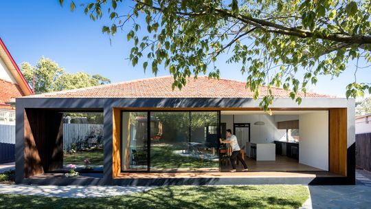
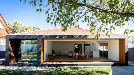
"The client came to us prior to purchasing the house to understand how they could convert this home for a family of four and, importantly, a house that not only complements their lifestyle but one that can enhance their connection between the family, garden and their home", explains the architect, Michael Ong MODO Architectecture.
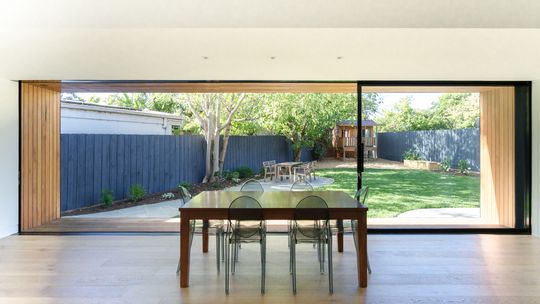
Unlike a typical addition, Michael quickly realised the lean-to had to go and instead of adding more space, slightly less would work once the internal spaces were reorganised and connected to the backyard. "Rather than simply adding more to the original house, we looked at what we could do within the original and raised the question, how much space is actually needed to fulfil the functions of the brief?" The new open-plan living areas are arranged simply to maximise the sense of space and connect to a separate music room via a sliding door. By bringing light and air into the home, it immediately feels larger. "Our focus then became on the finer details, based around material selection, construction method, integrated joinery and lighting."
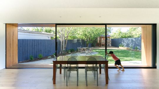
The key to the design, though, is opening the home to the backyard via huge sliding glass doors. From the living area, the glass doors and timber surround frame a panoramic view of the backyard. This, as well as removing the shed to create more garden space, helps the tapering backyard feel larger, allowing you to take in the whole view from the living area. The doors slide back into the music room to open the entire living area to the yard.
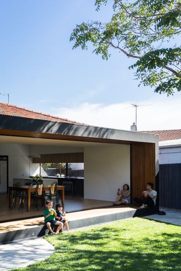
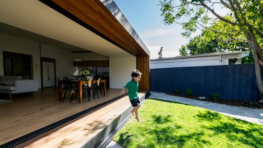
The rear faces north, so a timber frame around the sliding door not only creates a casual place for the owners to sit and enjoy their backyard, it also shields the home from the summer sun while still allowing the lower-angle winter sun to stream into the living areas.
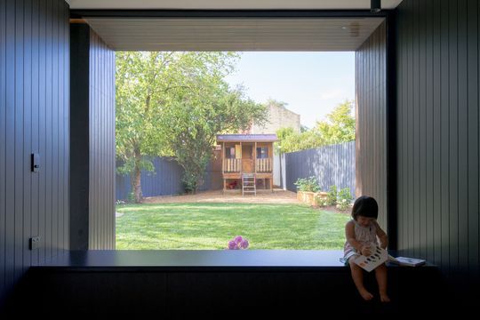
"A common misconception in real estate is bigger is better, here we challenge this notion and design a house which is smaller than the original dwelling but one that provides more function and vitality than the original dwelling." Open House proves you don't always need more space. In fact, sometimes a subtraction is greater than an addition, but would you be game to reduce the size of your house? Let us know in the comments below.
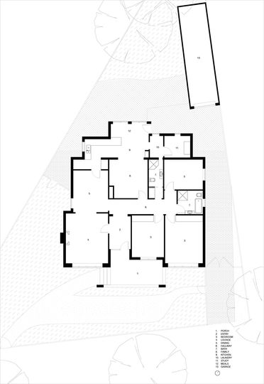
Original Open House floor plan
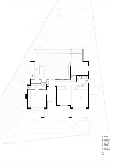
New Open House floor plan