Walking along a quiet, residential street in Fitzroy North, you know when you've arrived at One MANI House because you smile when you see it. As Marie Condo would say, it sparks joy. Perhaps unsurprisingly, a home with such street presence doesn't fit the norm inside, either...
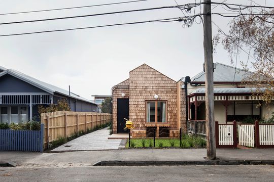
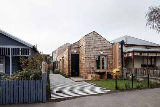
Uniquely, One MANI House is a project where the architect was also the client. Mani Architecture and a small group of investors taking on the project as an architect-led development, disrupting the conventional model of design. But the architects didn't let the need for profit limit their creativity. Instead, they set out to prove creative solutions and good design has value in and of itself.
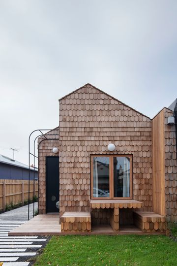
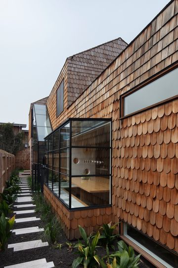
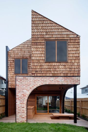
Beyond the bumblebee letterbox, this new kid on the block, clad in timber shingles, with a built-in picnic bench tucked under the front window, isn't afraid to be different. And yet the home is respectful of its neighbours, matching the roofline and setback of other homes in the street.
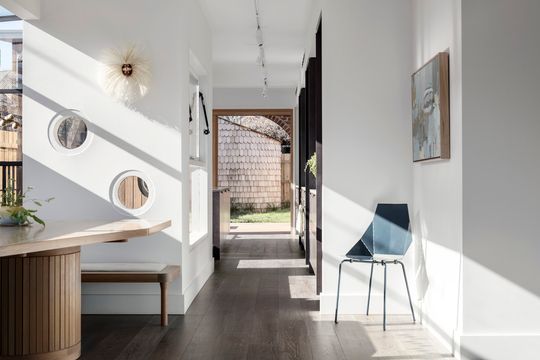
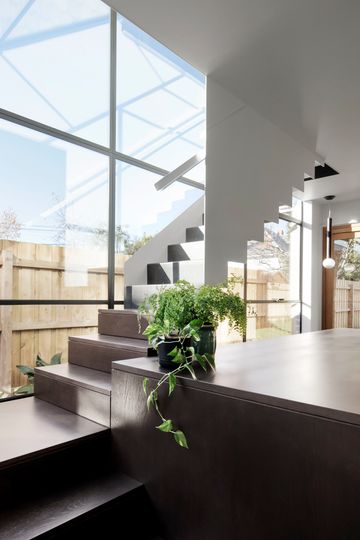
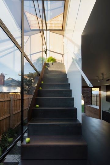
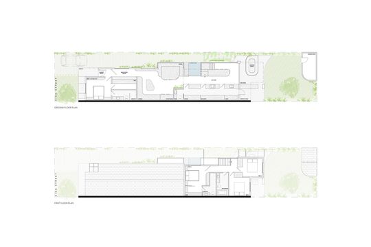
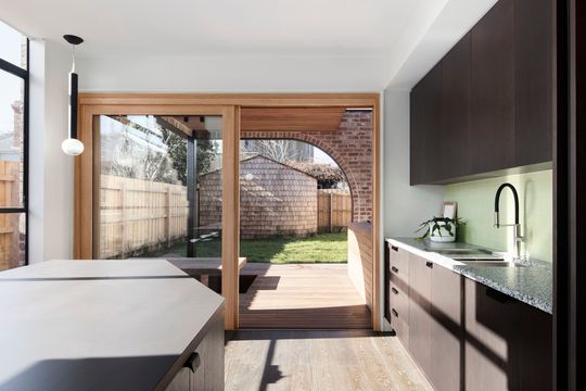
The winter sun soaks the home in natural light because the home is pushed towards the southern boundary, leaving space to the north to let the light in. Sitting in the dining area on a sunny spring day, you can soak up some rays, while a cooling breeze is drawn through the house to keep you comfortable. That's the reality of what good passive solar design can achieve. This setback doesn't leave a whole lot of space on the typically long and narrow inner-city site, but design again comes to the rescue: the use of built-in furniture in the living and dining areas makes the most of the limited space.
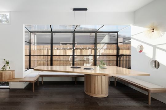
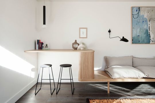
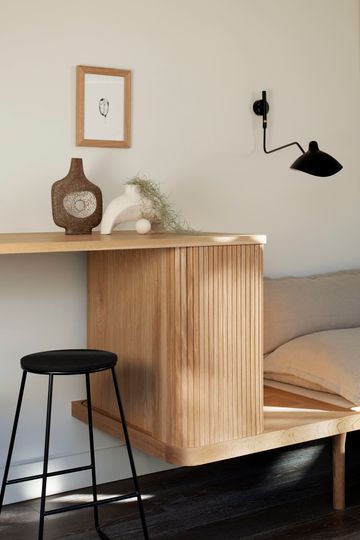
The architects have actually managed to fit a 12-seat dining table into the narrow home! And the custom lounge, wraps around two walls before transforming into a desk for those times when you just need to bang out a couple of emails before bed. "What we want people to take away is that by working with an architect, you can achieve incredible value in your house through design that... uses every square inch to create a comfortable and liveable home", explain the architects Sara and René. The north-facing glazing actually makes the home feel wider, too, helping to visually extend the internal space outdoors.
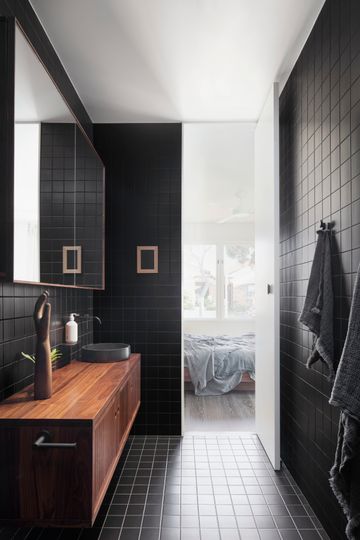
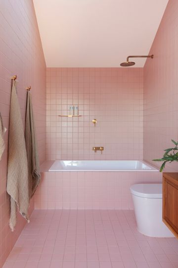
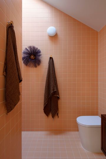
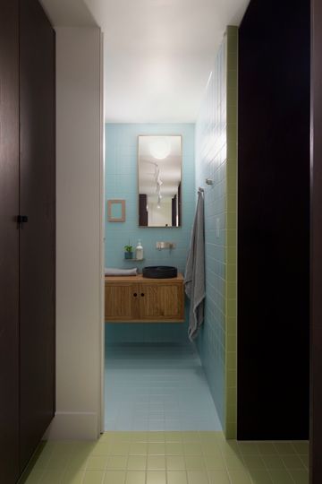
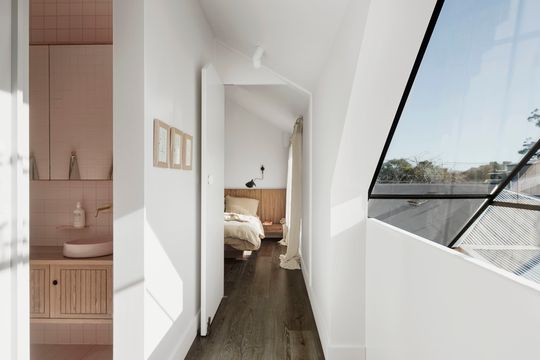
Each room has its own distinct personality and sense of fun and playfulness. The tiles used are all the same for economy and cohesiveness, but pop with their own colour. There's a bathroom in a shade to suit everyone: one black, one blue and (our favourite) a pink bathroom.
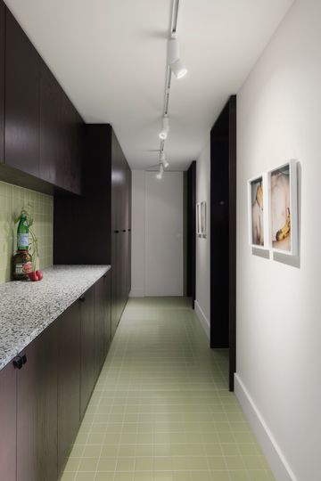
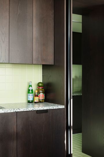
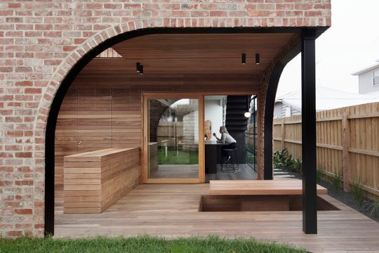
There's a green kitchen and an arched outdoor room with sunken conversation pit; an element of surprise and delight around every corner.
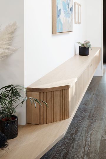
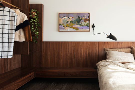
Numerous other elements of the house were handcrafted, in keeping with the Italian roots of the word 'mani', meaning 'hands'. A local ceramist made the basins in colours to complement the black, blue and pink bathrooms, and custom joinery fits into even the narrowest of spaces to maximise storage for a modern family. This adds to the home's charm and uniqueness, while also supporting local artisans and craftspeople.
The home is designed with flexibility and changing needs in mind. "What does a modern family look like? There’s no one answer, but we think that what suits today, may not be the case in 10 years, heck, maybe not even 5 years! So we addressed it", explain Sara and René. "Part of the house can be completely closed off if needed and the project cleverly includes two separate entrances. Simple. It means it can suit grown up kids sneaking home, anyone who wants to do some Airbnb hosting, there’s even potential for two families to take up residence and feel both privacy and connection."
The design shows on TV say to make a home saleable, you should paint everything in neutrals, scatter some cushions and make it appeal to the widest possible market, but One MANI House says, 'screw that, there are people out there who want a home that's fun and quirky. There are people who would be enlivened by showering in a pink bathroom, not a (literal) beige box.' At One MANI House, the architect was also the client, giving Mani Architecture more creative freedom to show what a modern family home could look like if it prioritises good design. It's a strategy that paid off, with the home selling in 2019 for close to $2.5 million, netting the Architects and investors a tidy profit. It's proof of the value of good design and the power of spaces with personality that feel good to live in, with loads of natural light, flexible spaces and thoughtful touches.
Perhaps the architects say it best, "What is the value of good design? Mani Architecture has created a kick-arse, one-of-a-kind exemplar that breaks the mould of the housing market in more ways than one. From the unconventional way the project was funded to the quirky and adventurous design decisions, One MANI House in Melbourne’s Fitzroy North is a true showcase for what’s possible when you bring an architect on board for the journey."
