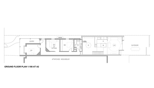
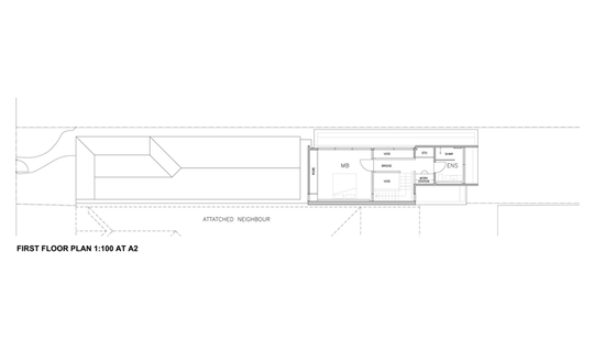
There's a certain charm in a building you know has been around for a long time. And while the temptation may be to stick with that style when adding onto the rear of a heritage property the outcome of that style of pastiche replication always ends up looking fake -- lacking the patina that develops over years of use.
When approached to design a new rear extension for a terrace house in an important street in North Fitzroy, AM Architecture's response was unashamedly modern. But they managed to integrate old and new by using materials and colors from the original home in modern ways…
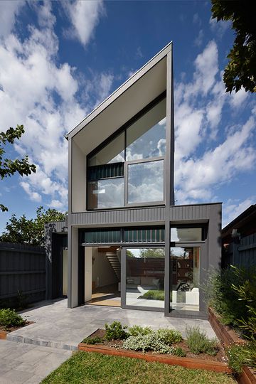
Contrasting Modern with Traditional: Modern lines and contrasting black and white define the modern extension to the rear of North Fitzroy House. The same roof pitch was adopted, but dramatically extends from one side of the site to the other.
"These common materials serve to bind the two parts together, reinforcing the idea that both old and new, so different in era and style, are borne of the same substance." -- AM Architecture
The existing materials used in modern ways includes white bagged brickwork referencing the face brickwork at the front of the building, white painted timber cladding connecting to the painted timber soffit of the portico, glossy white steel plate, exposed polished concrete, charcoal timber shiplap cladding and a timber veneer.
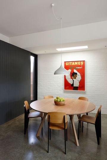
Separate but Spatially Connected: The dining room is a separate space to the kitchen, but it is still spatially connected to create an intimate evening space.
Evening Dining
The owners really wanted a private evening dining space, separate from the kitchen but still spatially connected. This was achieved by placing the dining area in the center of the house, (the darkest part) at the junction of old and new. Here the selection of materials is most in keeping with the old part of the house to ease the transition.
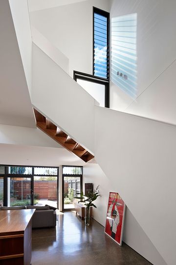
"During the day, skylights and long windows wash perpendicular walls, so the space receives a reflected and ambient glow of light." -- AM Architecture
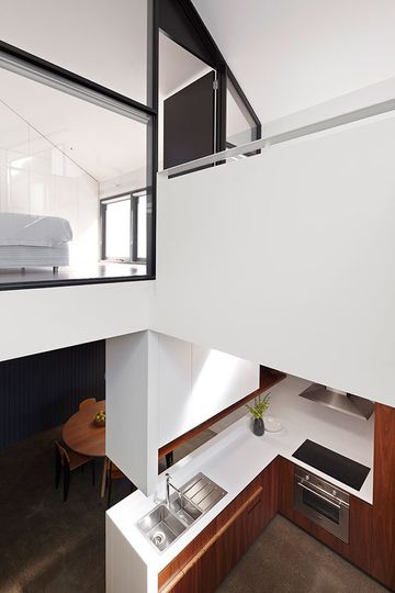
Light-filled Void
Central to the extension -- both specially and experientially -- is a void which creates a double-height space over the kitchen creating a dramatic light-filled space. The void allows light to flood into the space, while also spatially connecting the master bedroom and ensuite bathroom to the lower level. This makes the whole house feel larger than it is.
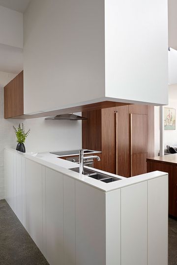
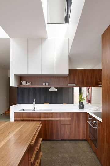
Simple But Rich Kitchen
In the kitchen timber veneer and a textured white panels keep the look simple but richly textured. The kitchen becomes a timber insertion into a white space, cementing it as the new heart of the home. A solid timber island bench doubles as a casual meals area connected to the living area.
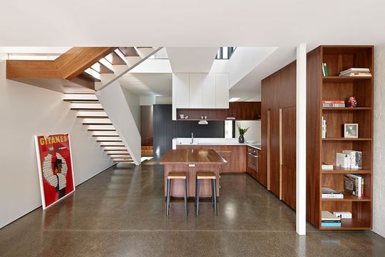
"The living area is fully glazed to the northern garden and the first floor the en-suite above sits in a deep white recess for privacy, enjoying a high pitching ceiling that opens the space up to the sky and nearby trees." -- AM Architecture
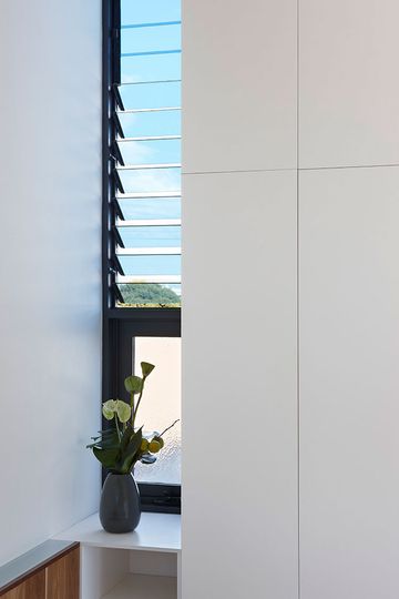
Louvre Windows: Louvre windows help with ventilation, creating a stack effect in the double height space. Slits of louvres let shards of light into the house which dance and reflect on the crisp white walls.
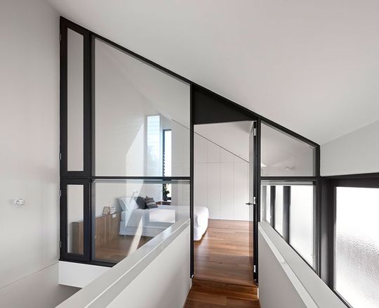
Mezzanine Bedroom: The bedroom is surrounded by glass, giving it acoustic privacy, but making it feel more like a mezzanine loft. This also helps to distribute light deep into the lower levels.
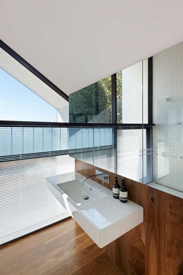
Timber Wall and Flooring: Timber flooring continues up to become a wall surface in the new ensuite.
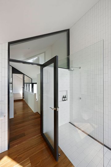
Stunning Bathroom: The ensuite is stunning in black and white with an unusual basket weave tile pattern.
