Tribe Studio Architects have transformed a 1920 Californian-style bungalow in Sydney's east into a simple, but fun home for a young family. A poor 1970s rear addition was carefully removed from the original house and historic details preserved. A new addition to the rear has a contemporary architectural and interior language inspired by the old…
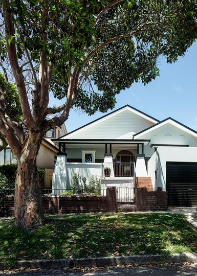
Richly Detailed: The Californian Bungalow facade of House Boone Murray is richly detailed and ornamented.
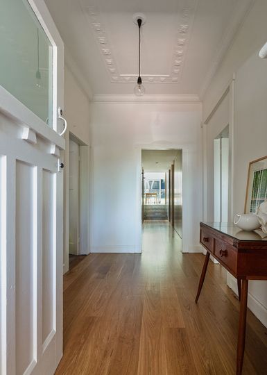
Just a Glimpse: From the entry hall you get a glimpse of the modern extension and garden beyond.
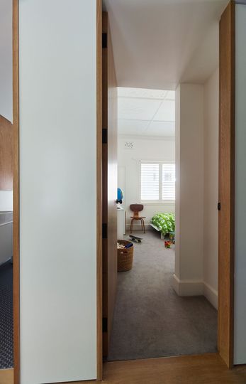
Mixing Old and New: Traditional detailing is retained in the rooms, but where new opening are created they're surrounded by simple timber frames.
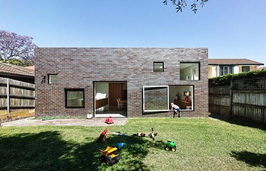
Contrasting: A flat elevation from the rear with various-sized square windows.
Stark Contrast
"The existing house is highly decorative to the street elevation only: it is rendered and modeled with some complex corbelling and fretwork. In stark contrast, the side elevations of the house are completely unadorned. The new additions takes its cue from this diminution in decoration and presents a totally flat elevation to the rear garden. Hence the public face of the house is decorative and frilly, while the private face is quiet, honest and unadorned. It is the unpretentious face of private family life." -- Tribe Studio Architects
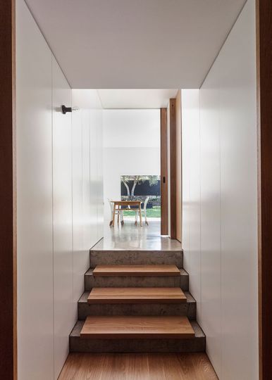
Stepping Up: The new extension steps up to create a better connection with the yard.
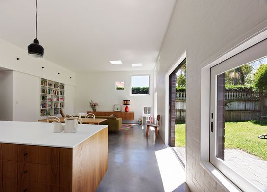
Inside or Out: Rather than ease you between indoors and outdoors with an intermediary threshold like a traditional verandah or deck, at Boone Murray House you have two options -- inside or outside.
Down with Convention
You won't see any oversized outdoor entertaining areas or, in fact, any mediation between indoors and outdoors here. You're either inside or you're out. Tribe Studio have also refrained from full-height glass overlooking the garden. Instead, small, square picture windows highlight and frame views of the garden. Some of these windows swing or slide open to become entrances into the garden. Rather than deter visits to the garden, this partially obscured, visually and physically restricted access actually encourages you to get out there and explore!
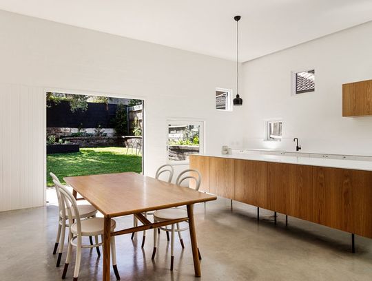
Picture Frame Windows: The square windows act like paintings hanging on the wall, framing different views of the yard and neighboring roofs.
White with Texture
White walls turn the squares of patterned light into artworks that dance across the space as the day progresses. The white also highlights textural differences (recycled brick, grooved timber and plasterboard), infusing a richness that is lacking in plain white plasterboard walls.
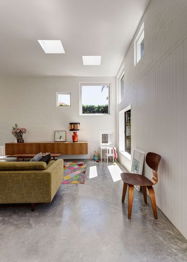
Patterns of Light: Squares of light create striking patterns as the sun filters through the various square windows and skylights.
Polished Concrete
The rear extension sits on a polished concrete slab raised from the existing house. This has thermal benefits -- helping to keep the house's temperature stable. It also creates an easily cleaned surface that is resistant to stains and spills -- perfect for a young family.
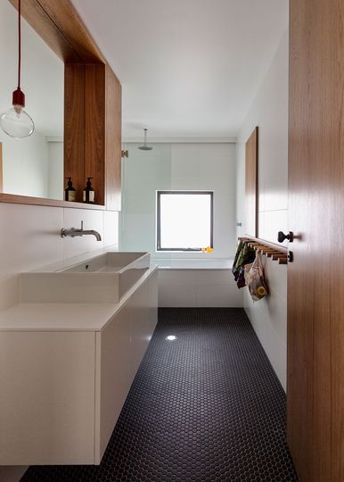
Minimal Palette: A simple palette of white, charcoal and timber is used throughout the house.
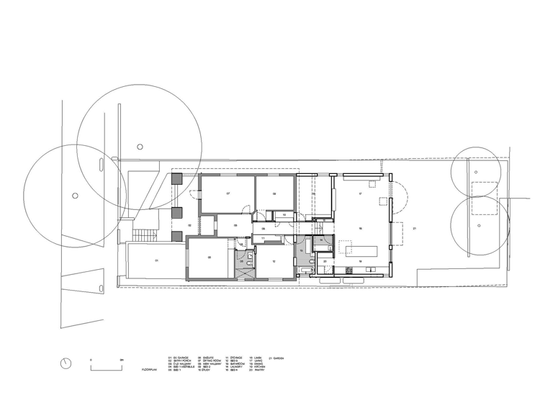
Floor Plan: House Boone Murray Floor Plan
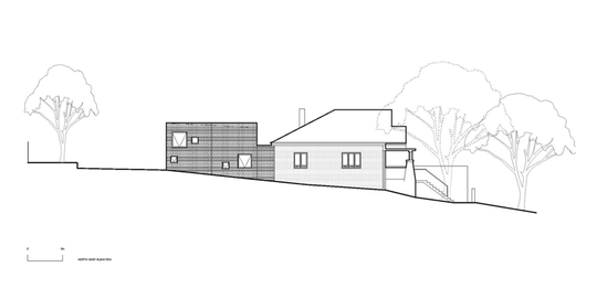
Elevation: House Boone Murray Side Elevation shows the minimal ornamentation on the side of the existing house replicated in the new extension.
House Boone Murray is a playful example of an inner-city alteration and addition. Tribe Studio Architects have bucked many trends in the design of this home. No outdoor entertaining space, no full-height windows and a minimal, graphic rear facade. Because of this refusal to follow convention, the project is intriguing, delightful and above all, fun.