For self-confessed 'habitual over-caterers', Hayley and Steve, their semi-detached home in Sydney simply wasn't cut out for the gatherings of friends and family they enjoyed. With a series of rooms getting smaller, darker and more enclosed the further they moved towards the back door, the house felt cramped and impractical. Working with architect, Aterre, they developed a renovation plan which would infuse their home with more light and create the perfect indoor-outdoor entertainment space for their lifestyles...
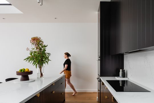
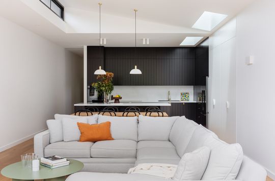
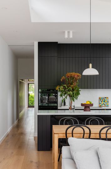
Hayley and Steve had originally planned to engage a builder to design and manage the project. But, with an open mind, they ultimately decided to work with an architect and the result is a renovated home that is carefully designed with their needs and budget in mind and also incorporates elements of surprise and delight along the way. "They let us quietly guide and educate them along the way, elevating the final outcome", explains the architect.
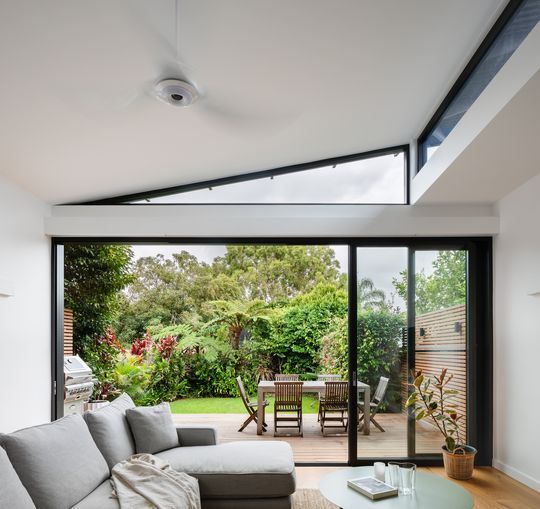
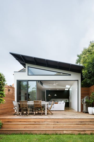
It was essential to first find a way to remedy the "series of closed rooms that concertinaed down in scale from front to back", explains the architect. A new floor plan was developed which fits all the clients' needs within the smallest possible footprint to keep the budget in check. A rectilinear plan was decided on to keep the construction simple, but an element of sun and surprise is introduced in section, with a raked, fin-like roof, lending the home its name, Fin House. The fin floats over the living areas, angling up towards the north to allow natural light into the space via clerestory windows.
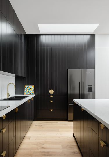
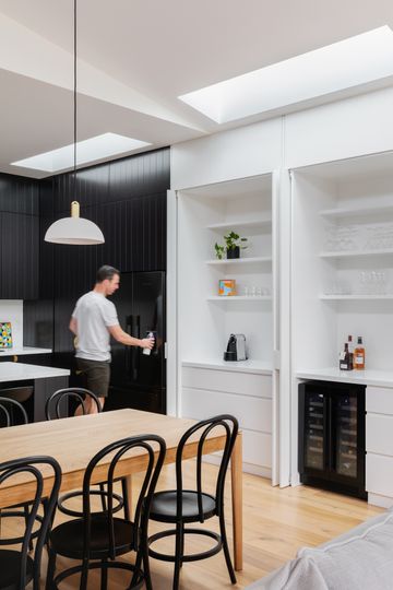
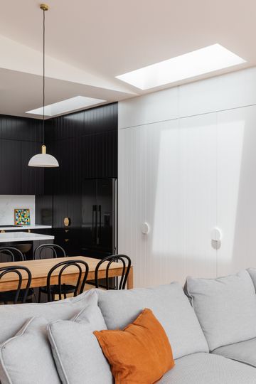
Skylights are used to bring even more light into the work zones in the kitchen. The changing light quality during the day gives this new living space an ever-changing feeling of light and movement.
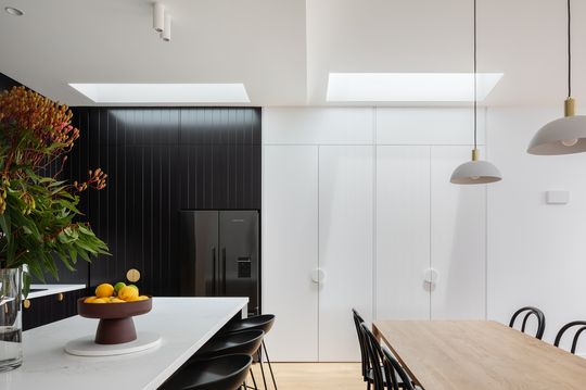
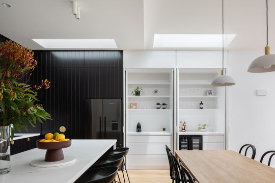
Storage space, including a wine fridge and built-in glass cabinet, is cleverly concealed behind doors in the kitchen. This allows the kitchen to open up when guests are around or close down when not needed for minimal visual clutter.
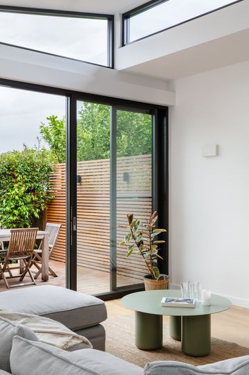
The rear living area opens up completely the deck, with a large sliding glass door stacking back out of the way to create the ideal indoor-outdoor living space.
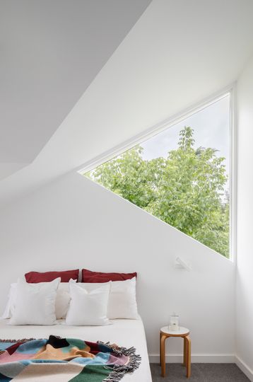
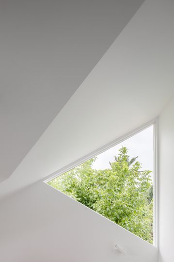
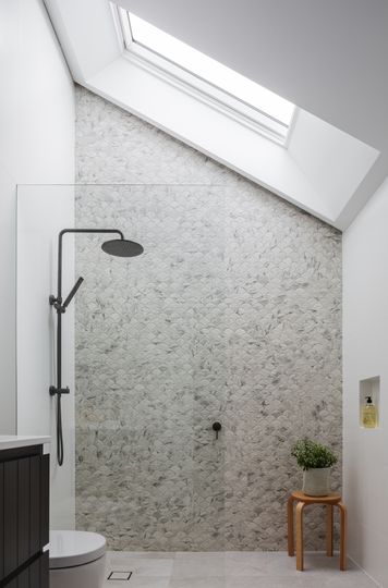
Upstairs is a generous main bedroom suite with a walk-in robe and ensuite bathroom as well as an additional bedroom. These spaces hug the northern boundary to minimise the overshadowing of their south-side neighbour. Similarly, the roof slopes down towards the south to limit overshadowing and skylights are used to bring light into the ensuite, while a clever triangular window follows the roofline and grabs all available light and treetop glimpses for the bedroom.
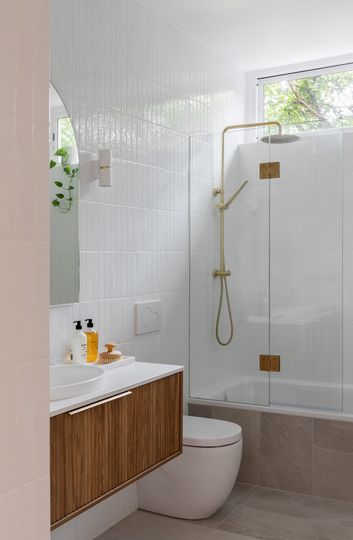
Keeping the design simple, but spending money where it counts has created a home that feels bright and spacious, and which functions effortlessly to serve its owners' daily lives. As the architect explains, "we set out to create a home that would sustain joy for its occupants. Not only competently meeting the requirements of a functional brief, or meeting sustainability goals but offering the sometimes intangible benefits of architecture - space that invigorates, heals, supports."
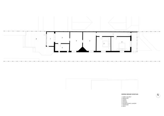
Existing ground floor plan
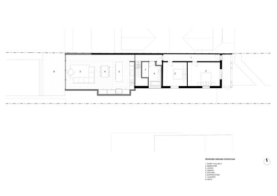
Ground floor plan
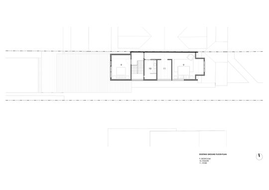
First floor plan