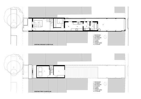
So many terraces feel dark and pokey. Which makes sense, often terraces barely measure four-metres wide, and with limited opportunities to access natural light from two narrow ends and a small light well, if you're lucky! To make matters worse, many terraces have been added to over the years, as kitchens and bathrooms moved indoors. Consequently, they often have a small kitchen and bathroom tacked onto the rear, blocking access to light and the outdoors. That's exactly the state Elaine Richardson Architect discovered Vy and Matt's House in at the beginning of this renovation project...
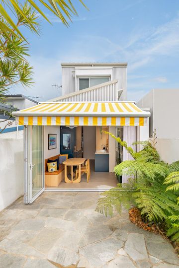
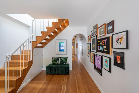
"We understood the fun that awaited us on this project right from the start. The owners have wonderful, big personalities with a bold sense of design and a love of colour", explains the architect, Elaine Richardson. The renovation, for a family of four plus their adorable pup, aimed to create a family home to house their incredible collection of prints.
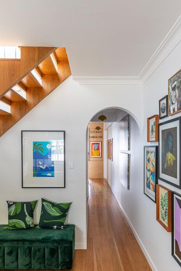
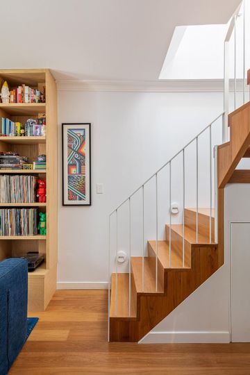
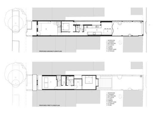
The main solution to the dark and pokey dilemma was relocating the bathroom and laundry to the centre of the house. This freed up precious space at the bright end of the house with access to the garden. Placing the kitchen and dining areas in this space gives them better access to the outdoors and creates a much more inviting living area.
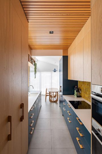
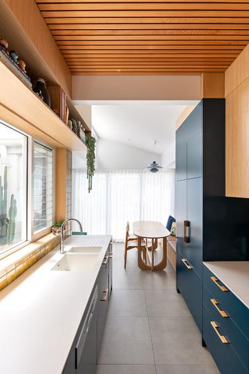
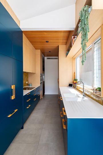
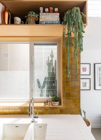
A galley-style kitchen makes efficient use of the narrow width where the existing light well steps in. Placing the kitchen here also allows it to take advantage of a window into the light well so it feels light, bright, and surprisingly spacious.
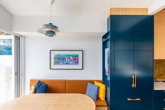
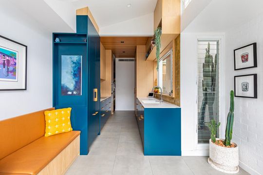
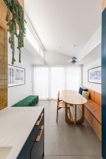
A raked ceiling and clerestory window in the meals/dining area brings in north light. Louvre windows help to create a heat stack effect, to naturally draw fresh air and breezes through the home in warmer months.
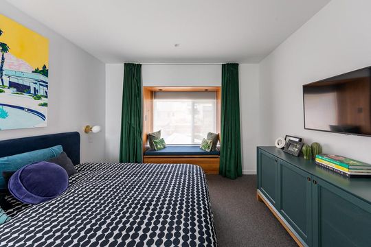
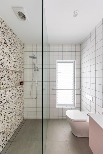
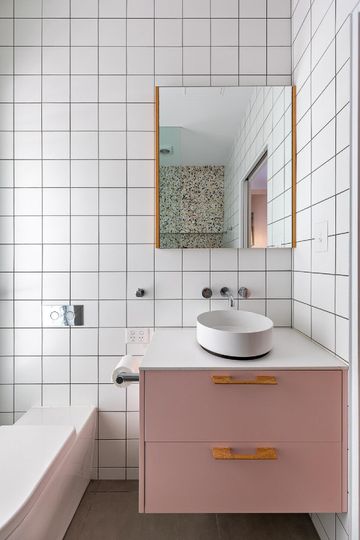
Upstairs, one of the existing two bedrooms is retained, while the other has been transformed into a bathroom and storage space. A new main bedroom with generous walk-through robe has been built over the kitchen area with a gorgeous window seat overlooking the garden.
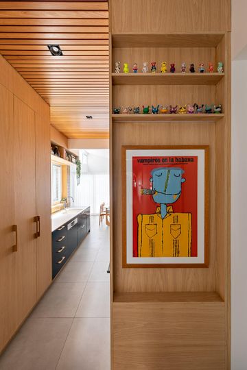
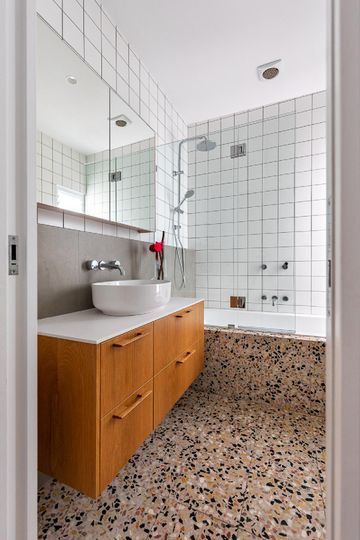
Owners, Vy and Matt love mid-century design, so they wanted to inject some elements of this period into their home. The bold colours, geometric handles, Louis Poulsen PH5 Lamp, flowerpot pendant, terrazzo and timber veneer all add fun mid-century touches while also complementing the family's art.
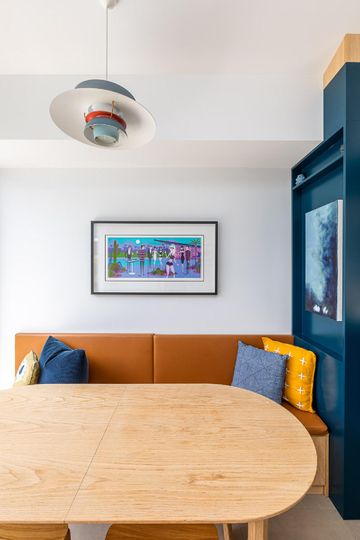
While it's impossible to add extra width to a tight existing terrace, clever design moves can make even the narrowest of narrow feel more spacious. Similarly, bringing in natural light and opening the home to an outdoor space makes the home feel larger than its actual footprint.
Your home should be an extension of your personality. While it's tempting to paint everything white, injecting colour and design into your house makes it unique and endearing home. This savvy terrace transformation has created a home for Vy, Matt, and family that certainly reflects their design style and personality.
