A home re-configuration and extension by architects, POLYStudio The Corner House is designed to cope with the evolving needs of a young family. Set in Balaclava in Melbourne's inner South, this black timber extension on a highly visible corner block is designed as a 'house in the round' which contrasts with the white Edwardian original...
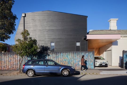
"Located on a prominent corner within the neighbourhood, the design leverages the opportunities of its multiple frontages and its condition of being experienced ‘in the round’ to animate and engage with the streetscape." - POLYStudio
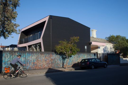
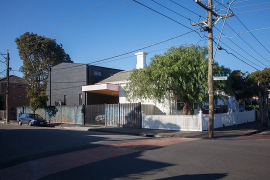
Black really is the new white at The Corner House, where the original weatherboard home is painted in white, while the new 'deformed box' timber extension is stained black. As you view the new home, it's immediately clear what's old and what's new, making a striking statement on the street.
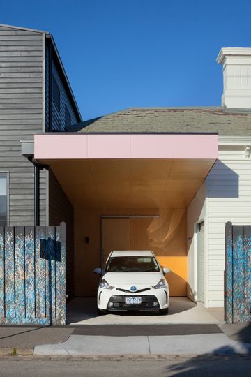
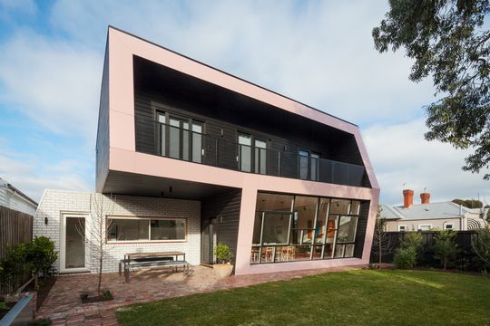
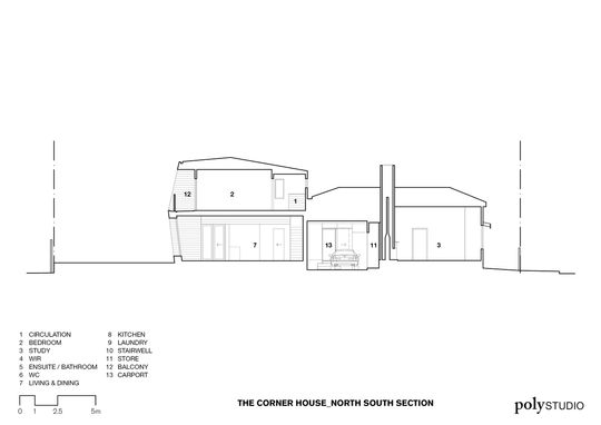
But this home is more than a dumb box. It plays with geometry of a bay window and the original home's roof form, giving it a sensitive, deformed appearance. Ribbons of pink highlight the section of the home from the street and framing large north-facing windows. The form of the rear creates a self-shading facade, where the building itself creates shade, rather that requiring additional shading devices.
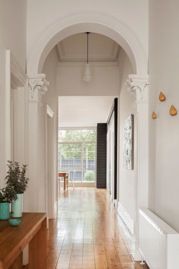
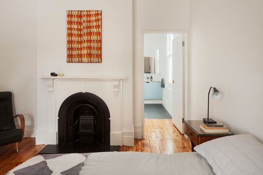
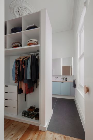
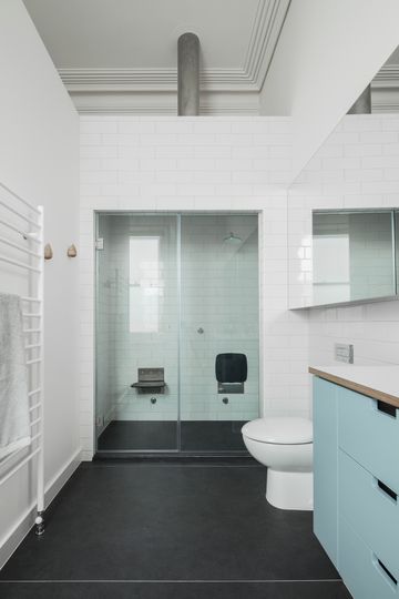
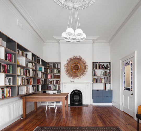
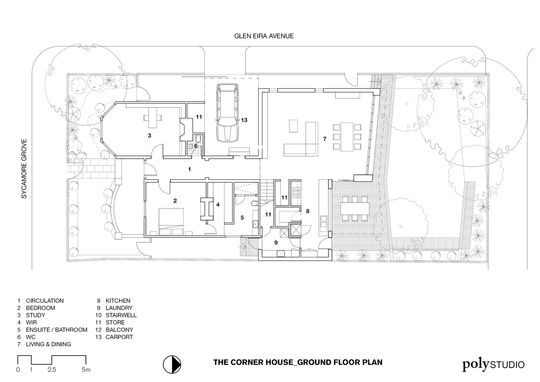
Inside, the home is broken into several distinct zones. Within the original home is a parents' zone. This area includes a mater bedroom with walk in robe and en-suite bathroom. There is also a generous home office in what was once the lounge.
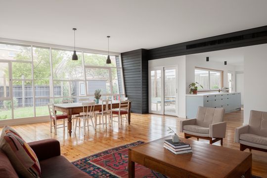
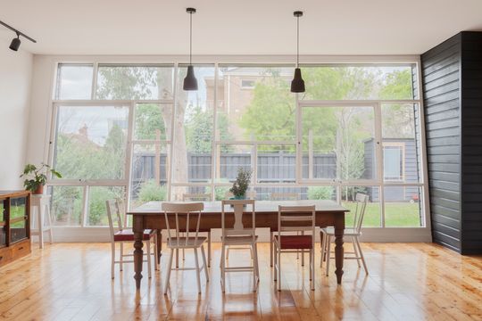
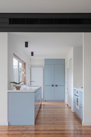
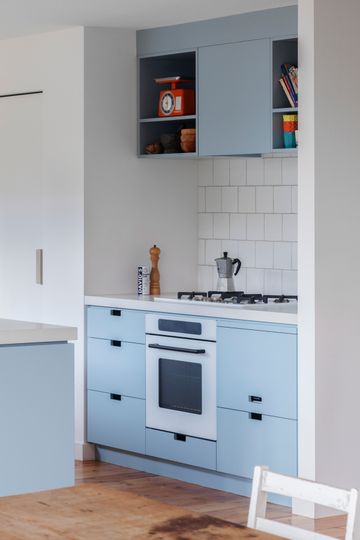
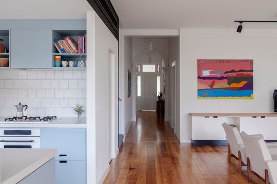
Open plan living and dining takes up the ground floor of the new extension, with easy access to the garden and large windows to enjoy the north light. Kitchen and laundry are contained within part of the original home, but are well-connected to the new generous living space. Off-street parking has also been incorporated, marking the separation between old and new, maximising the size of the backyard.
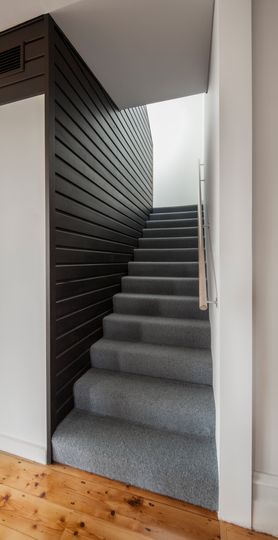
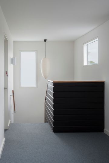
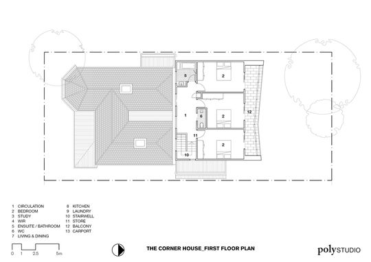
Upstairs is the third zone, the children's bedrooms. The three bedrooms are oriented towards the North and open onto a shared balcony overlooking the garden. A generous circulation zone could always serve as a play area or seperate lounge.
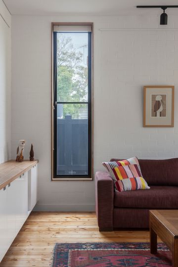
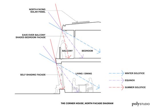
The Corner House makes the most of its orientation by incorporating passive design principles. Large north-facing windows in the extension bring in plenty of light and warmth in the winter, and reverse brick veneer in the living spaces helps to trap this heat to keep the home warm day and night. For the warmer months the home allows for effective cross-flow ventilation thanks to the strategic location of windows.
