Could you increase the light in your home, improve its livability and connect to the outdoors without extending? This terrace renovation in Sydney's Surry Hills achieved all of that with some key moves...
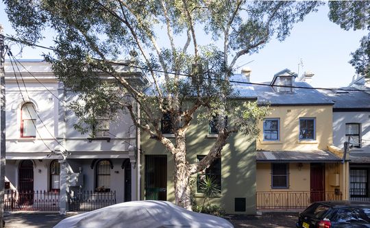
The owners of this beautiful late-Victorian-era terrace lived in the home for a few years before engaging CO-AP to design a renovation, so they knew what worked and what drove them a little bit mad. What they really wanted was a home that had plenty of daylight, was connected to outdoor space, a compact but precious courtyard, and generally worked better for their lifestyle.
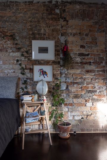
"The original late Victorian building was erected in 1873 for commercial use as dressmaking premises, and from 1879 a grocer's shop. Much of the original building fabric has been altered or removed since the 1950s", explains the architect. Part of the renovation would include exposing some of the original brickwork from under layers of old paint to reveal where some old walls have been filled or cutaway, revealing some of the history and character of the building.
Some remediation work was required to ensure the structural integrity of the building. This included new structure to the attic space so it could be utilised as a bedroom and ensuite space.
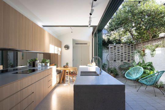
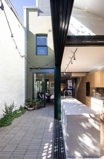
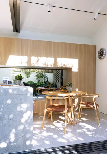
Key to both bringing in more light and connecting to the courtyard was an incredible corner-opening sliding glass door which allows the courtyard to become an extension of the kitchen. Other space-saving moves like the banquet seat as part of the kitchen joinery which allows for a built-in meals area in the narrow space. Mirrored splashbacks in the kitchen and extending into the meals area bounces additional light around the space and achieves the trick of doubling the sense of space, bringing the greenery of the courtyard inside.
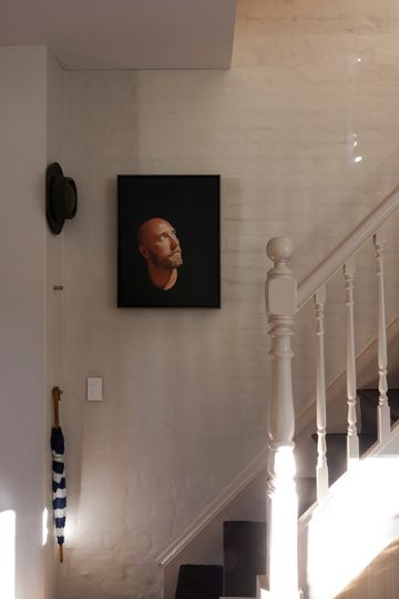
The original timber staircase was retained, leading to the first-floor bedrooms and a refurbished main bathroom. "New ventilating skylights allow the sun and fresh air to permeate the wet areas", explains the architect.
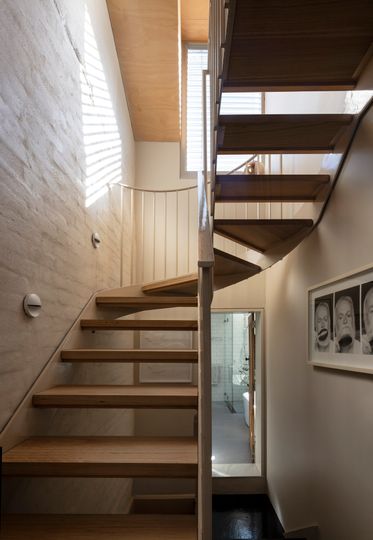
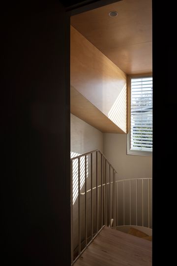
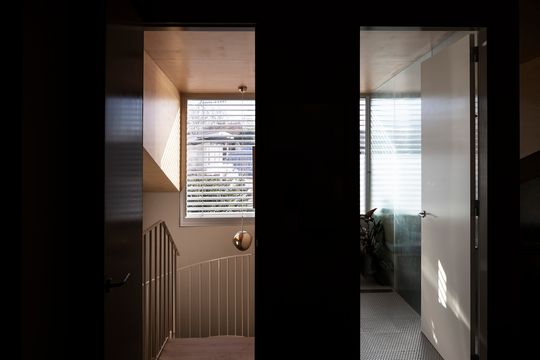
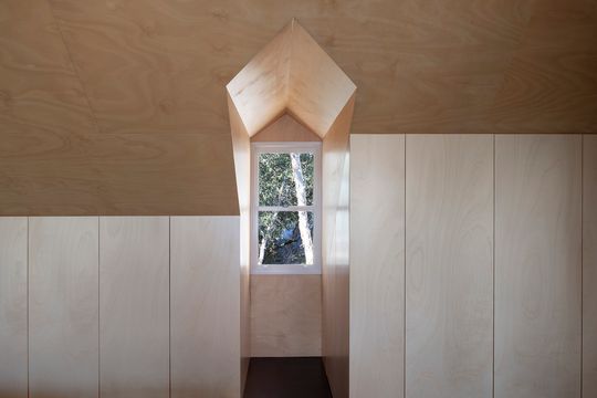
From there, "a new steel staircase winds its way up into the plywood lined attic bedroom and ensuite, which is tucked into a generous dormer window overlooking the city skyline."
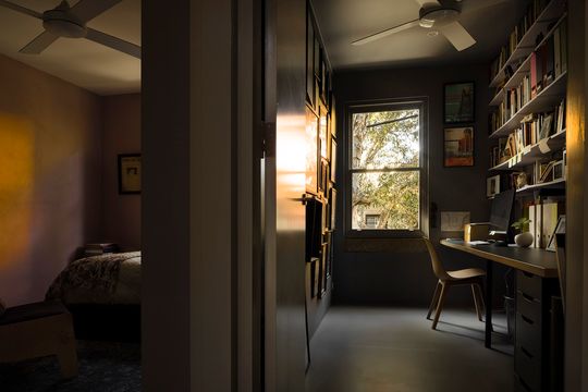
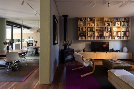
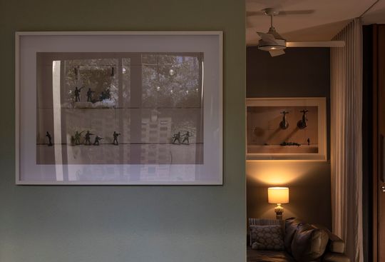
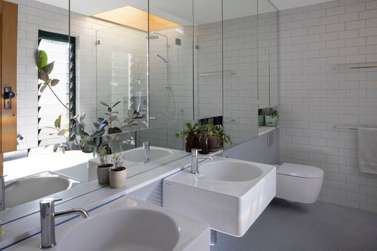
"Each room has been painted in contrasting muted colours to layer and define spaces. Cool tones are used in the living spaces and warmer tones to the bedrooms. The home office, saturated in a deep neutral tone, conduces focus on work and provides an alternative environment to the rest of the house when passing its threshold. Timber veneer, laminate and concrete are used for the kitchen. Bathrooms are playful with simple grey tiles and bright coloured grout." - CO-OP
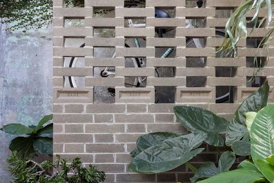
With a restrained approach, CO-OP has transformed this terrace, bringing light, space and views into previously dark, impractical spaces. These expert moves have created a generous family home on a tight site in a dense inner-city area. This 150-year-old building now has a new lease on life and can live of for generations to come.