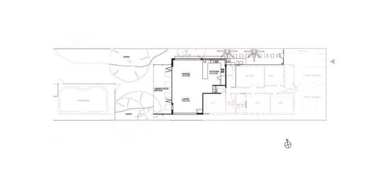
While there's a physical step down to the new bright and airy living pavilion at this Sydney renovation, it's certainly not a figurative step down from the original home: Step Down House is a step up...
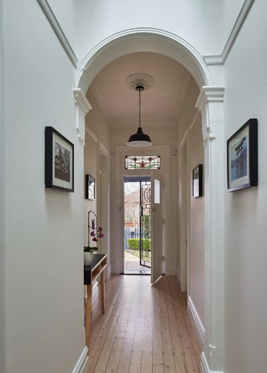
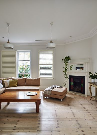
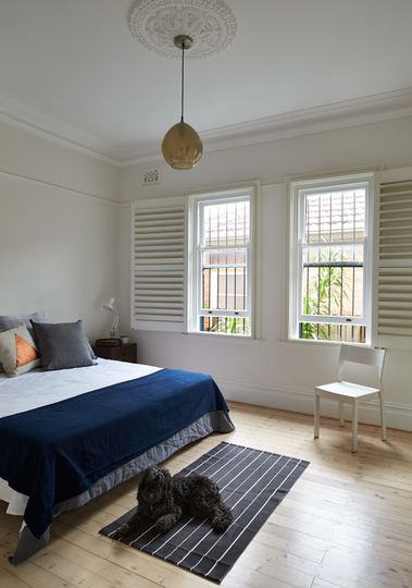
The original 1910 home provided a beautiful base for this extension. The timber fretwork, cedar shingles, stained glass and Kauri timber floorboards have been retained and revived, priming them for another century of service. Out the back and poorly-built 1970s lean-to made way for a new living pavilion.
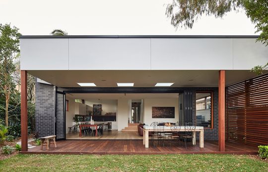
Stepping down from the original home (where Step Down House takes its name) brings the new living areas closer to the backyard. Combined with almost full-length bi-fold doors and a generous entertainers' deck, the home now flows easily to the garden and pool.
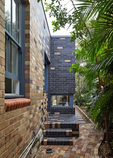
The new living pavilion is clad in a rich, dark-coloured brick which is tied back to the original home's straw-coloured bricks not abruptly, but more like darning, with the two slowly blended together in a mosaic-like pattern to the side of the house. This same idea of blending old and new is continued inside where the original floorboards and new are both whitewashed to help them merge together and achieve a sense of flow and continuity through the whole house.
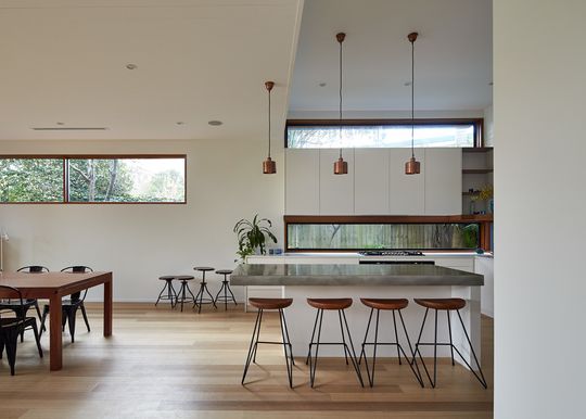
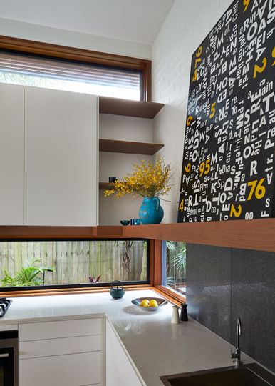
Windows are positioned and sized to capture views of foliage and sky, with the letterbox-shaped windows framing surrounding vegetation and bringing in north light.
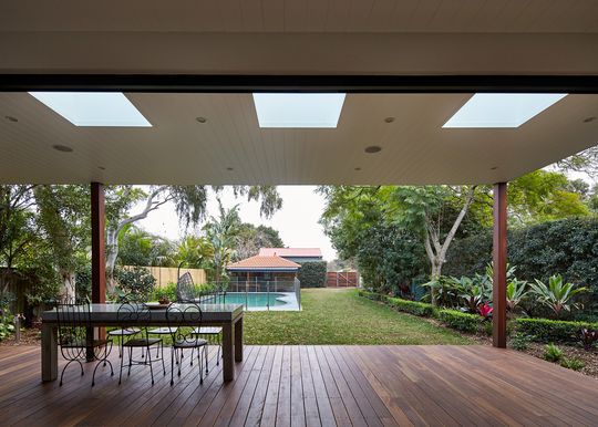
The shiplap ceiling provides a sense of texture and warmth which extends over the deck to create a covered outdoor room for all-weather outdoor dining. For a family who loves entertaining, this is the perfect space. Skylights over the deck allow additional light into the home.
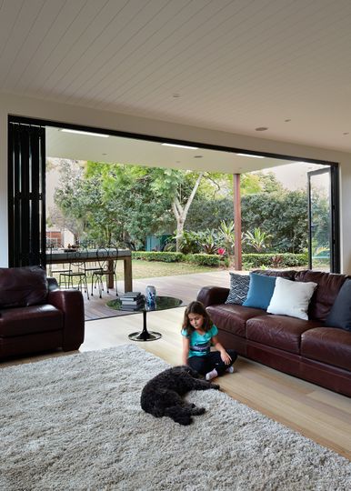
The sensitive makeover of the original home, as well as the beautifully light and airy rear pavilion, creates the perfect balance of old-world charm and modern-day living, definitely a step up even though it's also a step down from the original home!
