This professional couple and their young child wanted a practical and economical alteration and addition to their single-storey duplex home. Foomann Architects delivered with a simple, but effective 'box in the back' which, combined with an internal reconfiguration of the original house, dramatically transforms the functionality of the home. See, simple and cost-effective can have a big impact...
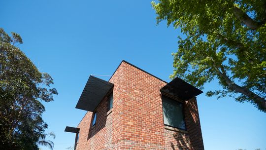
The transformation, built by Hydebuild was split into two stages. Stage one saw a more space-efficient internal reconfiguration and minor addition transform the one-bedroom home into two bedrooms. This more efficient paved the way for stage two, the two-storey 'box in the back' which added a spacious dining and living area for dining and entertaining and two additional bedrooms, a bathroom and study upstairs. All up, the alteration and addition transform the original duplex into a modern and spacious family home.
The addition is intentionally simple: a rectangular space built with recycled clinker and red brick with no overhangs to allow for very straightforward and economical construction. The bricks tie the addition into the original home, while shade is provided to the windows by inexpensive industrial mesh panels elegantly hung from above. Windows in the upstairs bedrooms are placed to enjoy views of the neighbouring trees while, downstairs, large sliding glass doors open up to the backyard and let the northern sun shine in.
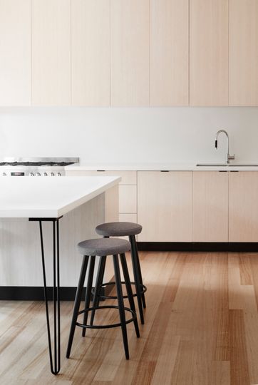
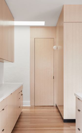
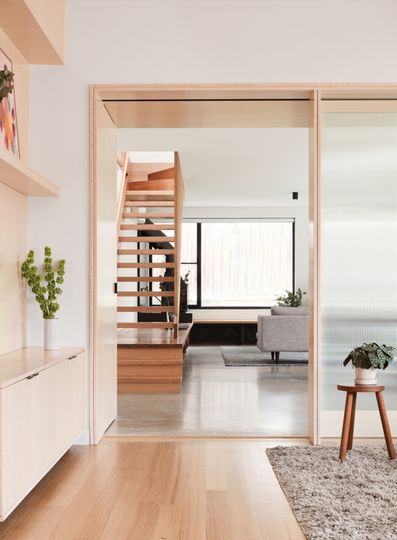
Inside, the focus is on low-maintenance, durable materials, perfect for a young family. The timber floors of the original home are retained, while the addition has a concrete floor for thermal mass. Sustainable bamboo joinery is used throughout.
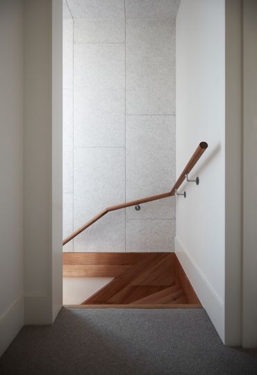
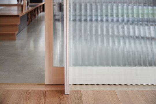
Adjacent living areas create a flexible arrangement for the owners who often have family stay for extended periods. The living area in the original home is the main family space, while the second living area is a retreat for parents and friends. A bamboo and reeded glass door separates the two living spaces, for thermal zoning as well as providing privacy and quiet when needed without blocking light, so the spaces feel larger. Similarly, acoustic wall panelling more commonly seen in commercial spaces lines the wall of the stair to dampen noise from the living areas for quiet in the upstairs bedrooms.
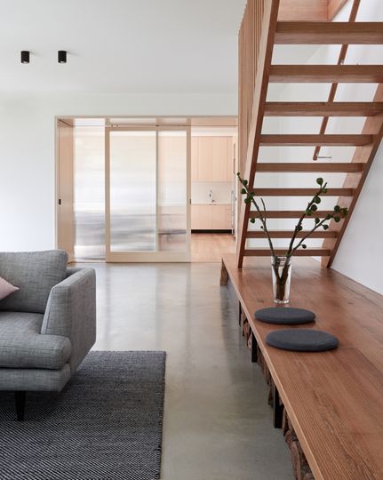
Keeping the addition simple and cost-effective allowed the owners to splurge a little on the features they really wanted, such as the Cheminees Philippe fireplace and the stunning open-tread staircase while still gaining the space and functionality they wanted.
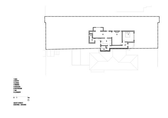
Scott stage 1 existing floor plan
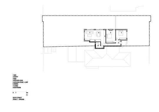
Scott stage 1 ground floor plan
Ensuring the addition was simple and cost-effective meant this young family could achieve all they wanted from their renovation and extension, even including some luxuries they'd always wanted. The simple box in the back complements the original home and living spaces flow effortlessly from old to new: a simple solution bringing enormous benefits for this young family.
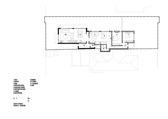
Scott stage 2 ground floor plan
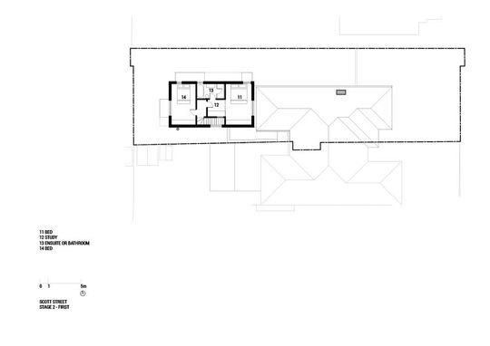
Scott stage 2 first floor plan