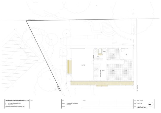
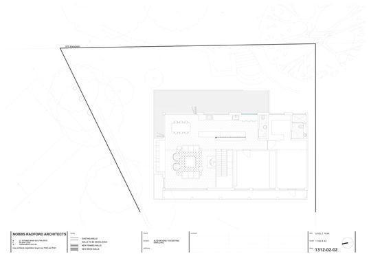
Like their owners, every home is unique. If you've lived in a home for a long time, or if you've just bought it, perhaps your home feels a little out of step with the way you'd like to live. You may not need more space, but the spaces you do have need to work for you better - to support your lifestyle. That was the case at Riverview House on Sydney's Lower North Shore. The tired house hadn't been updated for an age, but more importantly it needed a redesign to ensure it fit this family's lifestyle.
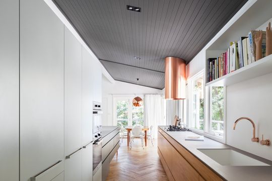
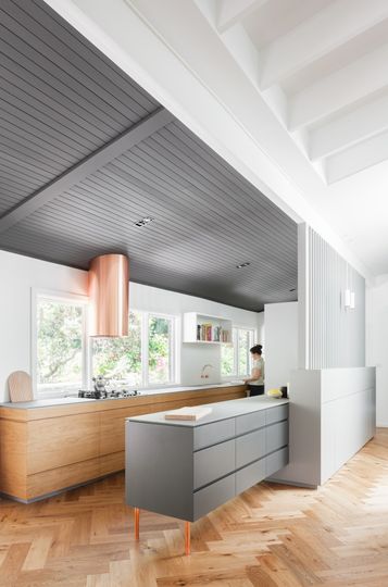
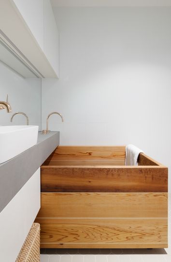
The clients are a family of four with two school-aged children. High on the family's list to architects Nobbs Radford was a generous kitchen. This foodie family wanted their kitchen to function almost like a commercial space, with zones or 'stations' that could run simultaneously - for in-house Masterchef-style cook-offs, perhaps! Other than that, the owners wanted a study without sacrificing one of the existing four bedrooms.
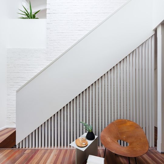
"One of the biggest challenges was the ground-floor entry. With quite a steep, rocky site the space opened onto the bedroom level, and had no clear connection or ‘journey’ to the living spaces on the first floor. What was there previously was quite a dark and uninviting stairway. So while one of the challenges was to lighten the house, the main challenge was to achieve a sense of connection between the point of arrival and the main public living spaces; to invite people up, and have a natural connection and flow from the front door at ground level to the living spaces above." - Nobbs Radford Architects
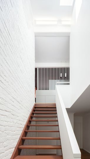
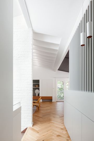
To achieve a lighter, more connected entry, the architects increased the size of the void over the entry and stair. The entry is now a light filled and generous double-height space which connects visually to the living area. Psychologically this was a clever move, because it gives visitors an immediate sense of where they need to go, making people feel more comfortable in the home. This relatively simple idea transformed the entry without changing its location or messing with too much structure.
“We opened up that journey to make it as generous as we could and so it became very clear that that’s where you moved to. It was a bit confusing in the original home, because it wasn’t really clear whether you continued down the hall to the bedrooms or climbed the stairs. Our solutions made that entrance more expansive and created those vertical visual connections.” - Alison Nobbs
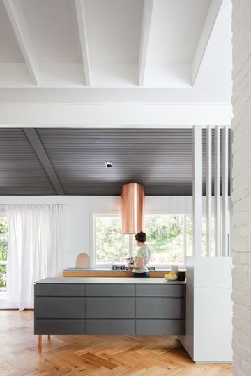
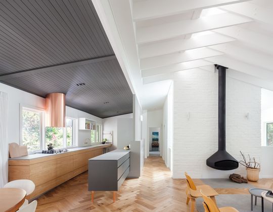
The updated living space with that hero kitchen is the star of this home (to use some Masterchef lingo). The now light-filled space takes advantage of the home's steep site and feels like it's floating in the tree canopy. A palette of timber, painted brick and exposed rafters are honest and textural, keeping the essence of the original home intact. Pops of shiny copper make an unexpected statement, feeling both modern and in keeping with the era of the original home.
