The days of walking down to the local milkbar for the newspaper and a bottle of milk may have been replaced with browsing social media while waiting for your soy milk chai, but the history of the local milk bar has not been forgotten at this home in Port Melbourne designed by Finnis Architects and interior design by Catherine Francis.
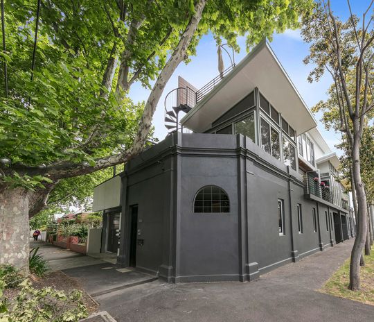
"Originally designed and used as a milk bar, the background of this residence adds to the charm as the site has undergone multiple renovations over its history", explains Finnis Architects. The original skeleton and framework were inherited by the architects in 1999, but they were recently called on to update the home for the family's current and future needs.
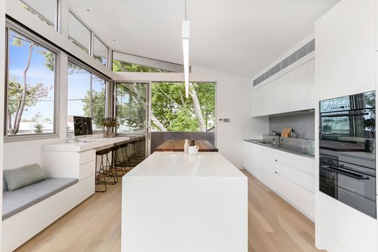
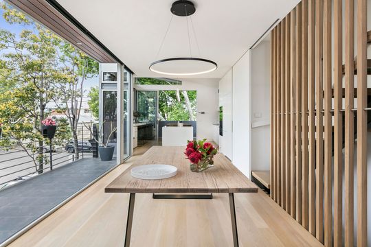
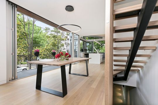
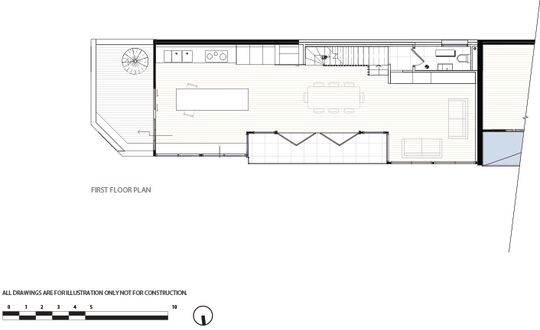
With the first storey's elevation, high among the trees, the architect's strategy was to open the living and kitchen areas to the views. By framing the lush greenery of the trees, the home takes on a calm tranquillity - it feels like a treehouse for adults. This tranquillity is enhanced by a light, neutral palette which helps to highlight the surroundings. Lightly textured tiling and timber detailing represent the movement of the trees throughout the space.
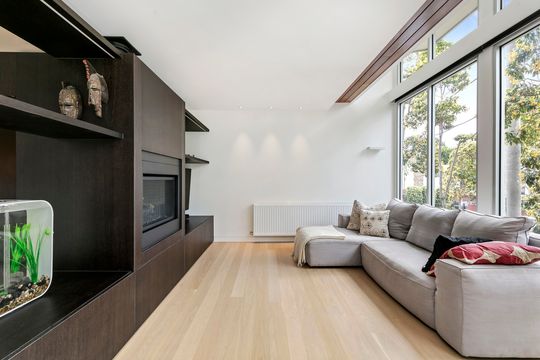
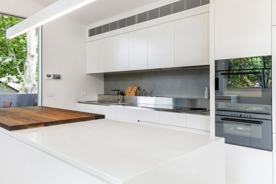
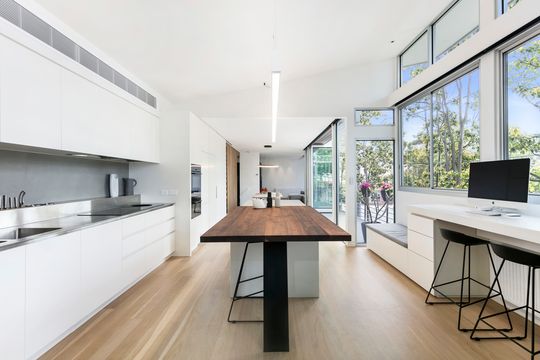
Much of the original qualities of the home were retained and celebrated. This ensured what was working was retained and the new works served only to improve what was there - the old, 'if it ain't broke, why fix it' approach. "For example," notes the architect, "the original spotted gum which lines the soffit was retained and exposed. A detail which is visible from the balcony and flows through into the living room."
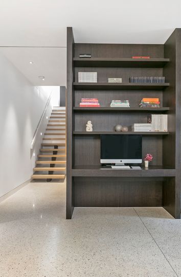
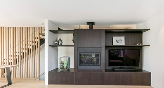
Custom joinery and furniture were an important aspect of the design, ensuring high levels of function to this important family space. You can never have enough storage, am I right?
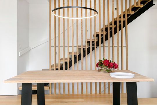
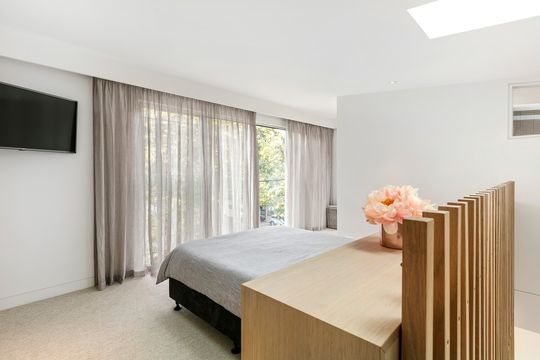
The original spiral stair was retained, which links the first storey deck to a rooftop terrace - a physical and sentimental link. On the second storey, the architects created a master bedroom, robe and ensuite bathroom. This helps to separate the family over three levels, children on the ground, adults on the second storey and living areas shared between the two on the first floor.
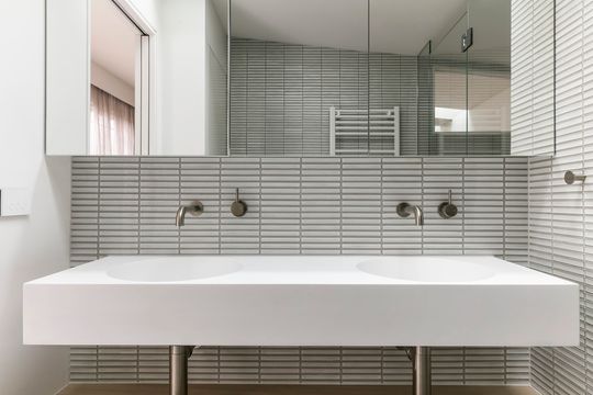
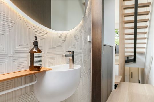
"By embracing the site's history and context, the design effortlessly integrates itself within its surrounds. Every spare centimetre has been designed meticulously to provide functional modern spaces for a young and growing family." - Finnis Architects
Tell us what you love about Port Melbourne House...
