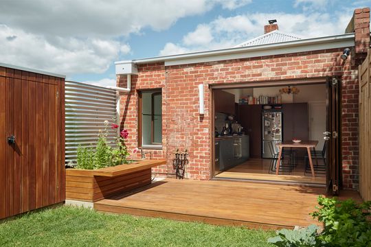
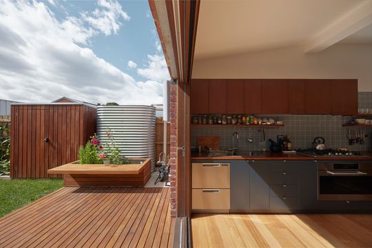
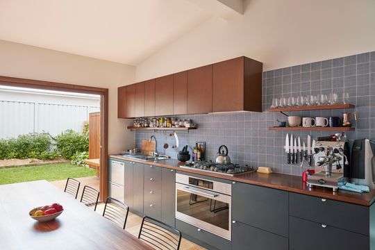
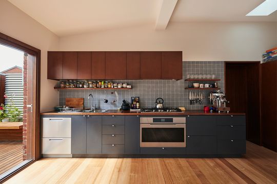
Oftentimes, the tiniest of renovations can have the biggest impact. Weighing (measuring?) in at 35 square metres of renovated space and mere metres of additional floor area, Coronet by Tan Architecture is undeniably small. The owner of Coronet, a keen cook, wanted an entertainer's kitchen and dining area big enough to cater to a large gathering and opening onto the backyard. The owner assumed this would involve the demolition of the rear of the home, but the architect quickly realised that wouldn't be possible given the budget. No worries, the solution is to think slim - even with the budget!
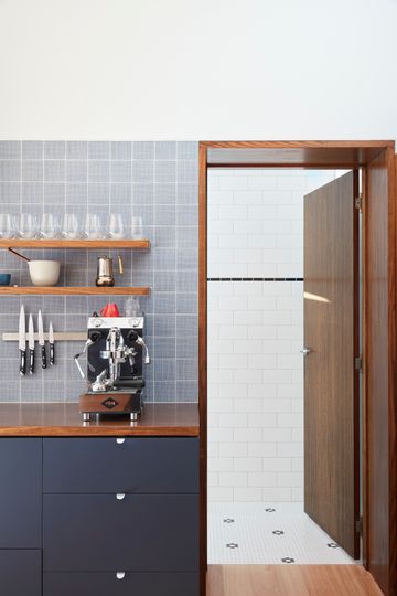
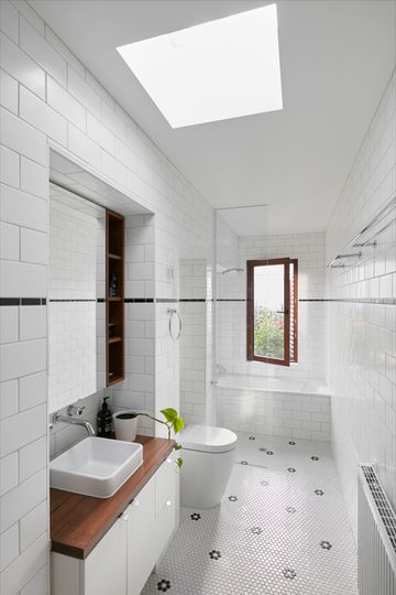
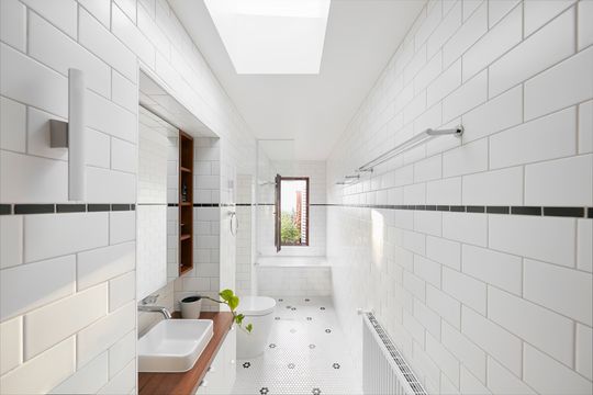
That clever solution was to pop a thin extension out the side of the existing home, between the existing wall and the boundary. "We only had just over 1.4m between the external brick wall and boundary to fit in a new bathroom", says architect Jos Tan. "After taking wall thickness and finishes into account, we were left with less than 1.2m. That is a skinny bathroom." In this narrow new bathroom, fittings and fixtures were located in former door openings, creating a little more space in the bathroom and retaining a hint of the house's former self.
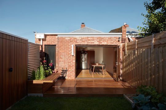
This home's conjoined twin lives just across the fence. Built side-by-side sometime around 1930, Coronet was saved from extensive demolition thanks to the narrow addition. "This saved money in new structure and roofing while still allowing the entire back section to be reconfigured", explains Jos. "We also liked how the home's physical connection [to] its twin next door was maintained."
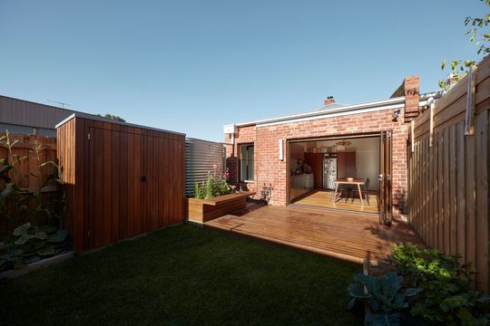
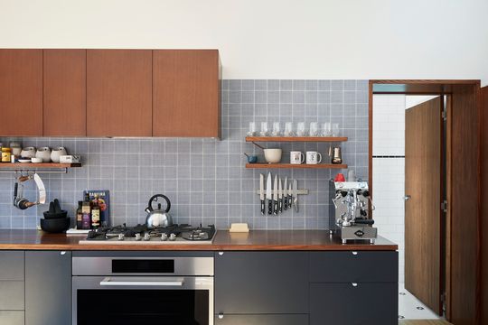
At first glance, it might be difficult to spot where the original house ends and the addition begins. And that's intentional. You see, there was some demolition internally, cleaning out the hodge-podge of bathroom and external laundry at the rear to make way for a spacious new kitchen and dining area, which opens seamlessly onto the backyard. The architect ensured bricks from this demolition were whisked up for reuse in the addition, meaning new and old sit harmoniously beside each other, like both have always been there. An articulation joint and a dropped facia board the only hints of any change.

"One of our tenets is that bigger is not necessarily better. Witnessing the huge difference in function and amenity achieved through this compact renovation has been very rewarding, as was sharing our client’s joy in the reinvigorated space." - Jos Tan Architects

Existing Floor Plan

New Floor Plan