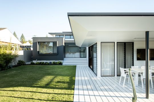
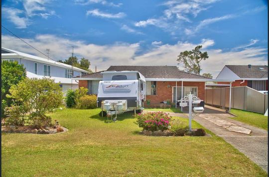
Not that you'd know it now, but this sleek, modern-Japanese-inspired home was once a tired '70s brick pad and what a transformation! Thanks to an extensive renovation, it is now a stunning family home with an outstanding connection to the backyard...
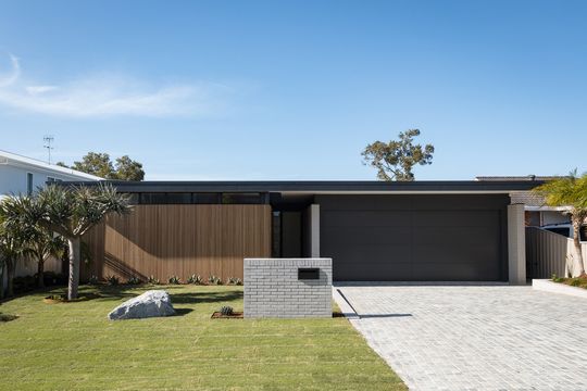
The 1970s red brick that's a classic in the Australian suburbs has been completely transformed by this comprehensive alteration and addition. The house had come to the end of its life, but Fabric Architecture Studio was able to create a completely new chapter for the home.
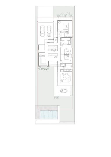
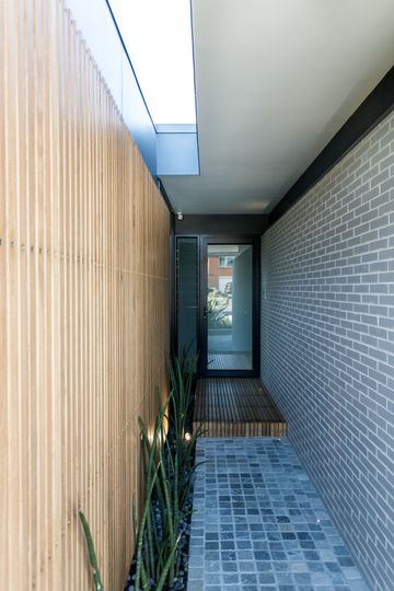
By adding spaces all around the existing home, the new renovation has completely transformed the look and feel of the original. Now, a new garage and main bedroom suite at the front create a low-scale street frontage that feels minimal and modern, inspired by the new Japanese aesthetic. Timber and grey brick to the front of the home are textural and naturally beautiful materials to help achieve this look.
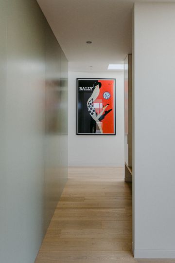
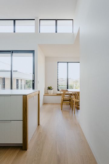
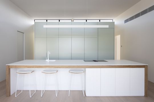
Inside, the kitchen is contained in a central pod with circulation on all sides, making it quite literally the centre of the home. Giving the home its name, "a double-height, light-filled space has been incorporated via a large 'pop up' into the existing core of the home where the stand-alone kitchen pod and dining area is situated."
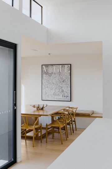
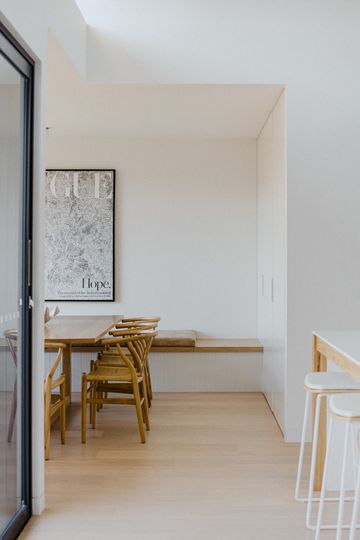
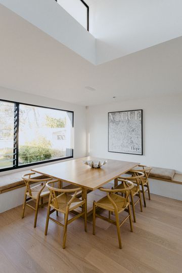
A dining area overlooking the backyard makes the most of the space with built-in banquet seating on two sides. Stepping down into the new lounge brings you closer to the backyard and creates a more private retreat to relax in.
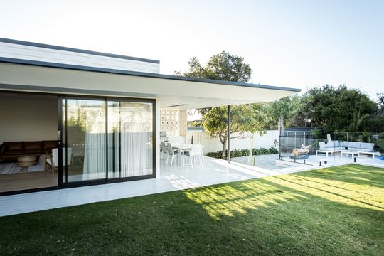
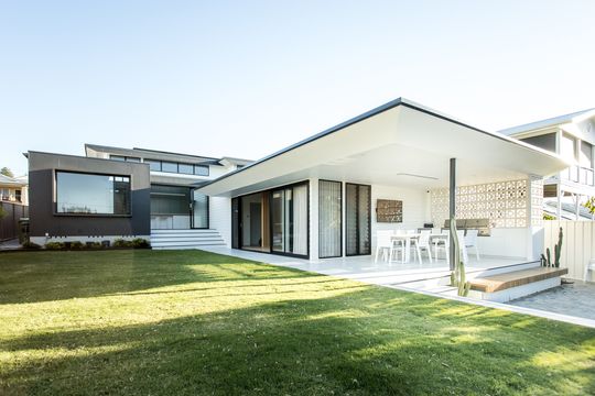
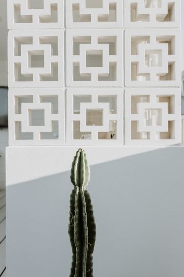
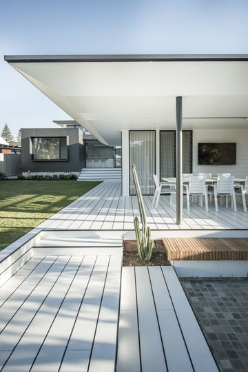
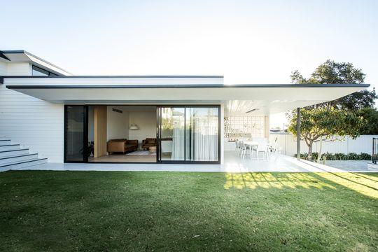
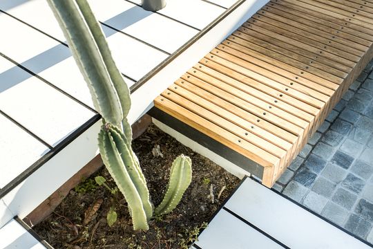
"The rear of the home consists of a low-scale pavilion that is incorporated into the rear yard and pool, creating an open living/entertaining area where the young family seek to relax and give the children space to roam", explains the architect. A deck off the kitchen steps down into the backyard towards the outdoor living area and pool, creating an outstanding connection to a garden that was previously disconnected by the height difference. A breeze brick wall is a nod to the era of the original home and provides privacy to the outdoor area without blocking the breeze.
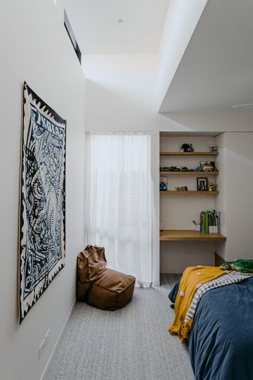
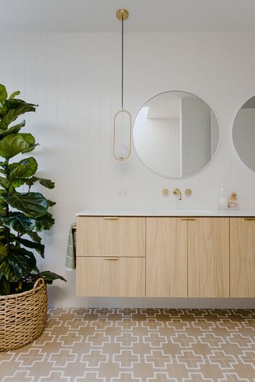
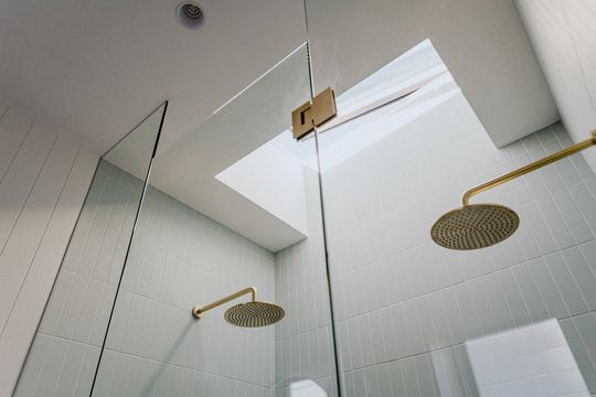
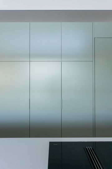
Inside, white walls are complemented by light timber throughout and texture is introduced with timber lining boards, timber floors and carpet. The kitchen pod is offset is a subtle green-grey which makes it pop out in the 'pop up' space.
What a transformation! While there's not much to see of the original anymore, this classic 1970s house has gone on to provide the bones for a new generation of Australian living.
