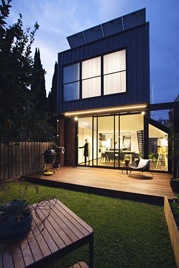
We're taught that deception is a bad thing. The domain of mysterious international spies. Or your cheating, good-for-nothing, dirtbag of an ex. But when it comes to our houses, deception can be a very, very good thing. I present to you Perched House, a project that uses deception for good, not evil. In this case, Wexhaus Architecture created an efficient layout and turned up the natural light to create a home that feels much larger than the reality.
"Our client wanted to renovate the existing rear extension which was structurally sound and add a bedroom - she had no idea we would reconfigure the entire house" jokes Wesley Spencer of Wexhaus Architecture.
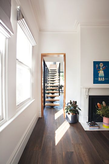
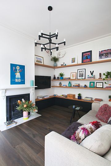
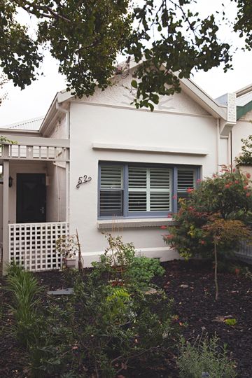
The renovation of a typical, narrow, inner-city, semi-detached Edwardian house tends to follow a pretty standard formula - out of necessity. Stacking rooms one after the other on the narrow block creates a deep plan that can feel dark and cramped in the centre. Wexhaus Architecture recognised this problem and focused on neatening the planning and eliminating dead space to fit everything in a compact footprint.
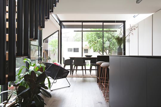
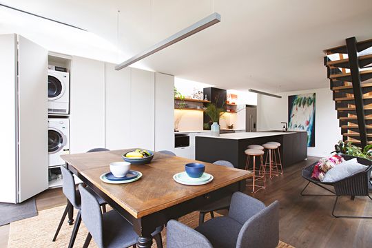
The architects utilised the exisiting extension as much as possible, but dealing with existing structures is always a challenge. "As we peeled back the layers, we gradually discovered more and more needed rebuilding. Thankfully, the client was very patient", Wesley explains.
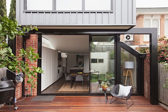
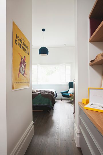
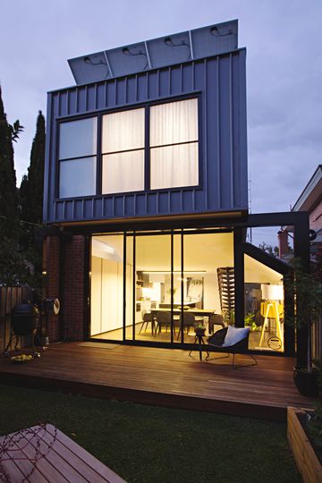
The architects solution was to 'perch' a COLORBOND® steel-clad upper storey bedroom and bathroom slightly higher than the other bedroom. This creates higher ceiling heights in the lower level and space for clerestory windows.
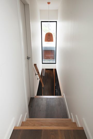
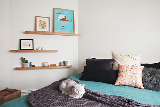
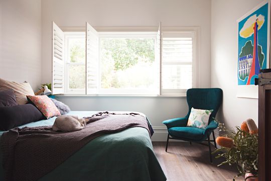
"We have a bedroom directly off the landing, then continue up a few more steps to reach the bathroom and rear perched bedroom. Sweeping the ceiling up with a curve just made sense after that."
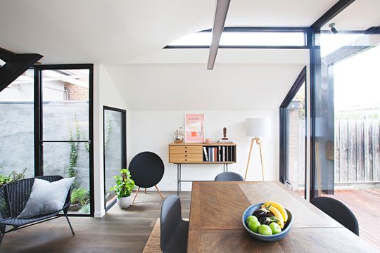
Back downstairs, the curved flourish and clerestory windows makes the lower level kitchen and living area feel dramatic - lofty, even - whilst letting in as much natural light as possible. The raised ceiling over the dining area also matches the high ceiling in the original home.
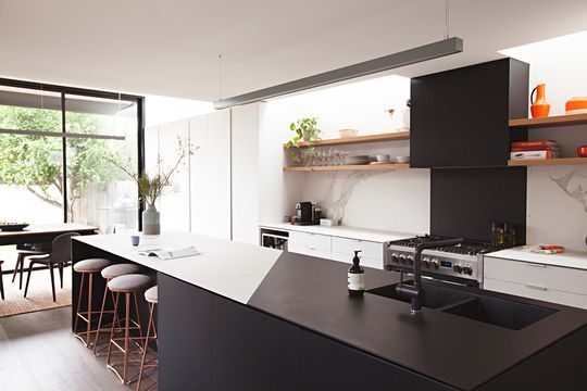
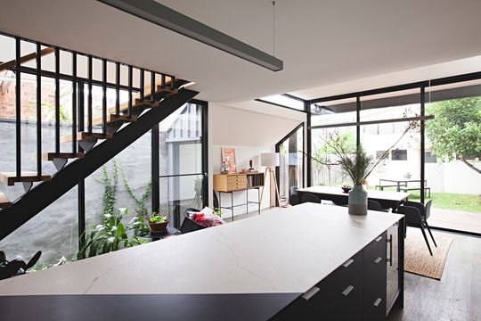
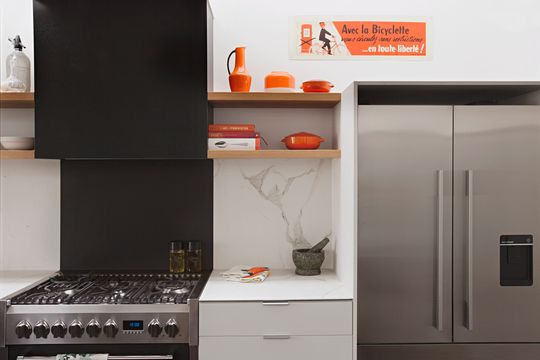
The kitchen is the focus of the new addition, creating a versatile entertaining and living space. "The kitchen was a very important component of the design as her partner is a chef - this had to take pride of place since entertaining and social gatherings around the island bench is a way of life for them", says Wesley.
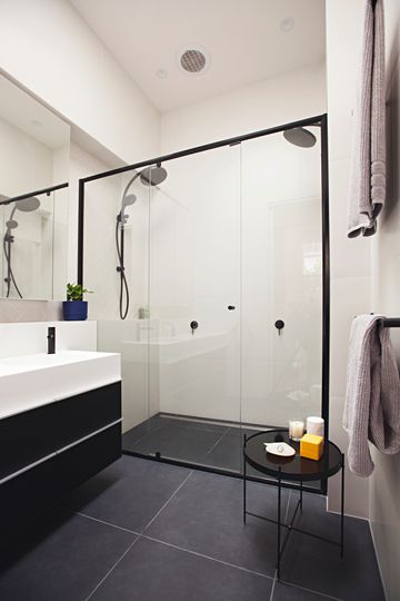
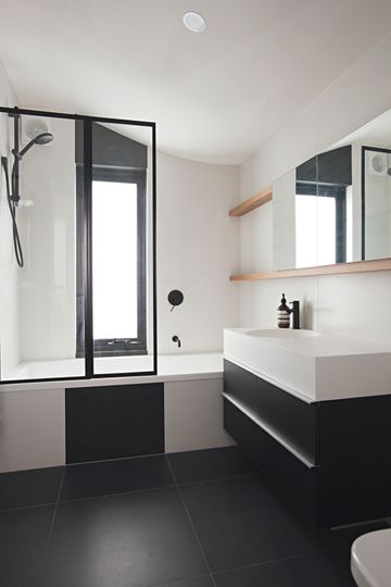
For a relatively compact space, Perched House works hard. "The space is in fact quite small, but no one would think so", says Wesley. See, deception isn't all bad...
