Constraints—budgetary, physical or otherwise—don't have to lead to lesser outcomes. Like a tiny, irritating grain of sand creating a lustrous pearl, sometimes a projects' constraints lead to the most charming solutions as is the case in this Paddington terrace renovation...
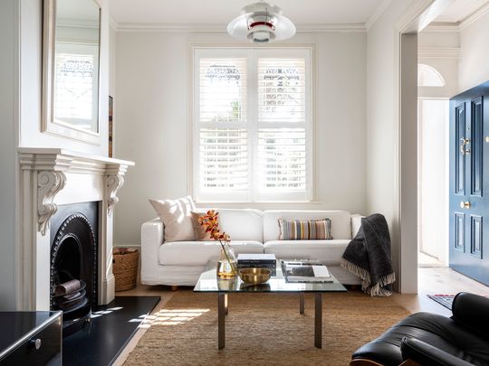
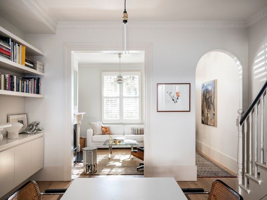
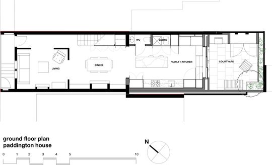
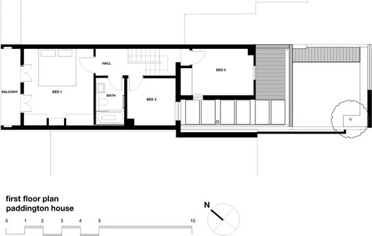
The 1890s terrace needed some TLC to update it for modern family living. The rear of the home was originally L-shaped with a light well to the south. This led to an awkward internal configuration, making the space feel needlessly cramped and left the home disconnected from the rear courtyard which was only accessible via steps at the side. The aim was to create a new kitchen, laundry and toilet at the rear of the home and create a better connection to the courtyard.
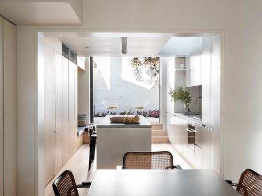
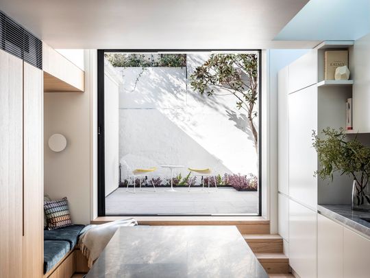
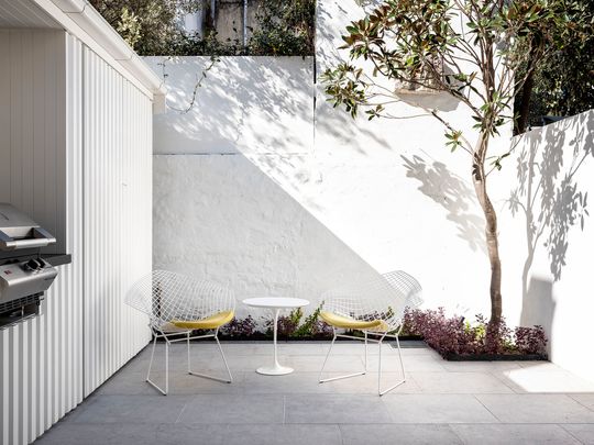
In this case, that irritating grain of sand was the rear courtyard which was elevated above the living area due to the gentle slope of the site. Originally owner and interior architect, Victoria D'Alisa, co-director of Porebski Architects had hoped to excavate the courtyard to create a seamless, level connection between inside and out. As it turned out, excavation works were prohibitively expensive due to the need to retain the adjoining house but, undeterred, Victoria turned this setback into a feature.
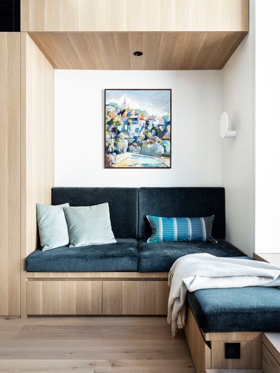
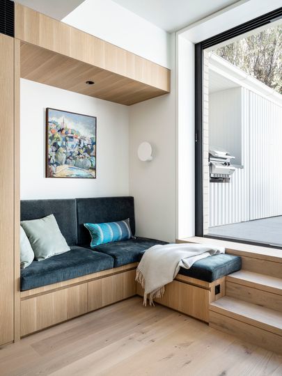
Keeping the raised courtyard meant they were able to retain an existing magnolia tree. With some clever internal planning, the steps up to the courtyard incorporate an upholstered reading nook which has become a favourite spot in the home. The rear wall conceals the sliding door, so when the door is open, inside and outside feel connected.
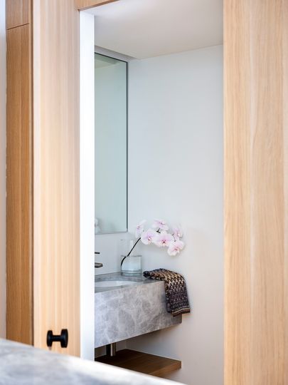
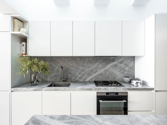
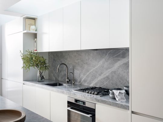
The toilet and laundry are concealed behind what looks like a wall of joinery, while the kitchen takes up the opposite wall with white cabinets and marble to keep things light and bright.
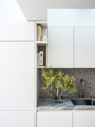
Skylights above the kitchen let soft, diffuse light into this rear part of the home, which helps to avoid that jarring single-source-of-light effect you can get with long, narrow homes.
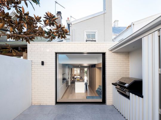
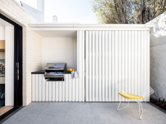
The rear wall is white brickwork, in keeping with the surrounding area, while the choice of colour keeps things light and modern. In the courtyard, a granite-topped barbeque area means cooking and living can spill outside. There's even a storage area concealed behind a timber screen which provides for all the family's practical needs without cluttering up the courtyard space.
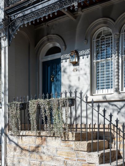
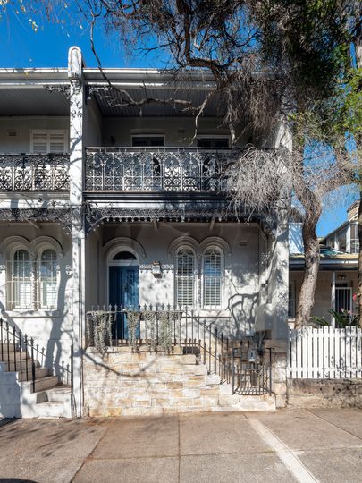
Out the front, the original sandstone steps have been resurrected from their previous tile and mortar crypt, bringing the authentic period charm back to the street.
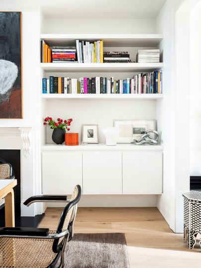
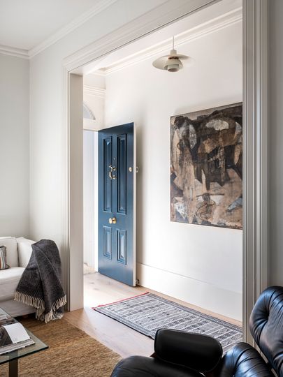
Cabinetry has also been carefully and considerately added to other parts of the home to provide plenty of storage.
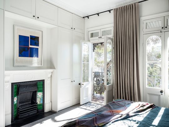
At this Paddington terrace renovation, the careful arrangement of spaces means the architect has managed to squeeze a lot of functionality into a tight, constrained space. And while it would have been lovely to have a level connection between inside and out, the budget-conscious compromise has turned into a blessing in disguise, creating a unique home with a functional (and favourite) reading nook as a bonus. Talk about turning an irritating constraint into a valuable pearl!
