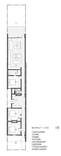
When you live in a suburb where the average property is almost three times larger than yours, it's easy to get a case of size envy. In reality though, how much space to you really need? This Elsternwick terrace, Murray, felt smaller than it needed to, in part because of a low-ceilinged '90s addition. Architects Foomann updated the home to grab natural light and views of the sky to help it feel larger. In the process they did away with any need for size envy...
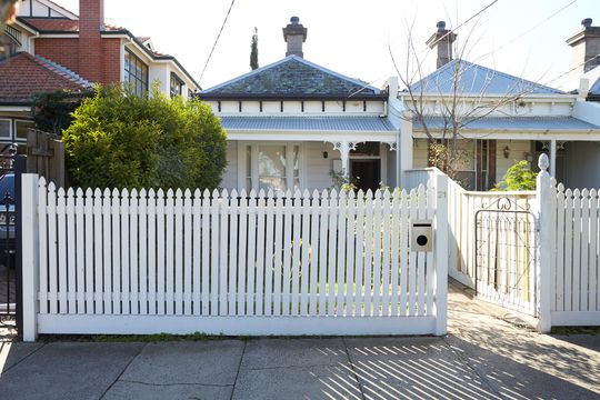
Updating this home was not easy. Apart from the narrow block, the home is in a street with restrictive planning overlays. Jo Foong from Foomann Architects explains, "this house required tightly planned solutions".
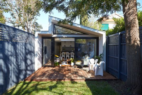
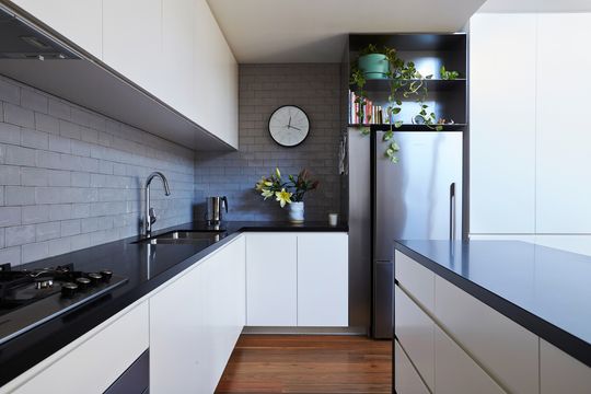
After doing away with the unflattering '90s extension (and, let's face it, most of the '90s was unflattering), the architects designed a new open-plan kitchen, dining and living area which opens onto a north-facing backyard with a large, established tree.
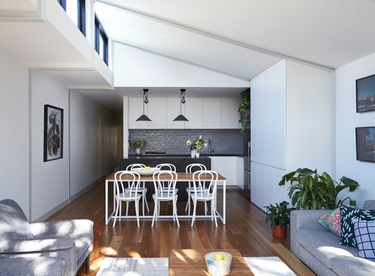
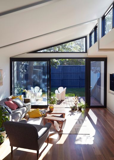
To make the space feel as large as possible, the ceiling is raked towards the east. This gives the home a larger sense of volume and also creates the opportunity for east-facing clerestory windows. Capturing views of the sky and surrounding treetops, the clerestory windows give the illusion of infinite space - and when you're hemmed in on every boundary, that illusion is key.
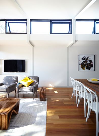
Not just for light, the clerestory windows serve a double purpose in summer. By opening these windows in the roof's apex, the owners can flush warm air out of the home and draw fresh, cooler air through the house.
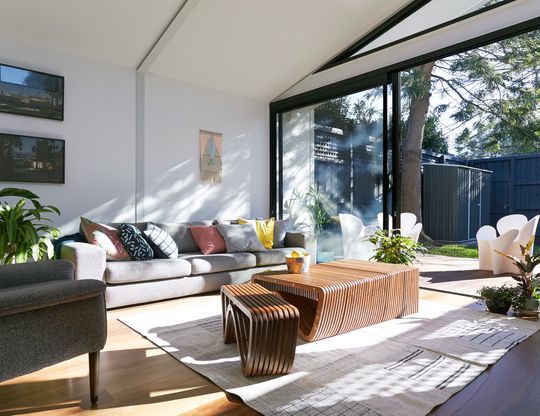
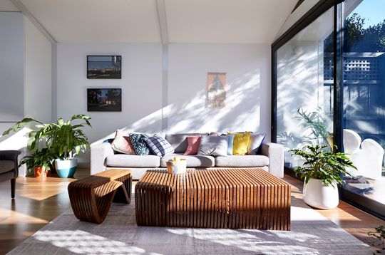
Fooman use their signature exposed steel to create a portal frame for the extension. The framework establishes a rhythm in the living space. The architects have also cleverly concealed lighting in the framework which bathes the ceiling in warm white light at night. This lighting approach gives a much more natural, reflected light to the home - a much better solution than the overuse of harsh, directional down lights we're used to seeing.
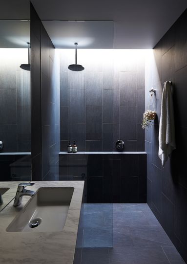
The ensuite bathroom at the centre of the home plays on its lack of external walls with rich, dark tiles. A skylight punctuates the darkness, creating a dramatic - almost spiritual - showering experience. Nothing like some soaking in some god light in the morning!
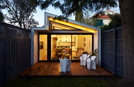
In spite of its size, Murray feels remarkably spacious. Jo says it best herself, "the result is a house with warmth and the amenity and feel of a much larger building." Don't be tricked into thinking you need a large house. It's likely you'll be just as comfortable in a more compact home that feels light and spacious. Invest in design, not square metres. Your bank balance will thank you.
