Narrow Extension
It's a classic inner-city story: Aging terrace bursting at the seams as its family reaches the teenage years. In most cases the family are making do with a cramped and dark home, but they're committed to the home because they've established strong roots in their thriving community.
That was certainly the case for this family of four who've lived in one of Fitzroy's quintessential terraces for eight years. The old part of the home was dark and musty. A dilapidated lean-to, tacked on out the back housed the kitchen, bathroom, dining and laundry but would become insufferably hot during the summer.
What this family needed was a well designed renovation that would bring together their two-speed house into one comfortable, cohesive whole -- and provide some space and privacy for their growing children. Oh, and all within just 4.5 meters width!
Andrew Maynard Architects' solution takes the best qualities from the existing home and reworks them to create a stunning, functional and spacious home. As Andrew himself says:
"How do you create a home in 4.5m? It’s tricky, but a lot of fun."
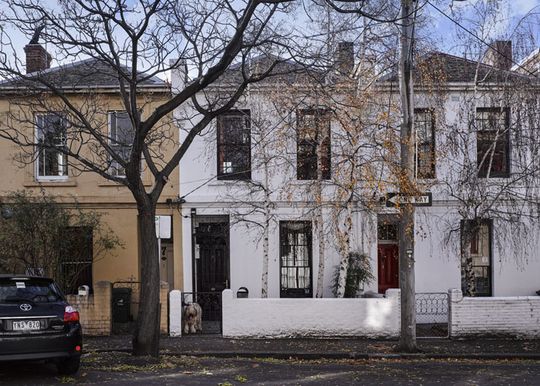
"Within this pocket of Fitzroy is a dense mix of workers’ cottages and small terraces. All are modest in size, many are dark and cold. Many of the cottages and terraces are in original condition, with a simple facade hiding an assemblage of brick and weatherboard lean-tos in the rear yard looking onto bluestone laneways. These lean-tos create a mesh of detailed and varying volumes, in stark contrast to the simplicity of the street front. When building in the rear of a property in this context, facing onto the laneway, one is acutely aware of the smallness and texture of the existing built form. Within this context the burden is on the designer is to respond to the assemblage of small volumes while also maximising the potentials of the owners’ brief."
Reflecting the Character of the Area
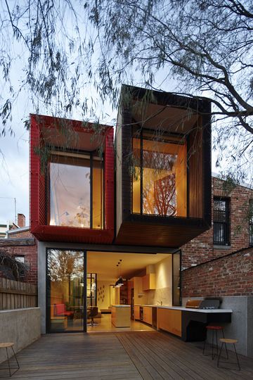
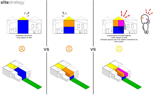
"As Fitzroy has gentrified we have seen renewal take place in unsympathetic ways. There are numerous examples of this assemblage of dark brick and weatherboard being replaced with large contemporary objects that dominate its context. The tactic at Moor Street was to maximise the interior functions and available space, while also responding to the context by creating a single building out of three small objects rather than a single contemporary monolith."
The Architects quickly realized that a standard two-story extension would do this site and the unique character of eclectic Fitzroy a disservice. Instead, they carefully crafted the facade so it appeared as three smaller objects, rather than one imposing surface.
Connecting Old and New
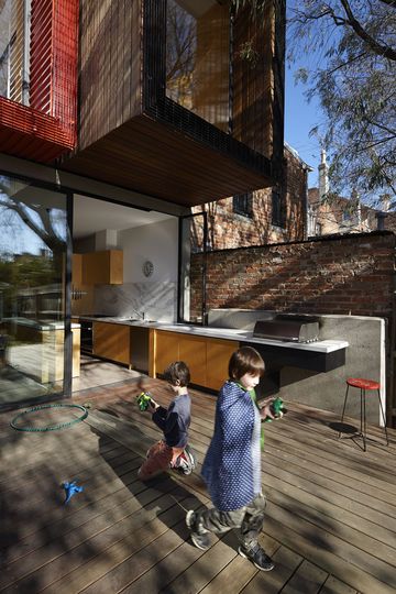
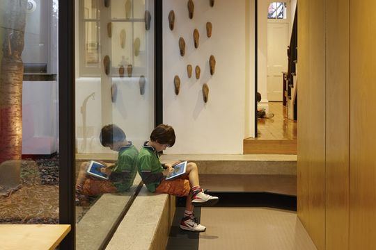
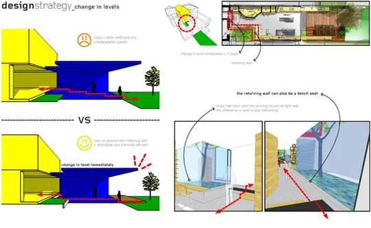
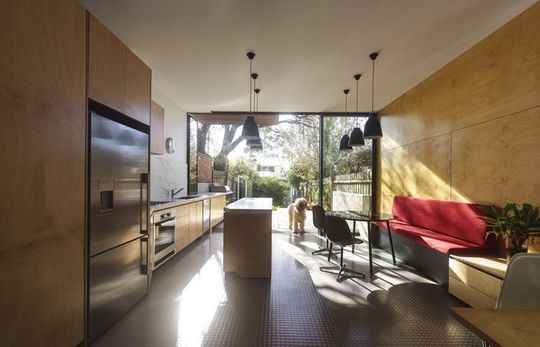
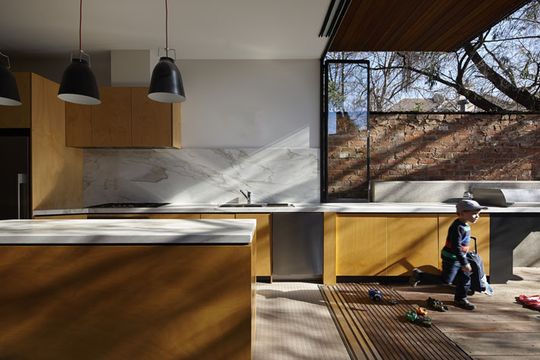
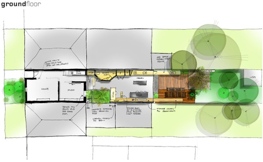
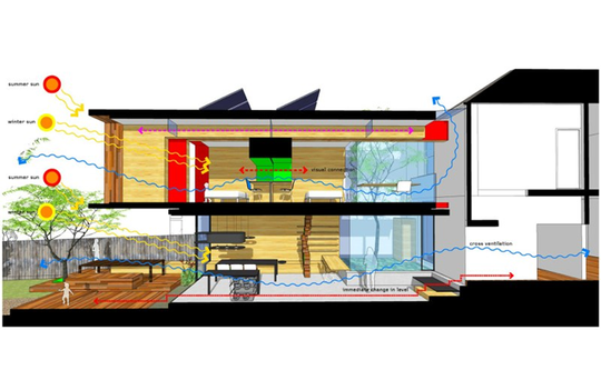
Inside, the threshold between old and new is marked by a drop in level. The addition is built on a concrete slab at ground level -- better for moderating the house's temperature with the help of the sun. Changing levels inside the house, rather than between indoors and outdoors, creates a better connection with the garden.
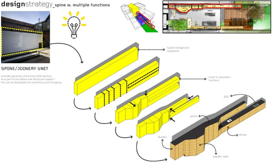
As a side note, how great are Andrew Maynard's diagrams? I think they do a great job at explaining where the architect's design decisions come from. Any architect will tell you that a lot of thought goes into their designs, but these diagrams prove it!
Light Well
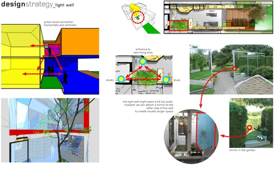
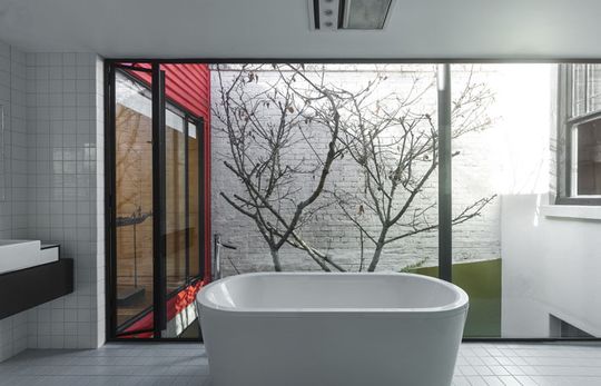
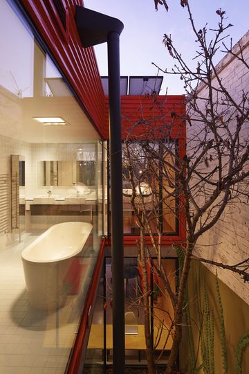
"In the centre of the original house was a small light well containing a beautiful, yet constrained, Japanese maple tree. The family often found themselves conversing through this lightwell. Conversations took place, through the maple, from upstairs bedroom to kitchen opposite, to study space and even the bathroom. The maple was retained and the lightwell expanded and surrounded in glass, bringing the tree into the living spaces. The conversations between spaces and levels, through the maple, are better and easier than ever."
The architect worked with the family to discover what worked about their existing house. They then capitalized on simple ideas that worked well, including retaining the lightwell. The idea of the lightwell was even expanded so it had a bigger impact on the new design. This is certainly a benefit of renovating an existing home you've lived in for a long time, rather than starting from scratch -- you know what works and what doesn't!
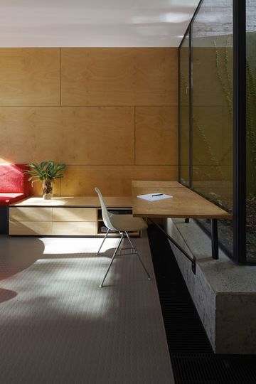
The lightwell now contains a concrete plinth around its edge -- a perfect for the kids to sit and read a book, or for extra guests to sit when there's a large gathering. A study desk fixed to one edge of the lightwell receives great light and is a new favorite place to work.
Service Spine
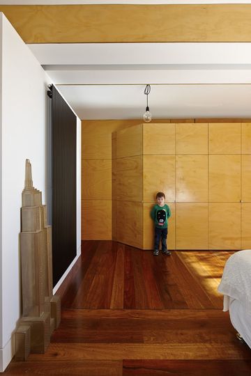
One of the strategies for dealing with such a tight site was to run a 'services' spine down either side of the living space. A large joinery unit runs through the living area and kitchen. It is divided up to contain all the necessary services and it even bulges to accommodate a powder room. By containing services such as the kitchen and powder room (and plenty of storage) in this continuous spine, the remaining space is freed.
Spine Continued
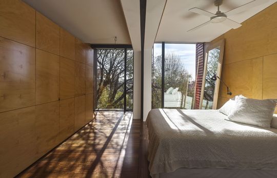
Upstairs in the master bedroom the idea of the spine is continued to create space for a wardrobe. The bedroom is physically divided in two to reflect the broken up facade outside.
Reworking the Best of the Old
Moor House takes the best aspects of the existing residence -- a space the family were intimately familiar with -- and reworks them into a modern and comfortable home. The extension feels at home in the eclectic Fitzroy neighborhood and will be a place the family can enjoy for years to come.
Despite its narrow allotment, the house feels spacious and generously proportioned. This is thanks to clever design decisions and spacial planning. Excellent connection to the garden allows the living area to break out into this space, making it feel much larger than its footprint would suggest.
This is an example of urban infill done well. It rethinks the traditional lean-to and designs it in such a way that the whole house feels connected and harmonious. And the family no-longer experience one half on the house that's cold and damp and another that's hot! The whole house is thermally and spatially comfortable. This one's a keeper!