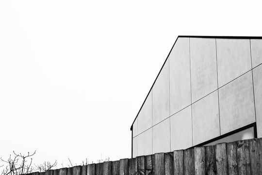
When you're designing a home for the long term and you need to fit a lot onto a small block, forget market expectations and look for light and functionality to suit your family. Ultimately this strategy will better serve your family. Wexhaus Architecture helped their client, Bianca, design a home that is filled with light, maximises the small site and respects its predecessor, a proud Edwardian. And with plenty of storage? The home is practical too...
"Our client hired us knowing the value an architect can add to the quality of their space. Bianca pushed us really hard to getting an exceptional work of architecture and not something easy they could ‘pull off’ as owner builders." - Wexhaus Architecture
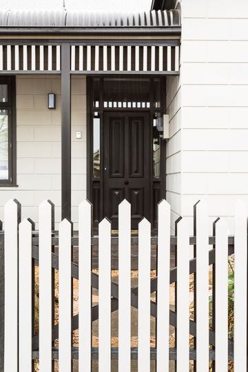
With a tight 300 square metre site in Melbourne's Clifton Hill, Wexhaus Architecture had to work hard to design a functional and three bedroom home. They began the process by stripping the original Edwardian back to its basic original and painting it in a subtle grey. This gave them a neutral starting point.
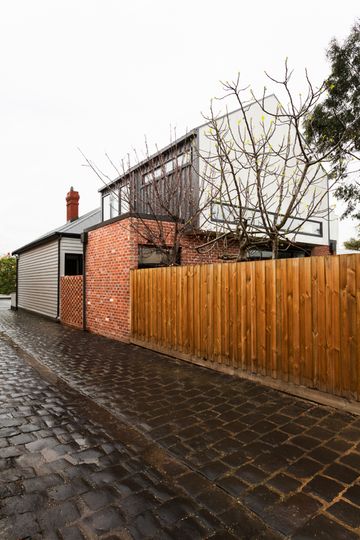
The idea for Monolith House came out of a close analysis of the original home and a respect for its form and austerity. The extension mimics the form of the old Edwardian, standing tall and proud. The addition even mimics the roof pitch of the original to help it feel more at home. It's in the material choices that the addition differentiates itself.
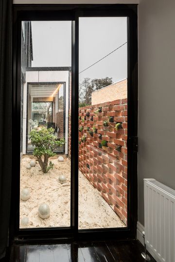
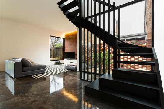
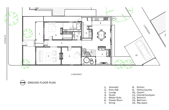
An internal courtyard marks the separation between old and new. Bordered by a perforated brick wall, the zen courtyard lets in dappled light and views from the adjoining laneway. It also lets light and air into the home. Operable windows maximise cross flow ventilation to keep the home light and breezy.
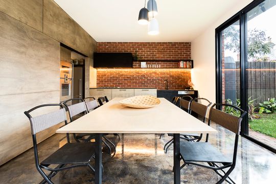
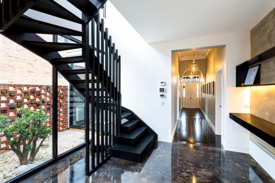
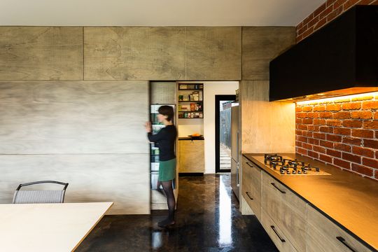
At Monolith House old and new are designed to contrast. The weatherboard of the old contrasts with the red brick on the new. Floorboards of the original contrast contrast with the black polished concrete of the new.
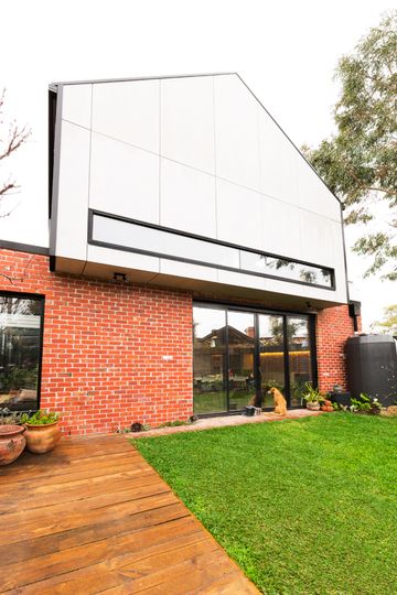
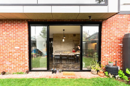
The upper floor is designed to overhang the ground floor, shading the ground floor from the summer sun, while still letting the winter sun in. The concrete floor helps to capture this winter heat and radiating it back into the space at night, to moderate the temperature.
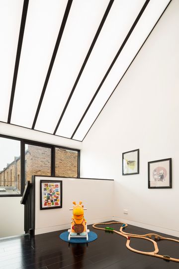
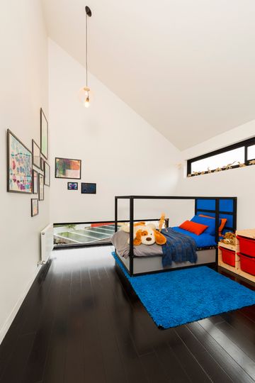
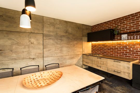
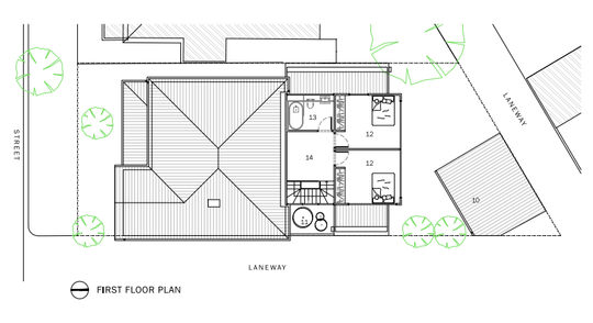
New open plan kitchen and living on the ground floor retain a great connection to the garden. Upstairs the kids bedrooms and a play space create another realm for the children. A translucent roof over the playroom glows with natural light making for a spectacular sense of space. Wexhaus Architecture also overcame the problem of overlooking by designing low windows below eye line (which also happen to be a lot of fun for the kids)!
With enough space shared space for the whole family and plenty of integrated storage, the home feels spacious and organised, "no one would guess there were two toddlers living in the space."
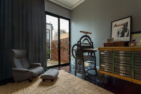
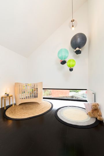
This light-filled and practicality-driven home is perfect for this family. It's proof that designing for light, functionality and the needs of the family can also end up pleasing 'the market' - even if that's not what you set out to do. A home that is light-filled and works will always keep the punters happy, remember that.
