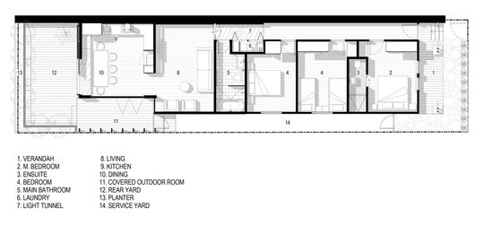
You're probably familiar with (and hate) the dark, gun-barrel corridors in your average inner-city terrace. For FIGR Architecture & Design, the renovation of this Cremorne terrace allowed them to play with and play up the transition from old to new, dark to light...
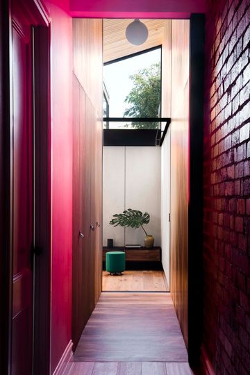
"Light Corridor House is an extension which celebrates the journey through the old to the new", explains the architect.
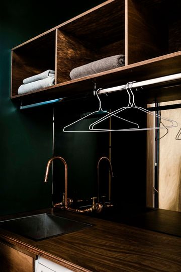
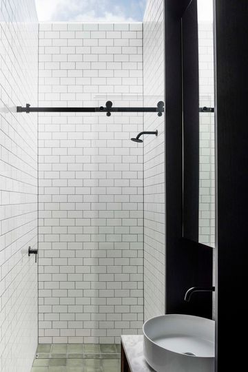
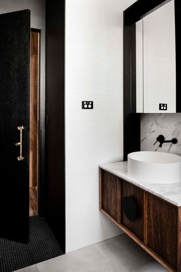
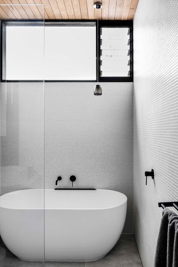
From the front, you get no indication of what's going on behind. The heritage facade has been restored, as have the front three rooms, ensuring they celebrate their original period features. Then, as you make your way down the corridor, you reach a cheeky double-height timber tunnel, marking the transition from old to new. The tunnel, clad in rich spotted gum, elegantly conceals the bathroom and laundry.
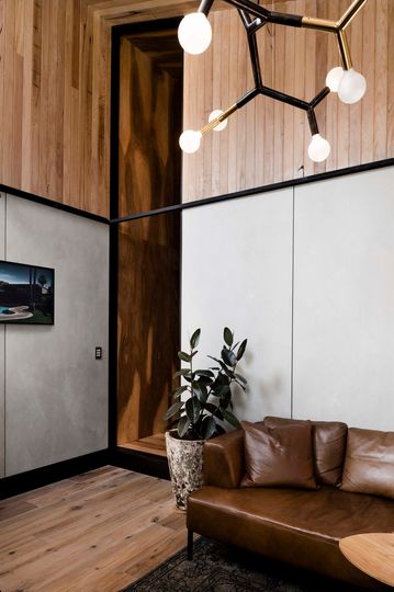
The transition from the tunnel into the new extension is marked by a transformation of the space and light. From dark and narrow into bright and open, the contrast makes the living spaces seem even bigger than they actually are.
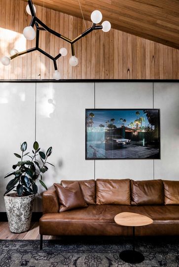
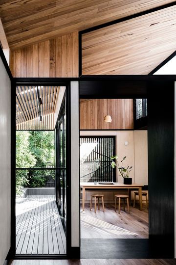
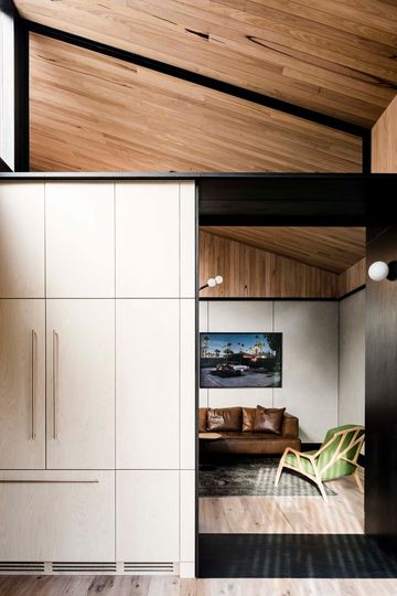
A large highlight window washes the timber ceiling in warm light and invigorates the living room. Eschewing an entirely open plan, the intimate living area then bleeds into the kitchen, creating two distinct, yet connected rooms.
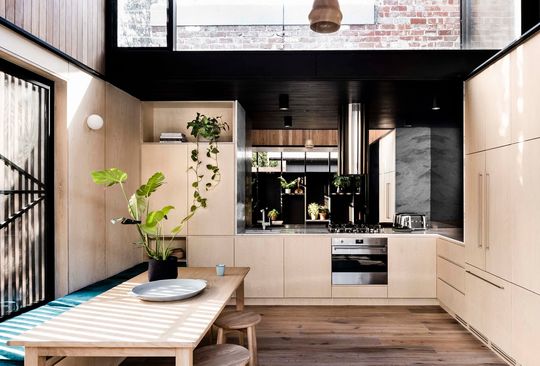
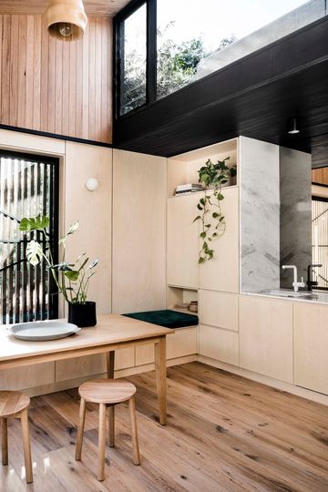
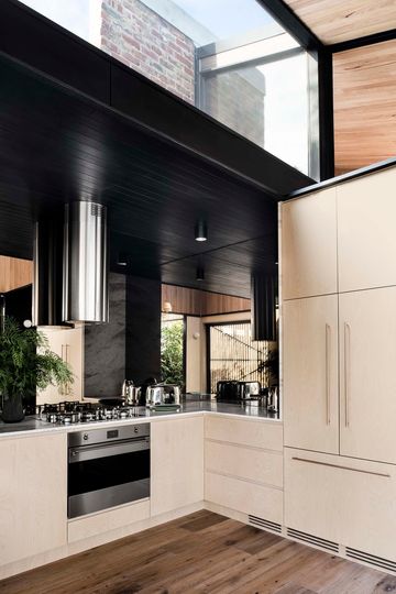
Mirrored surfaces in the kitchen reflect the surrounding light and greenery to visually expand the space. A low, dark ceiling over this area exaggerates the bright clerestory window above; this is a house of contrasts.
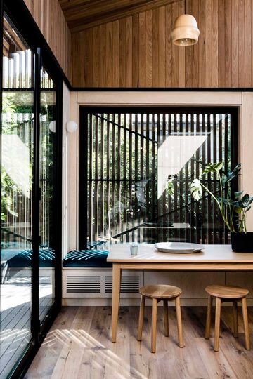
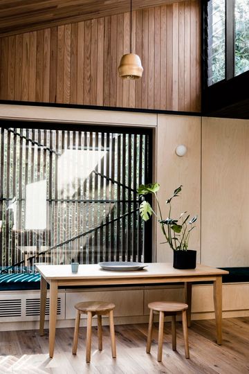
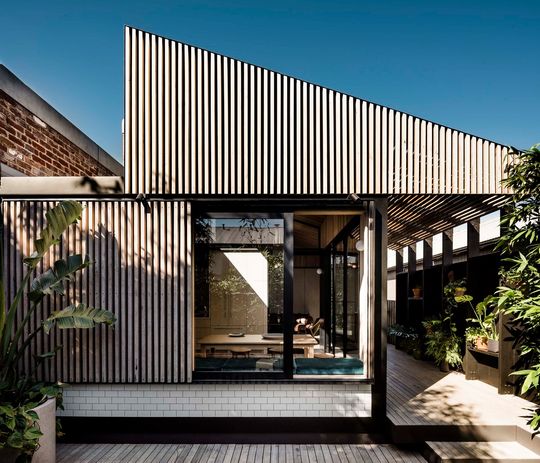
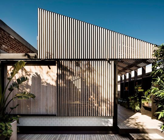
The dining area occupies the corner of the kitchen, where a window seat doubles as a dining booth. A timber screen can slide across to offer protection from the sun.
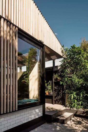
From the kitchen, you flow directly onto the back verandah, where plants and greenery create a lush oasis in the middle of the city. Battens which follow the line of the ceiling give this space the feeling of an outdoor room.
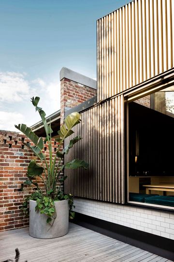
By playing with space and light and creating an experiential journey through the house FIGR Architecture & Design have managed to exaggerate the sense of space and light in this new addition. A relatively measured addition feels extravagant thanks to this contrast. The rich materiality of the new home matches the flamboyance seen in old Victorian homes, but with modern sentiment. This is a beautiful, thoughtful project which shows the power of considered design.
