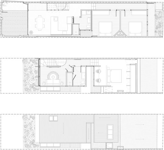
You might not think you can do much with a four metre-wide site, but Supercontext could see the potential of this narrow site and the existing workers' cottage...
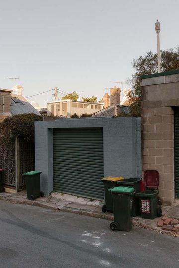
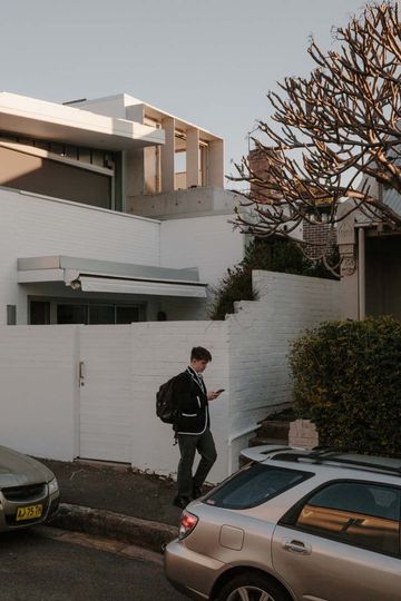
A family with two young children owned a small, single-storey workers cottage in Sydney's Glebe. On a narrow, four metre-wide site, and the desire to preserve the existing courtyard space, the only way was up! To pull this narrow addition off would require "careful, detailed planning of a tight space to maximise access to natural light and outlook while adding new bedrooms and bathrooms in a heritage conservation area of Sydney" explains the architect.
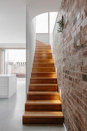
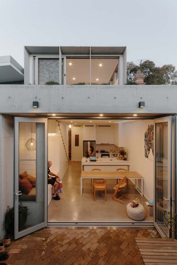
To defy the dimensions of the narrow site, Supercontext focuses the eye outwards with large, yet practical doors and windows. In fact, virtually the entire rear facade is glass, to maximise the outlook. Bifold doors open up the courtyard while a bank of louvre windows allow for ventilation even when the doors are closed for safety, overnight or while the owners are out, for example.
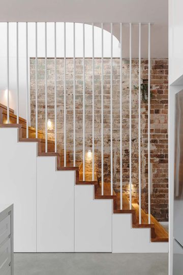
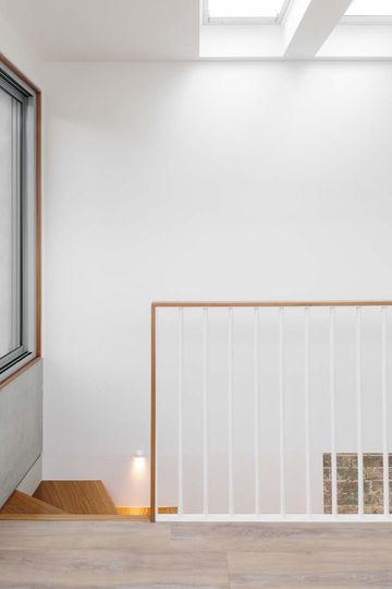
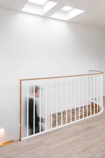
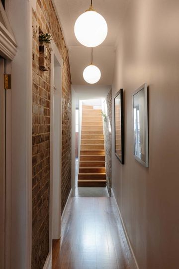
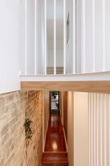
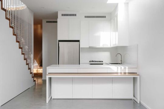
"Internally," explains the architect, "a simple palette of concrete, timber, exposed brick and white sought to create a warm but bright interior"
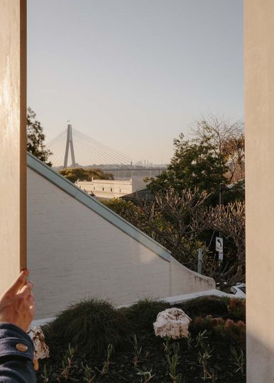
A rooftop garden on the upper level creates another lush outlook for the upstairs lounge, while the large sliding glass windows reveal a view of Anzac Bridge in the distance. As well as looking lush and beautiful the rooftop garden also serves environmental benefits, helping to reduce the heat island effect by lowering the surrounding temperature through transpiration and shading and insulating the living area below; mother nature to the rescue!
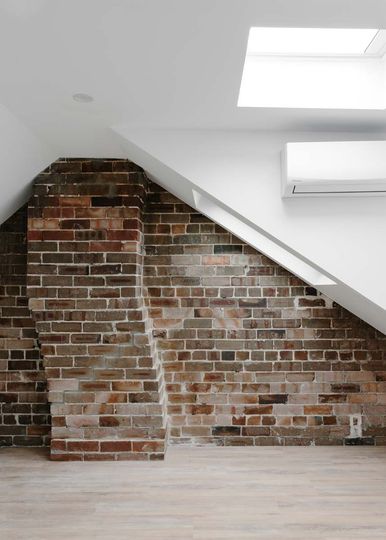
The main bedroom is cleverly tucked under the roofline of the heritage cottage, unnoticeable from the street, with skylights bringing the sun in and washing the beautiful original brick party wall in natural light. When you're hemmed in on both sides by party walls, may as well celebrate it, right? Similarly, the quicky twist of the original chimney is shown off, becoming a stunning feature of the new bedroom. To think this was once hidden in the roof space is borderline criminal!
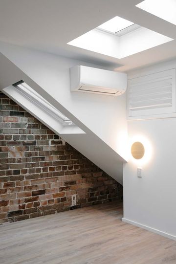
A study space is tucked behind the bed, with windows opening onto a lightwell. Clever shutters/louvres allow the study space to open to the bedroom to capture cooling breezes or shut off for privacy and noise reduction if someone's up late burning the midnight oil and possibly listening to Midnight Oil.
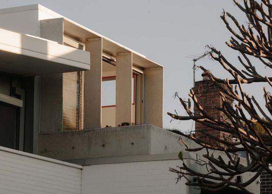
Another challenge of the site was the west-facing rear. The meant the new living spaces would cop the brunt of the hot afternoon sun. To help the home keep its cool, thin fins were designed to cover the upstairs windows. The fins, constructed out of fibre cement sheet and supported on a simple steel frame help to block the sun in the warmer months, keeping the living areas shaded and cool. External blinds can also be drawn to further protect the home from heat gain.
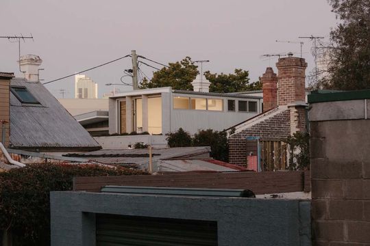
By opening the home up to the outdoors and maximising light and outlook, Supercontext distracts from the narrowness of the site to create a more spacious home. In addition, attention to the the details ensures to home is practical and functional. So often the problem with compact living is simply that it's impractical or uncomfortable. If you get the details right, it all just works and you don't even notice your home is compact!
