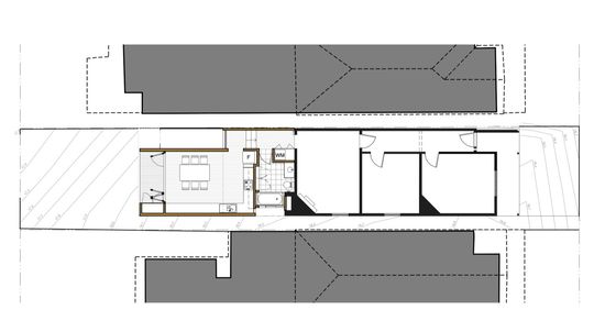
Typical of many early 20th Century worker's cottages in Melbourne's inner-suburbs this home suffered a series of poorly planned, gloomy and dysfunctional lean-to additions. The house had little access to natural light and no direct connection to the rear yard. The client's brief to 4site Architecture was to leave the two bedrooms at the front of the house intact, but to rework the series of poorly-planned additions to include a new bathroom, laundry, kitchen and dining area while making the home brighter and generally more liveable…
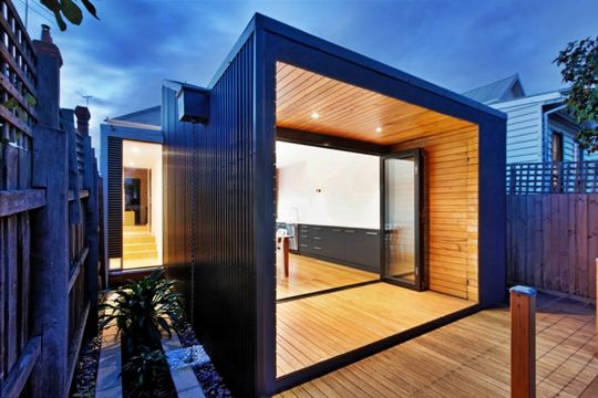
Poor Orientation
The major challenge -- and the reason the home felt so dark and gloomy -- was the site's orientation. North is towards the front of the property, leaving the rear yard and main living areas of the old home in darkness.
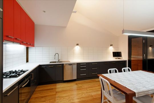
Crafty Solution
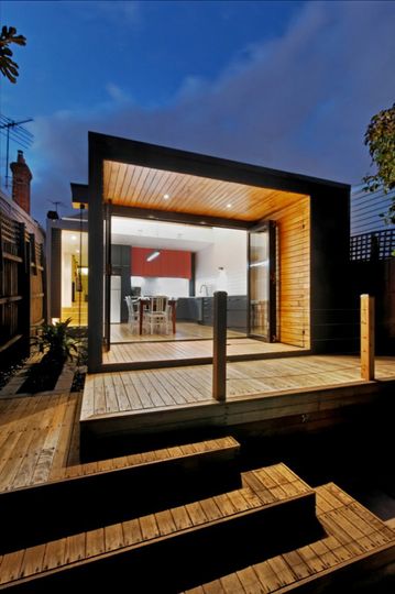
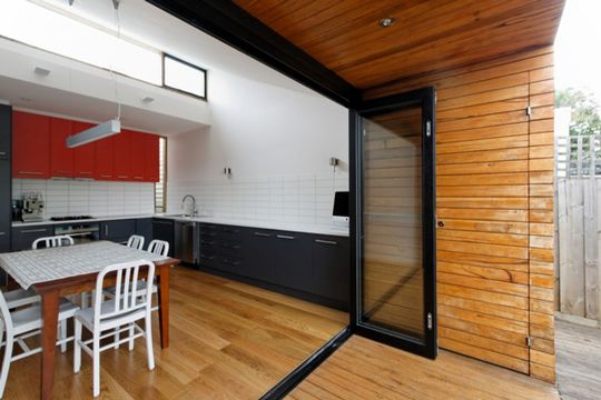
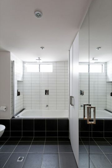
4site's solution was to create a compressed centralised service core containing the bathroom and laundry, and allowing a higher volume containing the new kitchen/dining room to connect to the yard at the rear. This higher volume also created the opportunity for a clerestory highlight window to let North light in.
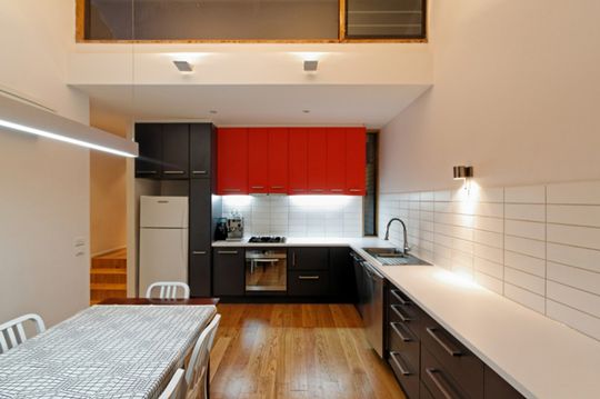
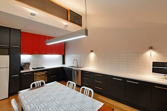
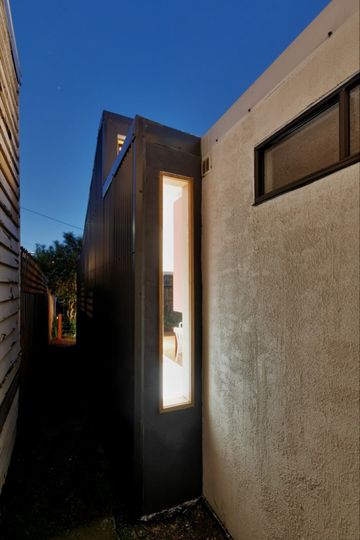
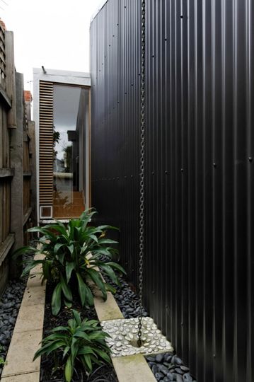
"Formally, the addition consists of two elements connected by a small hallway. The first is a white box, containing the new bathroom and laundry; the second being an open plan kitchen and dining area, a black metal clad box which is setback one meter from the boundary and reaches up over the white box for northern sunlight." -- 4site Architecture
Light at the End of the… Corridor
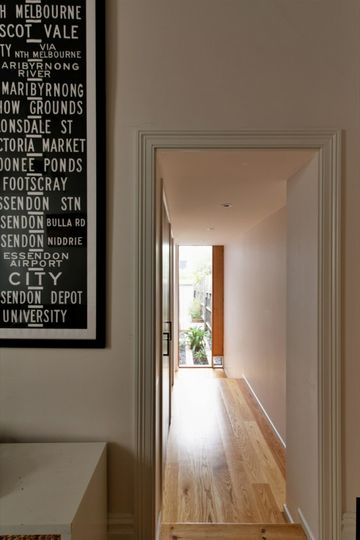
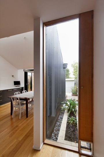
Have you ever walked into an older house only to be greeted by a long and dark corridor leading to the rear living areas? It's a common (and unpleasant) occurrence. And it's certainly not a warm welcome. 4site Architecture addressed this problem by creating a full height window with a view of a small courtyard. While the one meter setback was a council requirement, it has been creatively used to give an immediate sense of light and flow through the house. The inclusion of a side timber slot panel also provides the ability to cross-ventilate whilst providing insect screening and security, a simple and economical device that was inspired by the simplicity of '50s Modernism.
Compression and Release
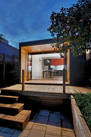
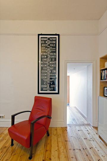
The transition from the existing cottage to the new addition utilises an architectural technique known as the compression and release effect. The original high ceilings of the existing cottage transitions to a much lower ceiling through the connecting hallway and services core. This compression is then released again upon entry into the kitchen/dining area. The visual and volumetric shift amplifies the sense of height and openness in the living area, strengthening the delineation between the new and the old. The connection to the outside is amplified by the framing of the rear yard by a low, beautifully proportioned timber clad verandah that acts as another compression device before being released to the small backyard beyond.
Simple but Effective
Essentially, the new kitchen/dining room is a simple shed-like structure. The modest extension has a simple skillion roof and is clad in corrugated iron. While the expense of the new extension is minimal, the improvements to the quality of living in the home are priceless.
Gardiner House
The Gardiner House is modest but effective. It demonstrates an efficient use of space where every design decision has more than one payoff. The result is a humble extension which exceeds its apparent simplicity to create a home that is lighter, more logically planned and infinitely more liveable than the previous dark cottage with a hodgepodge of poor additions.