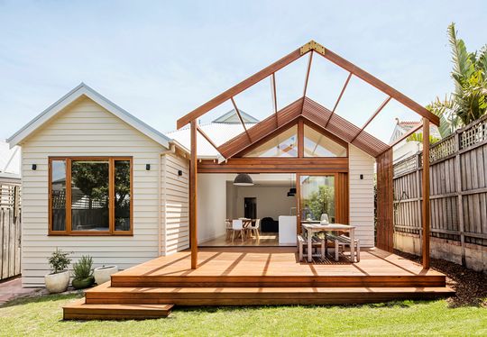
With an old extension out the back, this Edwardian home in Sandringham had the necessary space for a family, but it wasn't being used effectively. With a slight rearrangement and the introduction of two new gables, Sheri Haby Architects has created a more functional home with the illusion of extra space...
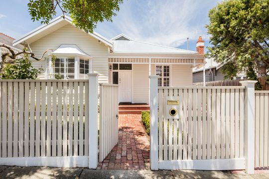
"The client was comfortable that they didn't need a bigger house, just one that worked better", explains the architect, but they wanted "a spacious, light-filled, open plan area at the back that better connected to the backyard and corrected the lack of privacy between the main bedroom and living area." The clients were also conscious of not eating up the backyard with a greedy extension or over-capitalising on the relatively small site. So it was necessary to think creatively about how the space they already had might be used more effectively.
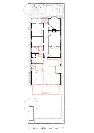
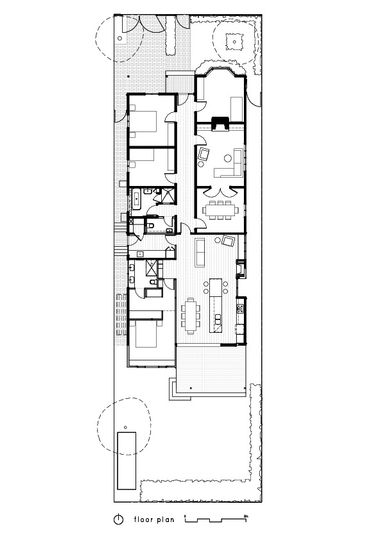
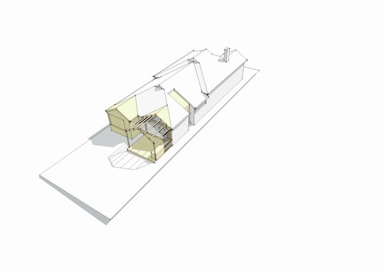
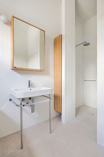
To achieve all this, Sheri Haby Architects kept the front part of the period home intact, including three generously-sized bedrooms, a formal lounge, dining room and original hallway. The bathroom and laundry were reconfigured to include a separate powder room, while the previous addition was reworked to provide greater efficiency. The master bedroom gained a small extension so it now includes a larger walk-in-robe and ensuite bathroom. The entry to the bedroom was also reconfigured to retain privacy from the living area. In the living area, the kitchen and lounge were flipped to allow the kitchen to connect to the new deck and the backyard.
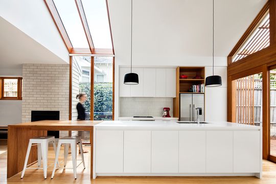
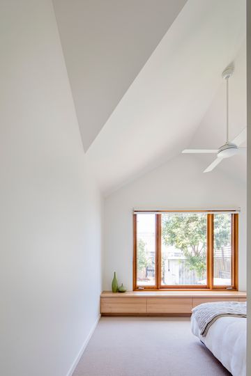
A gable over the main bedroom and the living area allows for cathedral ceilings inside, which is the real trick to giving the illusion of space. Many of us forget the third dimension, but the ceiling height can make a huge difference to our sense of spaciousness. Ultimately, just ten square metres was added to the home, but it feels much bigger.
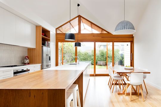
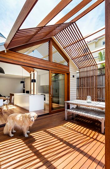
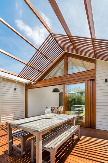
The gabled form of the roof extends over the deck to become a timber pergola. Once the doors are slid open, the boundary between indoor and outdoor blurs to create one large space, enlarging the sense of space further.
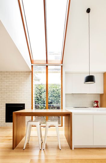
A large window and skylight demarcate the kitchen and living area in the otherwise open-plan space. Under the skylight, the benchtop transforms into a timber breakfast bar. Facing east, this joyous window creates a sunny start to the day in what would have been a south-facing (and therefore much darker) living area.
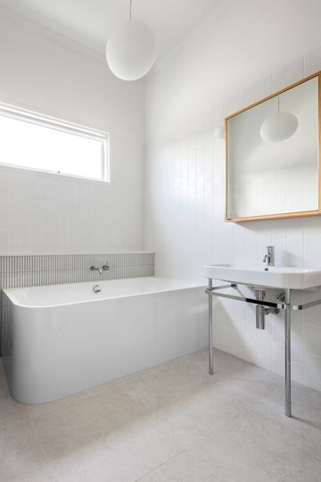
Do you really need more space? Or could the space you already have work harder for your family? That's the question you need to ask before committing to an expensive and time-consuming extension. So often, subtle changes like rearranging spaces, lifting the ceilings and the addition of well-placed windows and doors can give you all the space you need. Or at least the illusion of extra space.
