Seamless Extension
Too often extensions to historic homes are disjointed and poorly connected. The ubiquitous lean-to comes to mind as the type of extension that is tacked on purely for extra space, without considering how to combine new and old into one free-flowing space. Elliott Ripper House is a prime example of how a well designed, harmonious extension can provide much more than extra floor space.
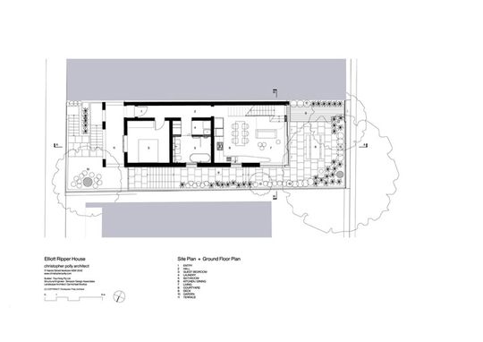
Interestingly, the new project sits on the footprint of a prior extension -- a lean-to that clumsily connected to the house. This new addition uses the form and materials of the original house to create an extension which seamlessly adds space and redefines patterns of living while also connecting to an improved outdoor space.
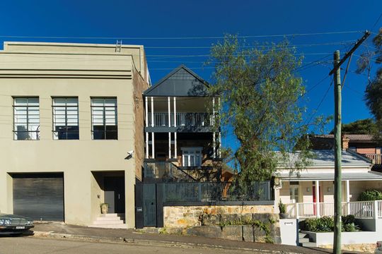
Existing House
The existing two-story sandstone cottage was cramped and only had one bedroom -- not enough for the new owners who “needed more flexibility and space” to start their family. An existing lean-to at the rear provided some extra space, but also caused other issues. It felt disconnected from the house and led to a poor connection to the garden.
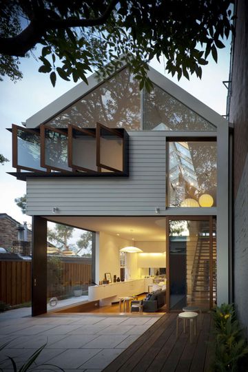
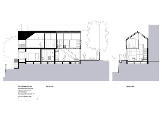
Christopher Polly Architects chose to use the same double height gable form and extrude this back to create the volume for the new extension. Combined with the use of matching timber weatherboards on the upper story, this creates a harmonious addition that feels connected to the original home.
Opening Up
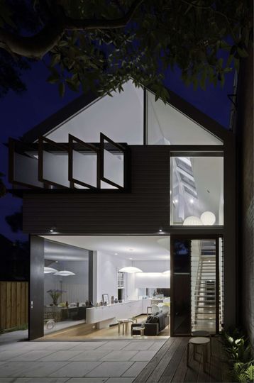
From the rear you can see how the continuation of the gable form is expressed in a modern, open way. Access to light and breezes as well as connection to the garden was a priority of the design. Large expanses of glass, casement windows that can be opened fully and sliding glass doors are used to achieve this goal.
Steel Framing
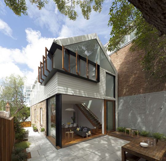
To create an extension that feels spacious and open, steel plate has been used structurally. This contrasts with the textural sandstone of the original, so it's clear where the old finishes and the new begins. Despite this contrast, weatherboard from original overlaps which again blurs the lines between old and new.
Thanks to the steel's thin profile, the walls of the extension virtually disappear into the garden.
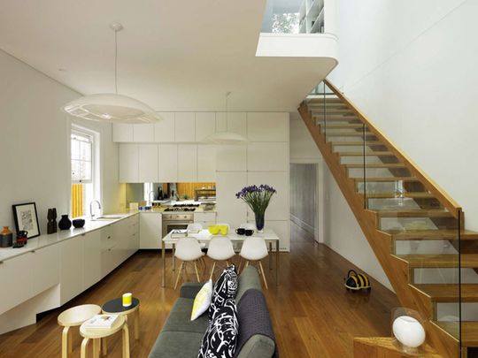
Making the Most of Limited Space
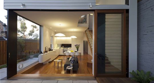
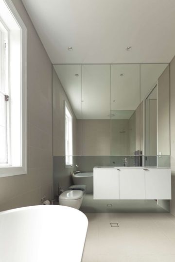
Inside, a modest-sized space is complimented by a simple palette and practical planning. Mirrors, stairs with open risers, and glass are used to visually expand the space.
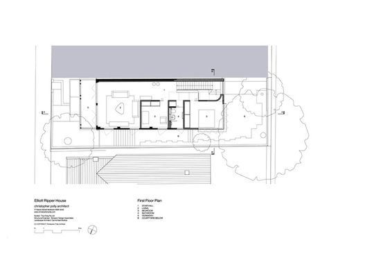
A generous double height void above the stair lets light into the space and makes the whole downstairs living area feel larger. This void also helps upstairs and downstairs to feel more connected.
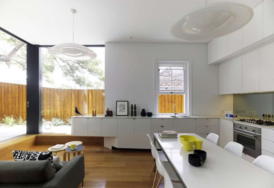
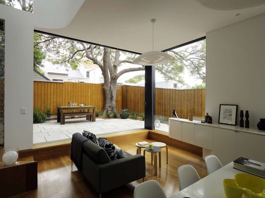
Connection to the Garden
A good connection to the garden and courtyard space was critical to ensure the living area didn't feel cramped. An oversized door sill creates an informal sitting space that is both indoors and outdoors, helping to establish a good connection to the outdoors. This sitting area also helps to make the living area feel more spacious when it's filled with visitors.
The sliding glass doors and fixed glass panel visually dissolve the corner of the house, making the whole living area feel like it's part of the garden.
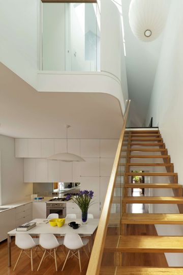
Glazed Gable
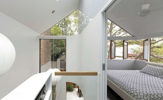
The whole rear gable is glassed to maximize the light into the house. The retention of the cathedral ceiling is a clever way to connect the old house with the new, while the open stair and sculptural void connects the two previously unrelated floors. Delicately translucent polycarbonate lets light into the bedroom without it feeling open to the void and visa-versa.
Dissolving Corners
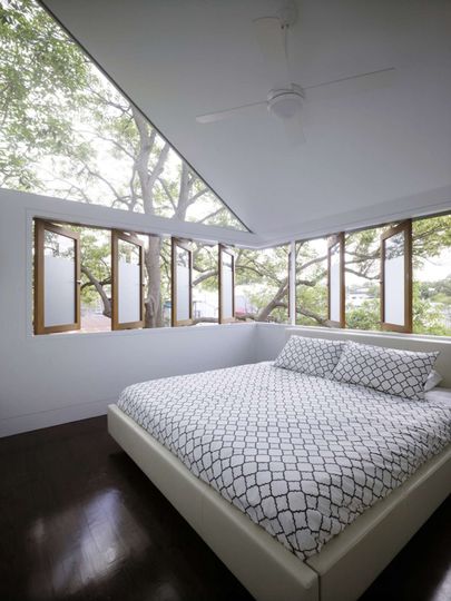
Upstairs the corner of the house is treated similarly to the downstairs corner, but is modified to suit the more private nature of a bedroom. Fully openable casement windows enable the bedroom to dissolve into the treetops, feeling light and airy. When closed, a frosted portion provides privacy.
Evening Space
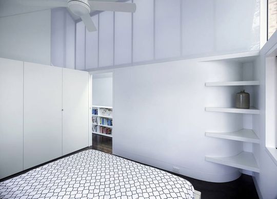
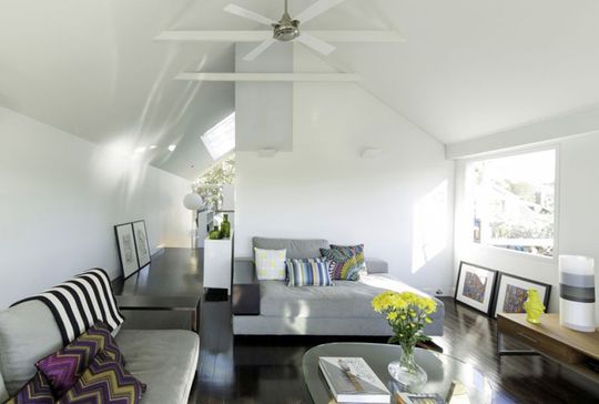
The open plan downstairs is designed for cooking, eating and family time. Upstairs, a more secluded lounge area is a place for adults to retreat to in the evenings. This will suit the family as their children grow, providing separate lounge areas for adults and children.
Well Connected Living
Elliot Ripper House is a terrific example of a well-considered and well-connected extension. Both this family and Christopher Polly Architects understand the importance of considering how new and old will work together. They've avoided the common mistake of adding rooms to the rear of the home for space's sake. As a result the whole house flows freely - there are no awkward junctions or wasted spaces here. Each zone works beautifully for the family. And, ultimately, they've gained a greater sense of space for their buck.