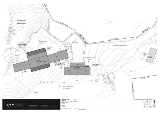
Taking its design cues from the utilitarian forms of a tent and a shed, this New Zealand home for an extended family is a duo of compact buildings that uses a humble set of materials to allow the landscape its rightful place in the scheme.
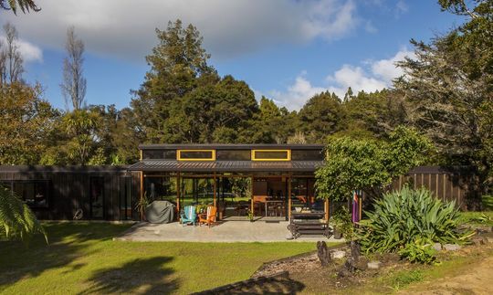
Main Dwelling + Mini Me
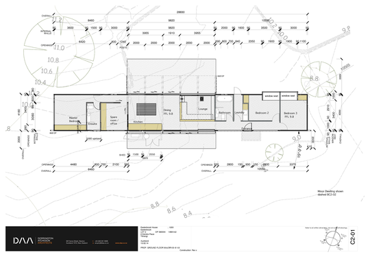
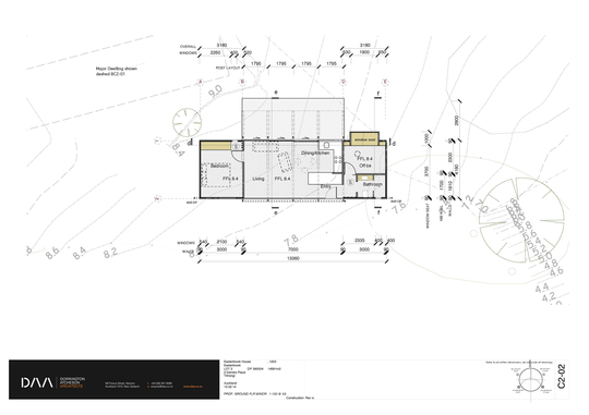
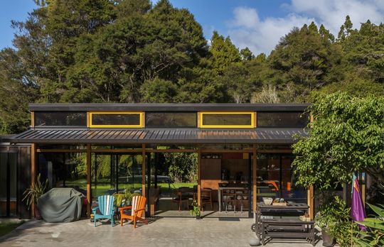
Sited for sun, seclusion and views of the surrounding bush, the main dwelling and its ‘mini me’ cousin share an aesthetic and similar planning. The primary home is conceived as a barn-like pavilion with bedrooms for adults and kids at opposite ends. A canopy-like roof is strung between these more-solid bookends like a tarpaulin.
Simple Ideas Executed Expertly
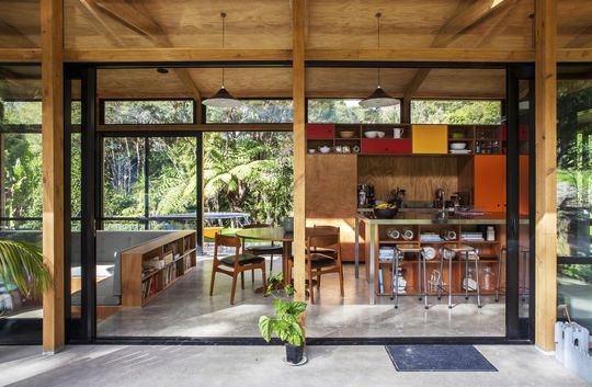
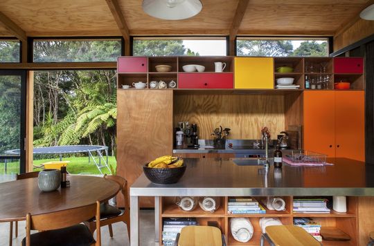
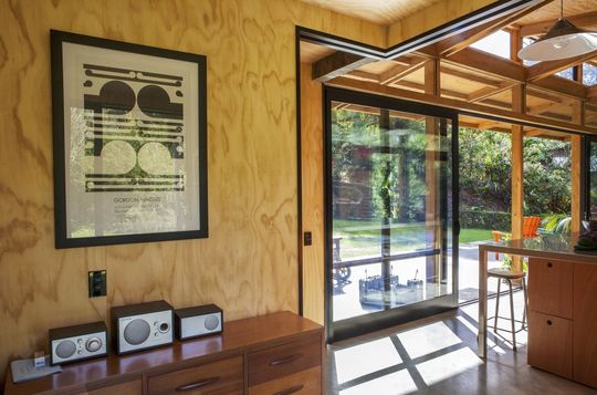
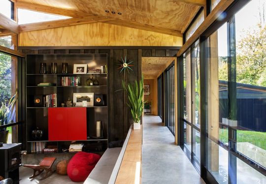
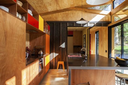
A modest footprint of 120-square-metres called for meticulous planning with no wasted space. Although the rectangular shape is only 4 metres wide, the soaring mono-pitch roof and full-height glazing brings a feeling of capaciousness to the main living zone. A split-truss roof allows an external pergola to shade the home in summer and clerestory windows bring in low winter light. The low-key palette of glulam beams, plywood walls and ceilings, aluminium joinery and concrete floors lends a casual holiday feel.
Sunken Living and Built-In Furniture
A sunken lounge in the open-plan living zone is a modern take on the conversation pit and this change in level demarcates the space. Built-in furniture helped with space saving and includes an entertainment unit as well as an L-shaped banquette backed by bookshelves.
Flexible Space
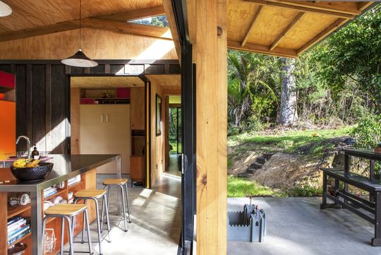
Off the kitchen, a set of cavity sliders demarcates a spare bedroom or office. Board-and-batten detailing on this insertion further defines this zone and brings the barn-like exterior detailing indoors.
Planning for the Future
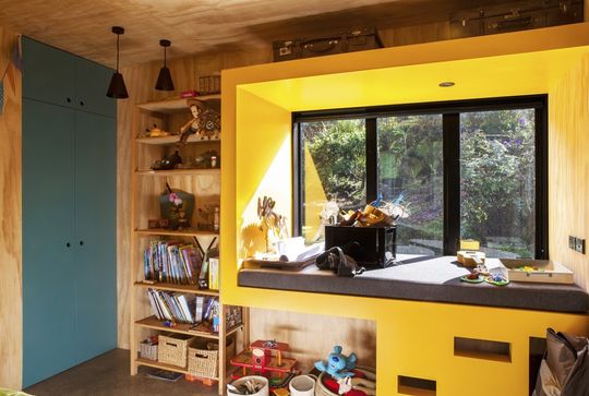
Built-in bunks in the kids’ bedrooms can readily be converted to a desk – an aspect which future proofs the home for a growing family. Pops of primary colour lend personality to an honest design that tells the story of how it was made.
