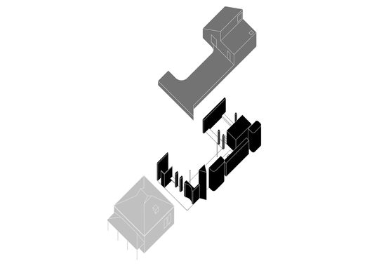
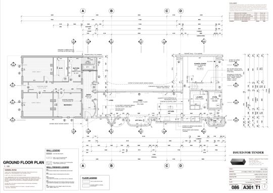
How could it be that the most important part of this house is the space that's not built? Well, by designing a north-facing courtyard and carefully placing the living areas around this green space, every room is elevated by its access to light, breezes, lush vistas and a sense of space the courtyard offers...
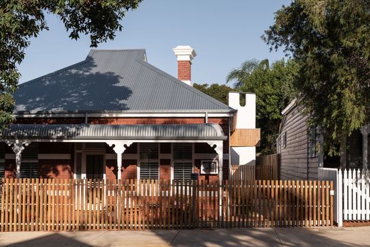
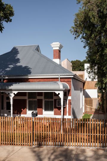
Nic Brunsdon began the design of this East Fremantle alteration and addition with a void. A generous courtyard facing the sun, "a space for sun, light, sky, sound, and breeze to inhabit." The house then skirts the edge of the courtyard, ensuring every room can enjoy its benefits.
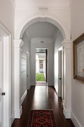
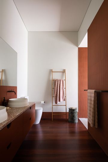
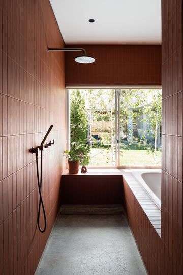
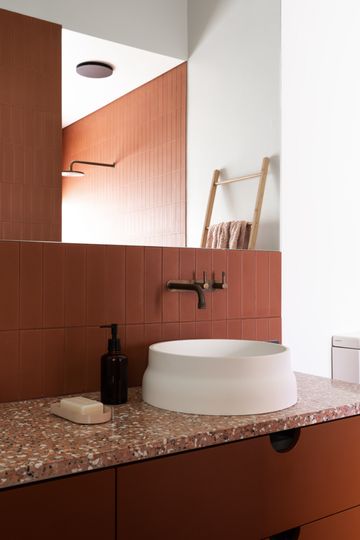
There are four parts to this home, each zone with its own unique character. There's the existing brick cottage which has been left largely intact apart from a new walk-in robe and bathroom. A flexible bedroom suite is created by connecting bedroom one to a walk-in-robe and family bathroom. "Currently," the architect explains, "the family is all living in the front of the house due to a recent birth. Over time, the parents or children may choose to retreat to the rear upper floor bedroom suite at the rear." This could also become an accessible bedroom for grandparents, guests or the owners as their needs and family structure changes.
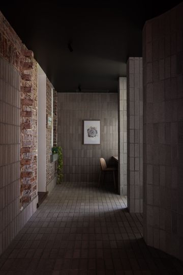
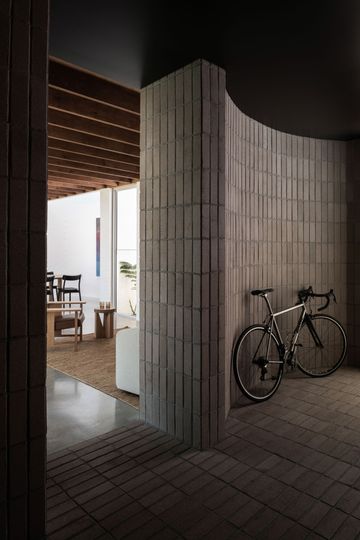
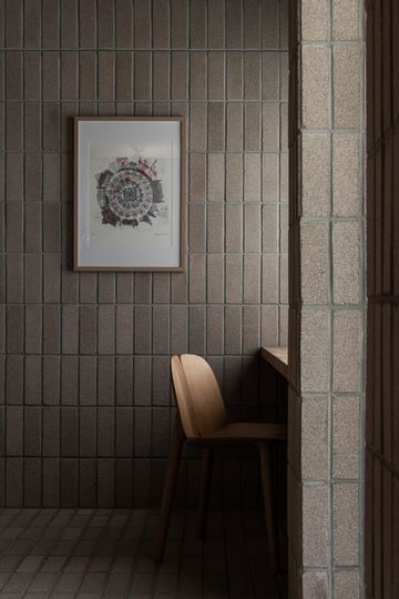
An intentionally dark, contemplative space acts as the new entry and serves as a link between old and new. Clad in beautifully rich bricks on the floor and walls, the entry highlights the colour and texture of the original cottage's brickwork. The architect has even left a tactile reminder of what once was by leaving half-brick projections of a previous wall on display. A curved alcove serves as storage space for a bike or other objects you don't want to take all the way into the house, while a desk is tucked under a window to make this a study nook as well.
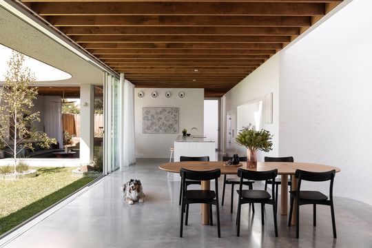
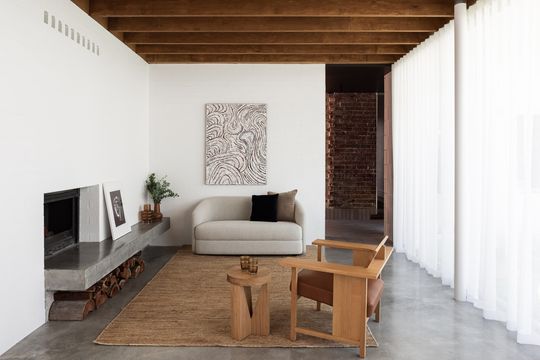
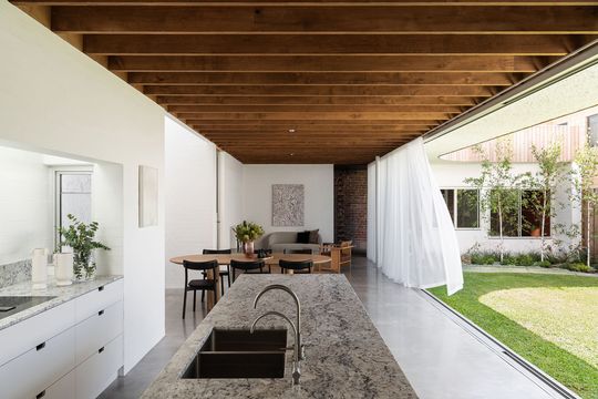
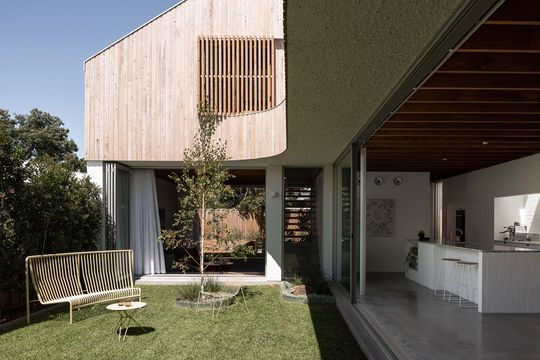
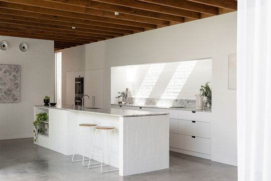
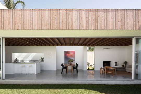
The dark solidity of the entry is immediately contrasted as you move into the new addition. A simple, linear open-plan living area stretches along the southern side of the block. A massive stack of sliding doors fill the space with light and mean the living areas can open completely to the courtyard, feeling more like one long garden room and allowing the owners to enjoy the full width of the site. Exposed rafters overheard bring a richness to the simplicity of painted brick and concrete, while their rhythm and direction draw the eye out to the garden.
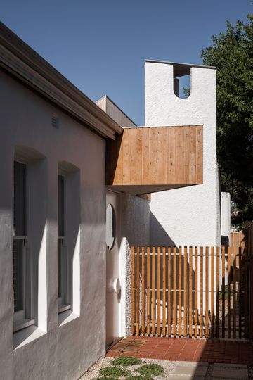
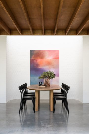
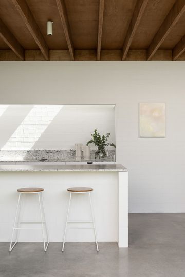
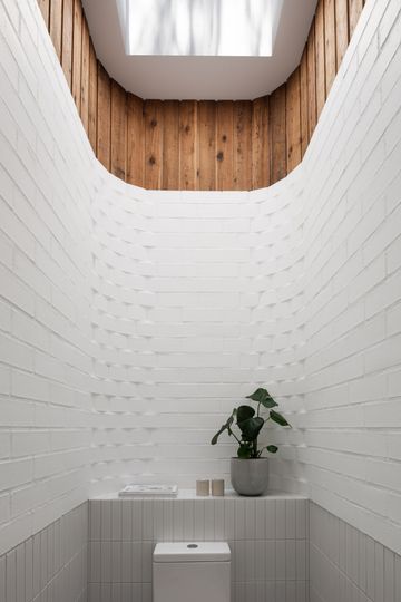
Along the southern side of the living area, a series of unqiqe spaces and forms are created to punctuate the long, thin space. These "lumps" as the architect calls them include "a tall triangular chimney for the fireplace, a curved north-facing shell for an art wall, a low top-lit box for the kitchen, and a high round cylinder for a powder room." These elements create special moments of delight in the otherwise simple space and create a whimsical series of forms as you approach the new side entry of the home.
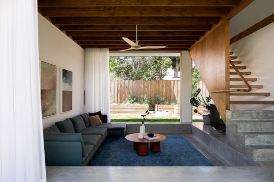
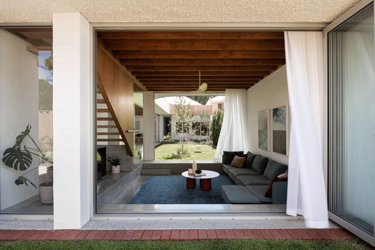
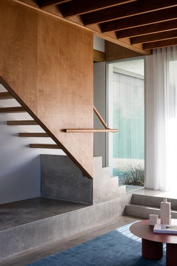
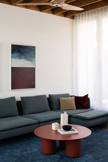
A sunken lounge bookends the courtyard, bringing you down to the level of the plants and creating a snug place to relax. Open on both ends via full-width stacking doors, even the sunken lounge feels like an extension of the garden; a room within the garden rather than a room connected to the garden.
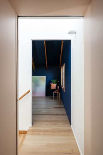
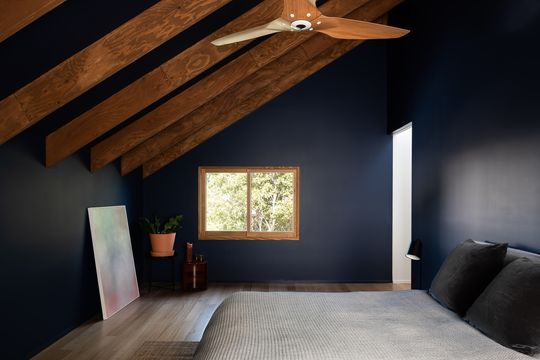
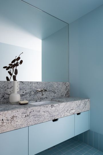
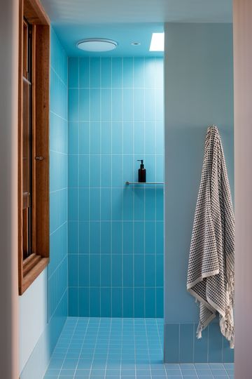
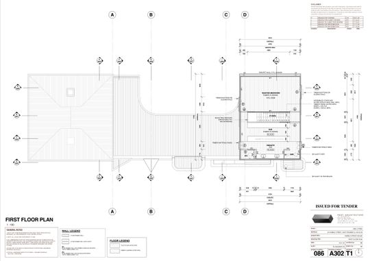
Upstairs is a hidden oasis, the main bedroom suite, tucked under dramatic raked ceiling within a wooden box which sits lightly upon the double brick ground floor. A deep blue wall colour in the bedroom marks another contrast and creates an intimate, relaxing space and highlight the warmth and texture of the exposed rafters.
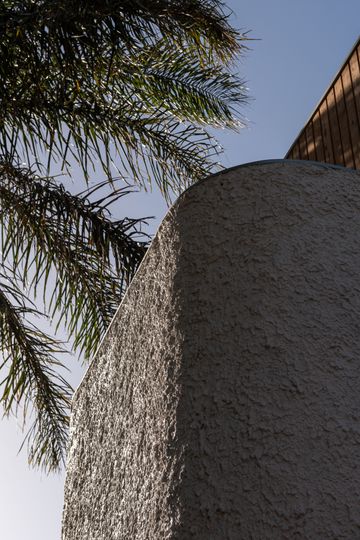
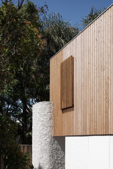
"The ground floor addition is masonry construction, either painted or bagged brick, or rough thrown concrete, all painted white. This floor then hits a very deliberate and expressed datum line above which the project becomes light framed natural timbers. There are two points where this hard datum threshold is broken; once on the southern elevation where the counter ‘lumps’ break through to varying heights, and again in the sunken lounge room where the first-floor stair flicks a timber hatch down to welcome and gently touch the heavy base of the ground floor program." - Nic Brunsdon
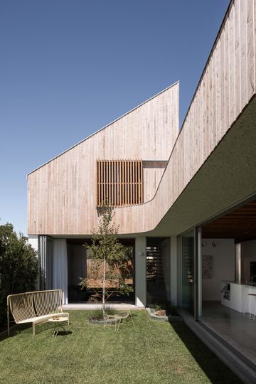
"This project demonstrates that by placing the northern garden as the first design move on site", the architect explains, "the building then becomes secondary and deferential to this. The garden, this void of space, gives measurable and appreciable amenity to the project and shows that an understanding of and connection to our celestial sphere can shape the rhythms, patterns, and quality of daily family life."
