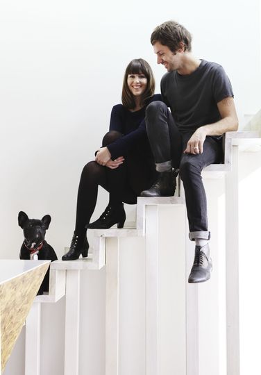
A Cubby House: Ben Edwards (from Edwards Moore Architects), his partner and their adorable dog on the stairs of Cubby House.
A Cubby House to Call Your Own
When you're a kid, a little imagination can turn odds and ends found lying around into building materials for a little space to call your own -- a cubby house. Now that you're an adult it's harder to see the potential in a sheet and two chairs, or for that matter a sheet of oriented strand board.
But not for Edwards Moore Architects. This project is obviously more elaborate than sheets and chairs, but they have taken a kid's perspective (and numerous salvaged materials) to create a pint-sized apartment packed full of fun. The project is appropriately named, Cubby House.
This is what a cubby house looks like if it's built for two sophisticated adults…
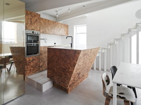
Texture, Style and Sparkle: Textural materials, stylish finishes and reflective surfaces make this small apartment feel grand for its size.

Pop Up House: The roof of Cubby House pops up to gain extra space, and take advantage of a view over the community pool.
Just Pop the Lid
Like a pop-up caravan, Edwards Moore have lifted the Cubby House roof to the maximum height planning laws would allow. This gave them a little more space to work with - but the one bedroom apartment is still a small space.
A Shimmering Light Box
Cubby House is undeniably small, but reflective brass panels, rich textures and large windows make you forget that. A view over the Fitzroy Pool visually expands the space. With the sun at the right angle, delicate ripples of light reflect from the pool to dance on the ceiling. In the light, the gold brass panels glow, making the house sparkle and shimmer. It's almost a physical representation of the whimsy of a child's cubby house.
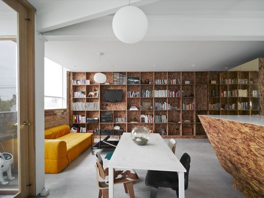
Make a feature of it: Fine craftsmanship is used to highlight important features like the full length book shelf and the kitchen bench. Varnished Oriented Strand Board (OSB) provides a rich texture.
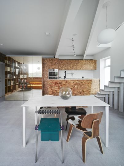
Sliding, Sparking Furniture: A reflective gold cupboard slides out of the way to reveal the entrance and a powder room. It also acts as a mirror, reflecting a warm light into the space and tricking the eye into thinking the space is deeper.
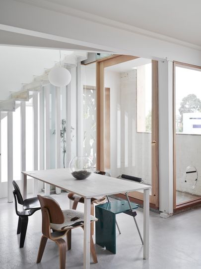
Private Terrace: A small terrace of the living space provides a good viewing point of the pool below and also a nice spot to get some fresh air. The stairs are held up by single, slender pieces of timber which increases the sense of space.
Not Smaller, But Smarter (And Not Shy, Either)
The well-trodden solution to a small space is to make everything very efficient - very small and very efficient. Ben and Julliette have taken a different approach. Rather than trying to squeeze space out of the envelope by making everything smaller and squarer, they've narrowed in on what is important to comfortable living -- and made it a feature:
- Instead of a bare-bones kitchen, they've created a finely crafted kitchen bench that juts into the living space -- asserting its presence.
- Rather than sacrificing a bath to reign-in the size of the bathroom, they've taken the bathroom out of the equation altogether and plopped a sinuous, sculptural bath in the bedroom (where it has a view).
- And instead of leaving bare walls and letting the space fill up with a hodge-podge of IKEA furniture, they've devoted a whole wall to storage - even including a home for their dog!
They've made everything perform at least two roles. As a result, the project is richer and the space is more suited to Ben and his partner's needs.
The Continuous Space
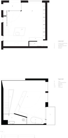
To combat any possibility of claustrophobia, the whole apartment is treated as one continuous space -- not divided by walls, but separated using movable 'furniture'. There's a pivoting wardrobe that turns one bedroom into two. And a sliding cupboard that doubles as a door. Even the wall in the bathroom isn't full height, because this would make the bedroom space feel smaller. Instead, it has a lowered ceiling height -- more appropriate for the room size -- and a pop-hole for the shower to fall through.
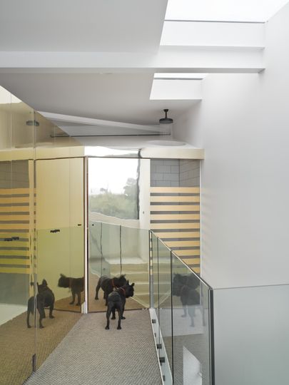
A (Golden) Light Well: More use of the reflective gold panels help to bounce light into the lower level. A pop hole over the lowered bathroom ceiling lets the shower water through.
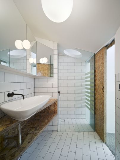
Light, Bright Bathroom: When the bathroom door is closed, a shielded glass screen lets the light shine in. That's a way to wake up feeling sunny.
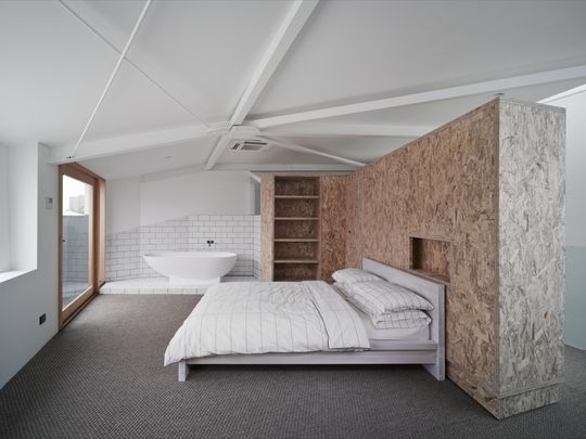
Bath Sculpture and Pivoting Wardrobe: A beautiful, sculptural bath is prominently displayed in the bedroom. The large wardrobe can pivot to turn one bedroom into two, or create separated study space.
Trick of the Eye
Everywhere you look there's an element cleverly designed to trick you into thinking the space is bigger. The glass balustrade around the generously angled staircase void helps to connect the lower level with the more private second level. Both the living area and the bedroom have access to their own little terrace. While this is a small gesture, it helps to ventilate the house and makes the whole space feel more open.
A Cubby House for Adults
Cubby House has all the elements necessary for a play space for adults. Fun, inventiveness and a touch of whimsy. A small space doesn't have to mean an uninteresting space. It doesn't even have to sacrifice the modern comforts! All that's needed is a creative approach and a bit of fun to create a versatile, yet still homely, space. Of course it's possible to create a fort out of chairs and sheets -- but here's what you can do with some more adult materials.
