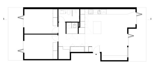
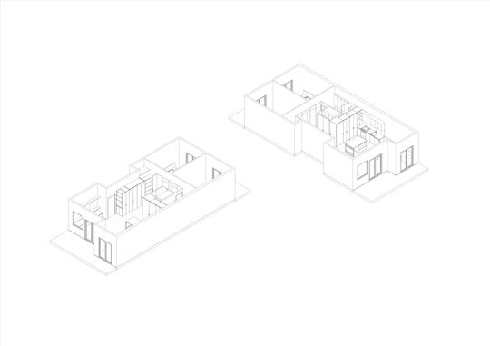
It probably sounds impossible to find more room in an apartment renovation, right? It's not like you can build up or out! But don't underestimate how inefficiently many apartments are planned. So, by developing a more space-efficient design, you can find more space for storage or even create a beautiful new home office in the corridor so the spare bedroom no longer has to serve double duty!
This 1990s apartment, named Katherine, is in a fantastic spot, close to the centre of Melbourne in Carlton and overlooking a park. The problem was, the apartment had barely been upgraded since it was built and, while Tamagotchis, bowl cuts and Windows 95 don't seem like that long ago, it was pushing 30 and looking its age.
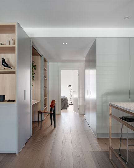
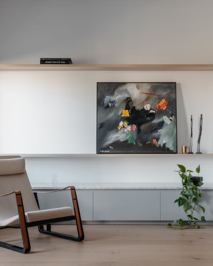
A renovation by Tom Eckersley Architects aimed to make the apartment as space-efficent as possible and maximise the 90 square metres footprint. The two-bedroom apartment overlooks some of Melbourne's beautiful gardens, so the renovation aimed to reorient the living spaces towards the view. In addition, the architect wanted to bring in and bounce around as much light as possible to make the south-facing home feel lighter and brighter.
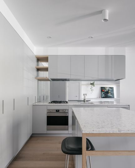
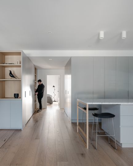
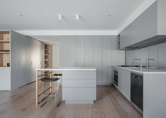
A streamlined box of joinery in the centre of the home incorporates the kitchen, laundry and bathroom.
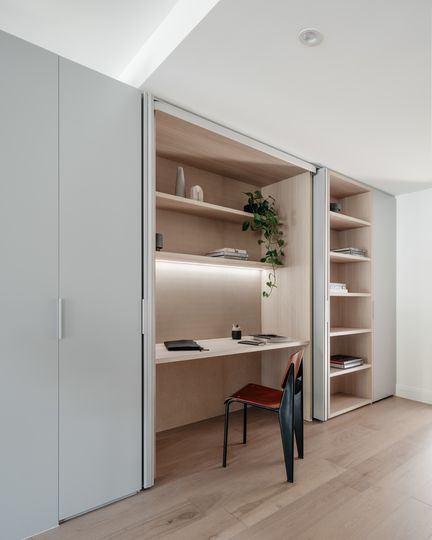
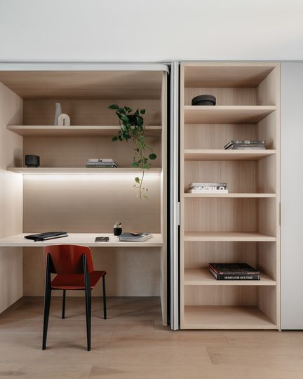
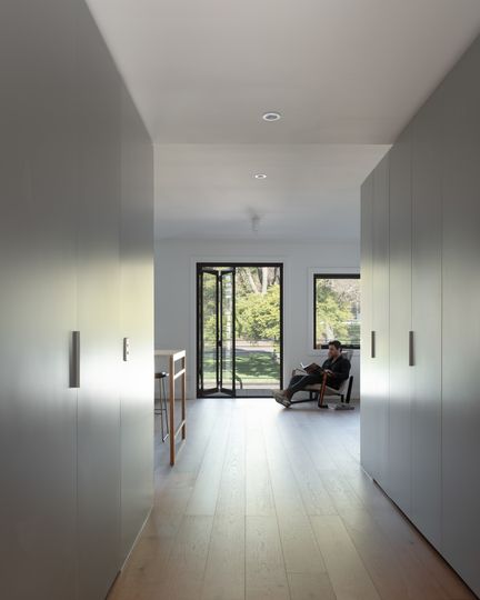
The owner was using the second bedroom as a home office, so the architect managed to incorporate a new desk and storage in a second joinery box in the corridor to better use this space while allowing the bedroom to be used as a bedroom again.
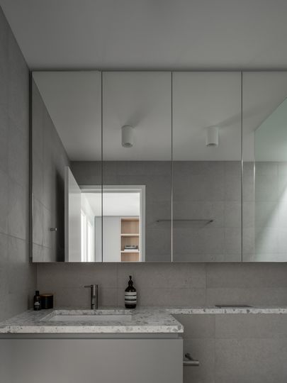
The light colour palette of white stone, light grey joinery and oak flooring helps to lift the space and makes it feel brighter. Mirrors also help to bounce around the light and reflect those great views and an added sense of space.
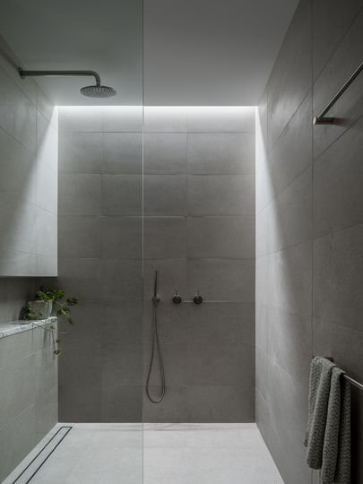
By rethinking the layout of this apartment, Tom Eckersley Architects managed to maximise space efficiency. Combined with plenty of additional storage, a focus on light and using mirrors to give the illusion of more space, the renovated apartment suddenly feels lighter, brighter and much more practical.
