You remember that girl at school? The hard-worker? You wouldn't say she was dim, but she certainly wasn't bright. Academics didn't come naturally to her, but she always did well through persistence and grit. Well, on a narrow, inner-city site with an existing Edwardian house at the front, the descriptors, 'bright, modern and spacious' don't come naturally to Brunswick House, either. But with determination and great design, Brunswick House succeeds...
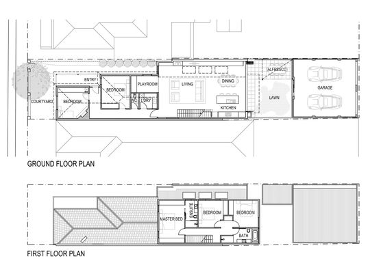
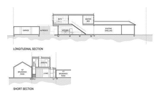
Renovating the semi-detached, single-fronted Edwardian terrace came with its own unique set of challenges. The block was long and narrow. A shared party wall ran down one side and the existing house was over 100 years old. So how do you create a modern, flexible and light-filled home when it just doesn't come naturally?
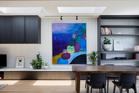
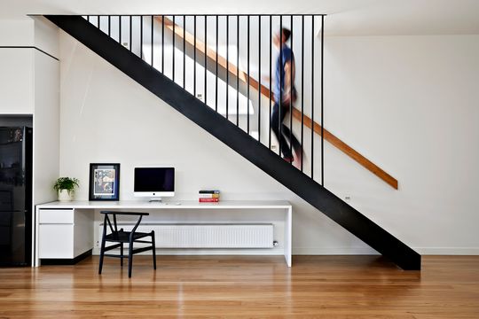
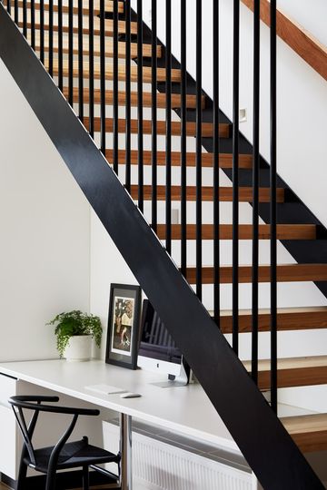
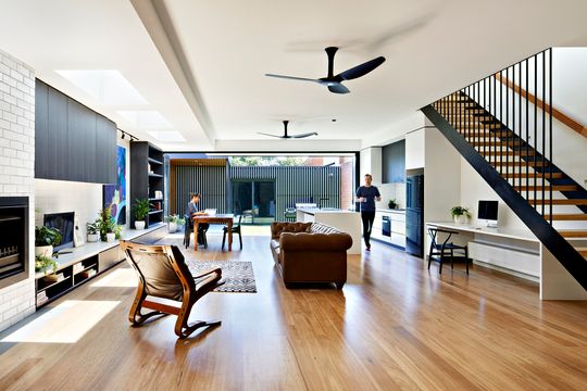
Chan Architecture designed an extension which hugs the boundary on both sides. By embracing the boundary, the extension enjoys a new-found width, maximising the site's potential. Inside, high ceilings and skylights give the home an unexpected sense of light and volume. And what have we told you about volume? That's right, like an eighties perm and tease, more is always better.
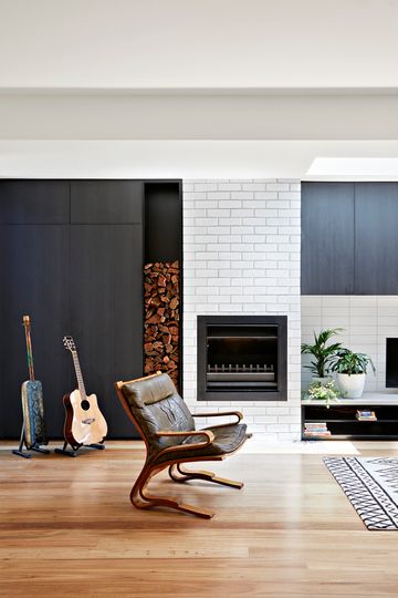
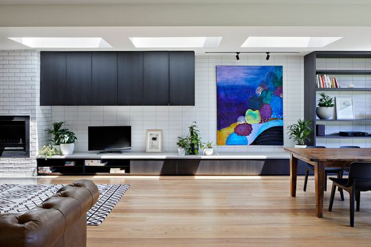
The architect customised the cabinetry to the client's needs so everything has a place. Yes, even the Thermomix you only use to make smoothies has a dedicated space. With a space for everything and everything in its place, the home feels clutter-free and, consequently, more spacious. Marie Kondo would be proud (but she's judging you for the Thermomix).
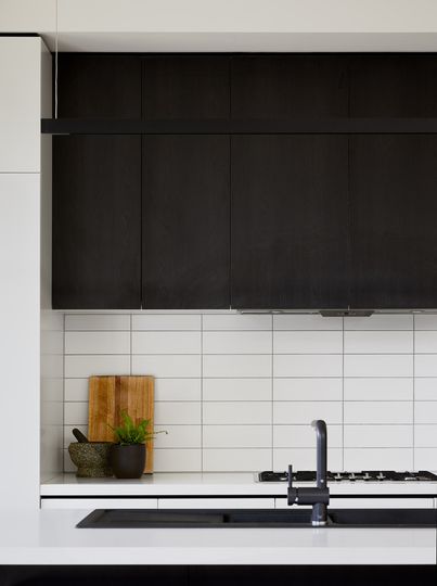
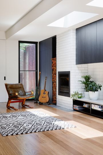
Materials were chosen for their texture and variety, so while minimal, each space has its own unique personality. Light timber floor, dark timber joinery and wall tiles combining to create a richness of texture and light.
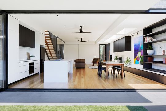
With the fold of a few doors, the kitchen and dining areas open effortlessly onto the backyard. Once open, the home flows into the backyard and alfresco dining area for an even greater sense of space and light.
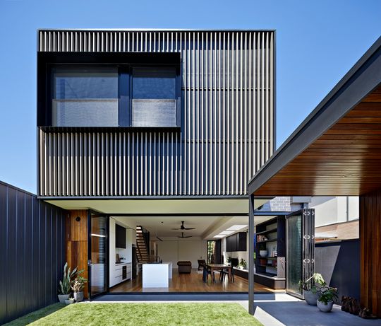
The north-facing backyard lets light into the living space, while the cantilevered upper storey helps to shade the living area from the intensity of the summer sun. The view from the backyard is all clean and rectilinear, with fine detailing and vertical battens setting the addition apart from the original home. The vertical battens create the sense of depth and transparency to ensure this facade is anything but flat and fake, while the steel box around the window provides shelter, shade and privacy to the upstairs bedroom window.
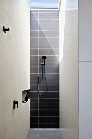
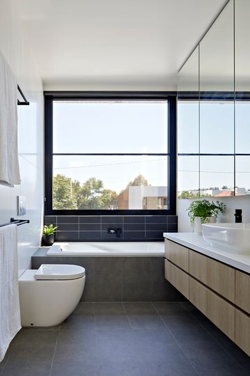
By utilising the full width of the block, strategic skylights and high ceilings, Brunswick House outshines its classmates. Even if modern, bright and spacious didn't come naturally, they got there in the end (with a little help from design).
