People are increasingly choosing to live in dense inner-city suburbs. While baby boomers couldn't wait to leave the likes of Fitzroy and Darlinghurst, younger generations are desperate to afford the convenience of inner-city living. But does all this change when a baby comes along? Are the suburbs, with their bigger homes and backyards and quiet streets a better place to raise a family?
When Andrew Maynard from Austin Maynard Architects first met his clients Bill and Tracey they had called their two storey Fitzroy apartment home for almost six years. With their enviable Fitzroy address, in an expansive apartment overlooking Edinburgh Gardens, Bill and Tracey were living the young adult dream. They were, after-all, #fitzroyalty. But with a baby on the way, would Bill and Tracey need to pack up and move to the suburbs?
"Bill and Tracey loved their Fitzroy home. They did not want to leave. They wanted clever ideas that would allow them to have a child in their much loved home", Andrew explains. But the apartment would need a radical rethink if it was to become a family home.
For starters the stair was tight - illegally tight, in fact. It was a challenge to carry groceries upstairs, but to add a baby to the mix would be downright dangerous.
The lower level was dark and the entry on this level was constrained and awkward. When it would inevitably become piled high with a pram and other baby stuff it would be a nightmare.
Similarly, Bill's office on the lower level was room-locked, with no natural light or view outside - a depressing place to work.
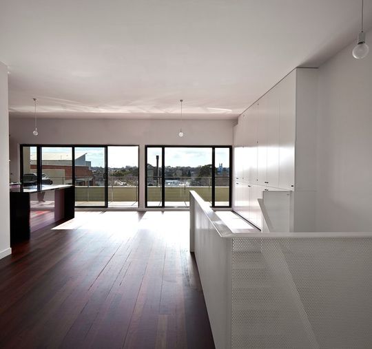
The upper level was spacious, but much of this space was wasted making it feel smaller than it truly was.
Bill and Tracey were worried about how they would physically fit a baby into their home. For Andrew the challenge was different, "for me the fundamental issue was much more than just increasing space. Armed with the hindsight of raising my own child, my concern was the radical day-to-day changes a baby brings. The endless management of ‘stuff’ was the key. The trick is to work with the chaos a child brings rather than naively hoping that your child will choose to be neat."
The solution? Andrew developed a multi-pronged approach.
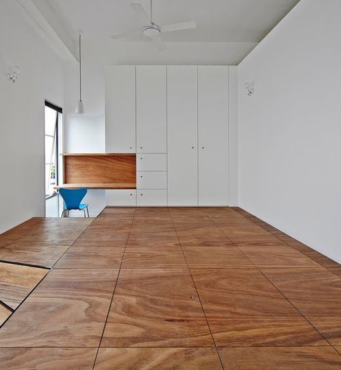
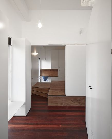
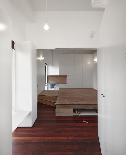
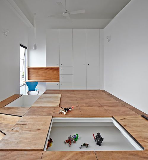
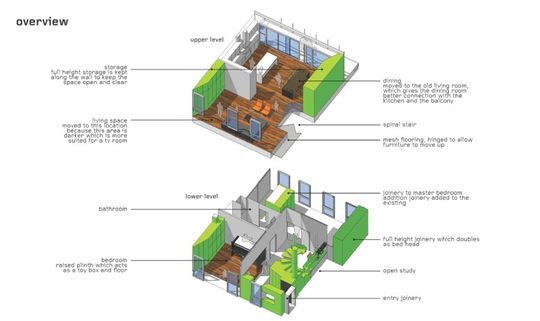
First up, solving the gravity problem. Andrew describes it like this, "gravity is colluding with your child. Gravity conspires in your child's favour. Their target is your sanity. Parents constantly pick things up, while kid throws them down. Children love dropping things on the ground. We have all seen the torturous game of a baby sitting in a high chair throwing a toy to the ground the moment it is placed on their table. It’s cute the first three times. It’s a nightmare the next 200 times. While gravity amuses the child, it punishes the parent. At Black House we have made gravity the parents’ ally rather than the child’s. What if the floor could eat all the mess up?" So Austin Maynard Architects created the toy box floor. "Let’s design a floor that swallows the mess. Rather than picking toys up to put back in the toy box, let’s make the floor one big toy box. Let’s get a broom and sweep all the lego in from the top and sides. It becomes a game for the child as well as a new hiding place for her to play."
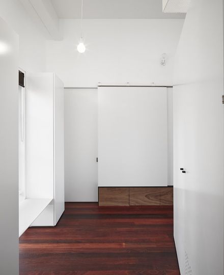
Secondly, a sliding wall between the child's room and the living areas helps to contain the mess with long-term flexibility in mind. "If we provide a bedroom that, at times, can feel like an extension of the shared family space, then it is likely that a child will play in their space and keep all of their stuff there. To accomplish this we have added heavy sliding walls rather than a fixed wall with standard door. If the child and/or you want to occupy one large space, the wall slides away so that the child’s room is an extension of the living spaces. If the child needs to sleep, study or wants privacy the heavy walls slide closed and lock in position."
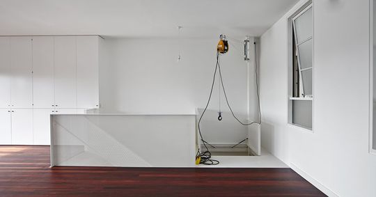
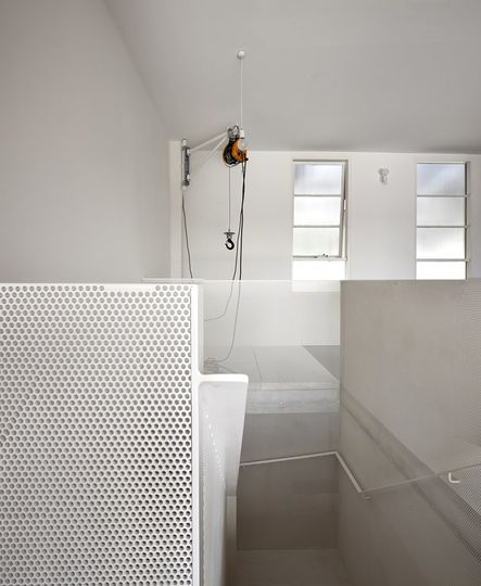
"'Stuff' is always on the move in any house, especially a house with a baby in it. Groceries go up, garbage comes down. Clean nappies go up. Dirty nappies go down. Groceries go up. Recycling goes down. And toys just go everywhere." How about a winch to help you move things in and out of the apartment? Austin Maynard Architects have designed a mesh floor over the entry which can open to allow a winch to be lowered to deliver or collect virtually anything - even a fridge. It's a small idea that will make Bill and Tracey's lives just that little bit easier.
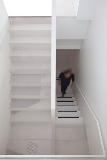
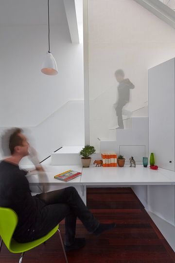
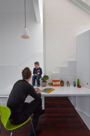
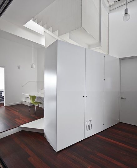
A mesh stair is a clever way to maximise the natural light that can get to the lower level. It will also allow conversations to flow between both levels. The stair is also part desk, part laundry, part furniture and part play space. "As apartments at the top of old warehouses don't typically have playgrounds for kids, the stair becomes a jungle gym for play and exploration. Give a child a handful of colourful magnets and a handful of pegs and that stair will keep them amused for days." Adding extra functions to the stair means space is freed up in other parts of the home.
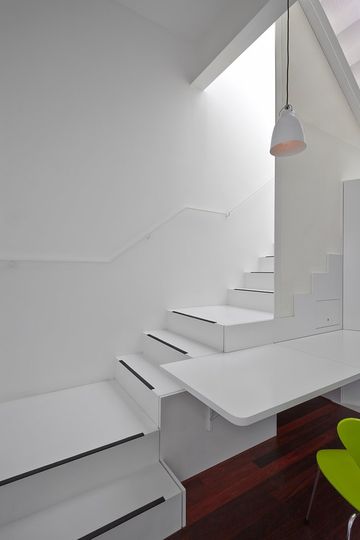
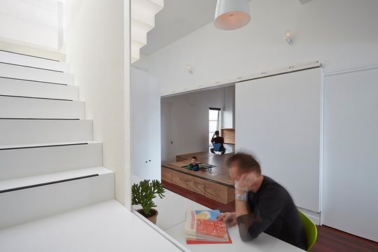
Bill's office is now at the centre of the house with extra light and the ability to watch his daughter while she plays.
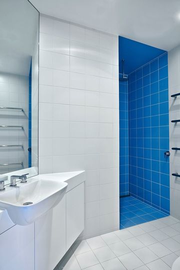
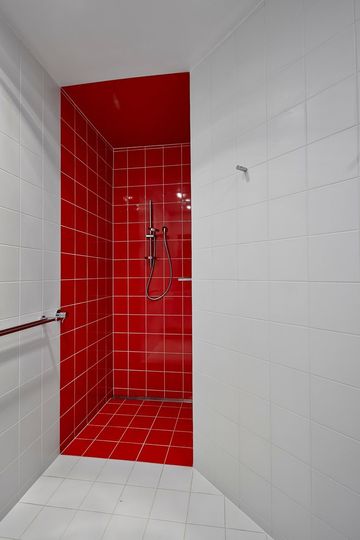
The architects transformed the original large bathroom into two smaller, but still functional bathrooms. This gives Bill and Tracey an ensuite bathroom and will streamline morning routines as the family gets older.
"Retreating to the suburbs shouldn’t be the default decision. ‘More space’ is often not the answer. The answer is more complex, and can lead to great spaces that do just what you want. All you have to do is challenge your preconceptions."
