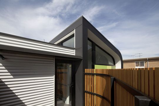
It's often assumed that curved facades and other stylistic flourishes are purely aesthetic. Sure that's sometimes the case but aesthetics and rational planning don't have to be mutually exclusive! At Abbotsford Residence, Chan Architecture have designed a curved and angled facade. It conceals a rational plan designed around a highly constrained site. See, it's not just about looks!
Adding to the Original
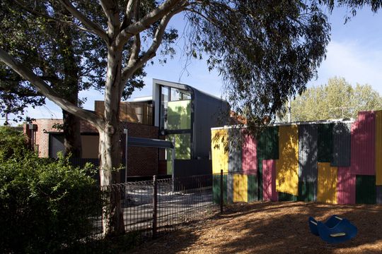
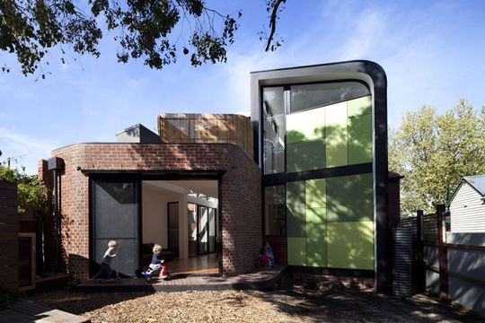
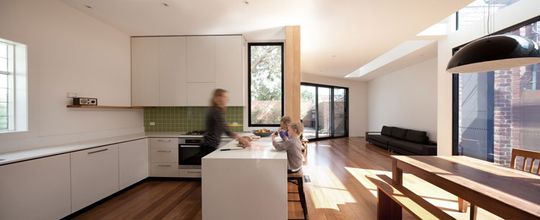
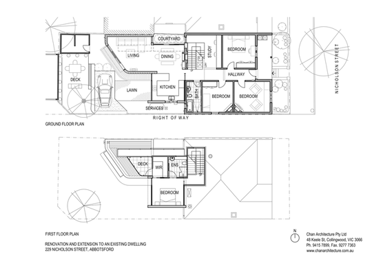
The original home is a double-fronted Edwardian home -- a common style in the traditionally working-class Melbourne suburb of Abbotsford. The extension is a double story addition to the rear -- carefully packed in the only unconstrained piece of land on the site.
Site Constraints
The project required dealing with numerous site constraints: an easement running diagonally through the site, large existing trees, a west facing block, site access issues and difficult soil conditions. The response creates an extension that manages to respond to this long list of constraints in a unique, creative way. It's a series of constraints that might have led to a dumb box addition had it been left to someone less savvy.
Curves with a Purpose
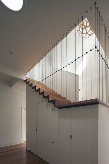
The curves in the design, in both plan and elevation, are a response to the site constraints. But they also introduce a more dynamic, fluid form, referencing the bull-nosed, corrugated iron verandah roofs of the typical Edwardian home. The new building retains a sense of the aesthetic values of old, reinterpreted for modern living.
Splash of Green
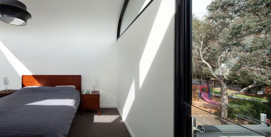
The green colors on the rear facade reference to the colors of the existing Eucalyptus trees on the site, as well as providing a fresh contrast to the other colors on the facade. Color is an important feature that is commonly under-considered. The right choice of color can ground a home in its site, and even invoke an emotional response in the owners. Green, for example, is traditionally associated with freshness and calm -- a wise choice for a family home.
Dealing with Light
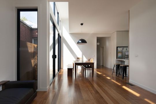
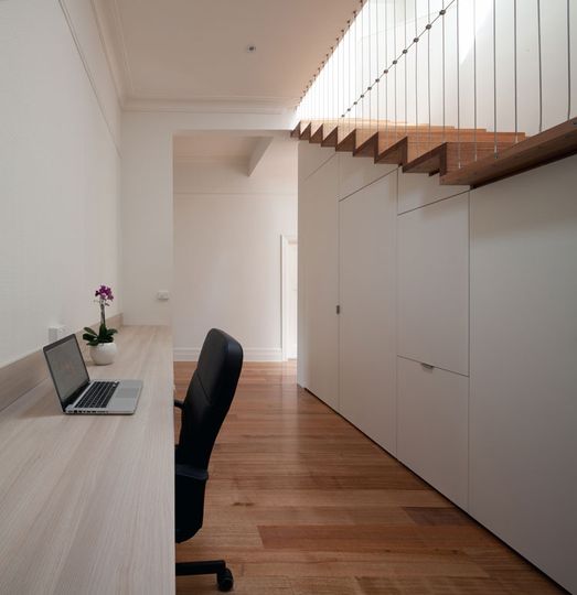
Light was another important consideration. As the site was West-facing, the design had to maximize North light and minimize the West light which is generally low, hot and damaging -- think stinging glare and faded curtains.
"By varying ceiling heights internally, we were able to let natural light into the house via clerestory windows and an internal courtyard." -- Chan Architecture
Chan Architecture have done a great job of squeezing a light, bright and fun addition onto a difficult site. It's a real pleasure to see these constraints handled with such efficiency without forgetting about aesthetics. A balance of both form and function is essential for a workable and welcoming home.