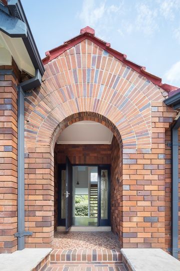
If you've got it, flaunt it. This modest, but well-constructed 1930s bungalow in Sydney certainly had its charms - complete with whimsical herringbone brick gables, a glorious brick sunburst over the door and a touch of Tudor detailing. By accentuating her assets, Tribe Studio made-over House Au Yeung with a series of decorative flourishes...
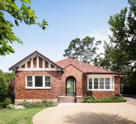
While the brick bungalow had some charming qualities, its siting, planning and energy efficiency left a lot to be desired. The owners asked Tribe Studio to upgrade the house for their young family. "That gave us the opportunity to address the garden more fully, to explore the character of the house and the character of the area, which is predominantly decorated single storey houses in beautiful leafy gardens", the architect explains.
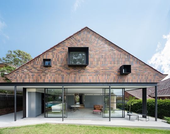
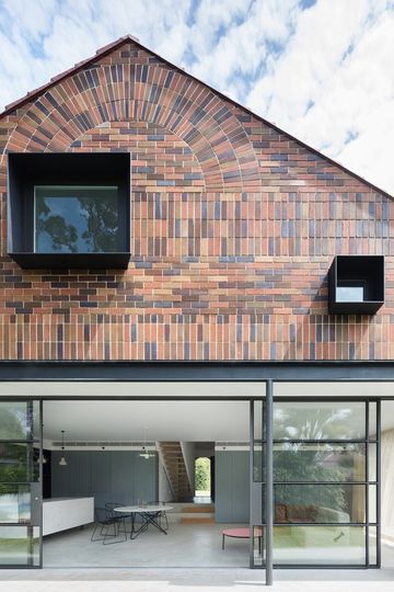
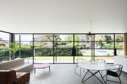
Tribe Studio plays to the house's strengths with a single, beautiful, gesture - to extend the home's roof into a large gable end facing the backyard. From the backyard, the brick gable appears to hover above the living area. Matching the brickwork and designing another sunburst in the brick pattern reflects the front facade, but with a modern freshness. "The rear is treated with as much care, attention and whimsy as the original decorative brickwork front facade". The single gabled roof extends over the new living areas which feel like garden pavilion thanks to steel windows and doors.
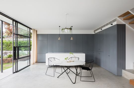
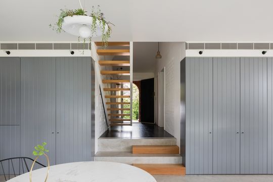
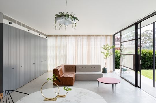
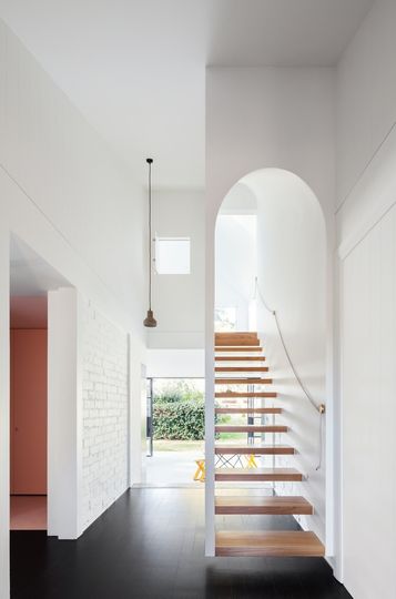
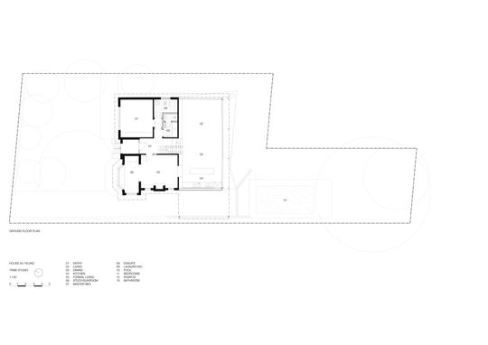
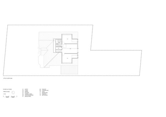
For its size, this home packs a Mayweather punch. Multiple bedrooms, bathrooms and living spaces all fit within what appears to be a single storey home. This helps to match other homes in the area, making it appear like just another house in the garden. The architects actually reduced the home's footprint in the process by utilising the space under the gable for bedrooms and a rumpus room.
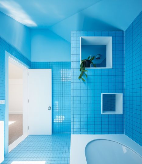
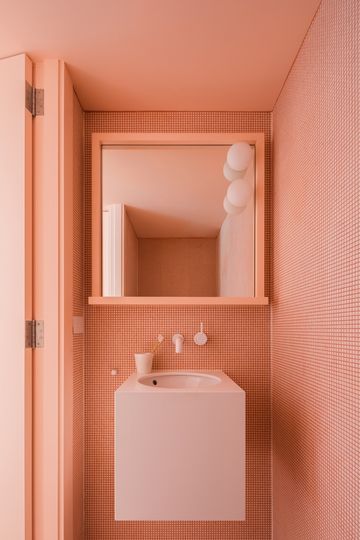
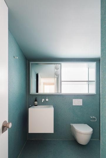
There's no feature wall to be seen in these bathrooms. This, people, is how to use colour. Be bold.
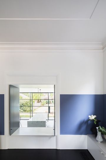
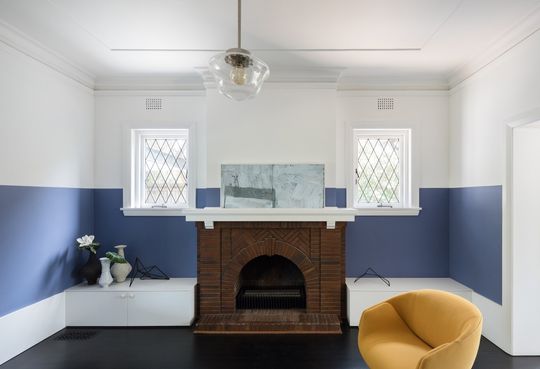
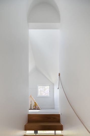
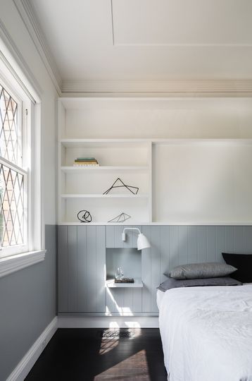
"We honoured the heritage fabric of this house by using a level of quality and detailing in the new back garden elevation. The brick sunburst on the front appears in the new rear elevation, lead light windows to the front morph into steel framed windows at the rear. It is a kind of material palette call and response between the public and private faces of the building." - Tribe Studio
The lesson in all this? Don't tack a soulless box on the back of your house. Don't render over your mottled red bricks. And for the love of Jeebus, don't put a floating floor over your original hardwood. Work with the unique qualities of your existing house to inspire your new extension. You don't need to be a Scandinavian beauty to flaunt the hell out of whatever you've got.
