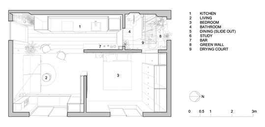
We get excited about the idea of tiny houses while ageing apartments in great inner-city locations languish because it's hard to visualise their potential. Take the classic 1970s walk-up apartments, for example. Often the interiors are tired and depressing with no outdoor space. But, with a little creative thinking, even the most neglected apartments can be transformed into something quite exceptional...
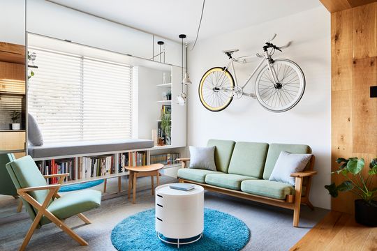
One of 12 apartments in the building, this neglected flat was just 35 square metres, had the standard 2.4-metre ceilings, no outdoor space, the kitchen was no longer functional and as well as an awkward layout, the bathroom was the only room with a north-facing window! While for many this would have been an instant 'no', owner and architect Jack Chen saw only unfulfilled potential (and a creative challenge). And he didn't even need to relocate any structure or services.
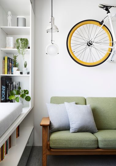
When you're dealing with such a compact space, every design decision has to solve a very specific problem (ideally more than one), so Jack's first response was to access that north light by punching an internal window through the bathroom wall. The window uses an electrically controlled glass which can change from transparent to frosted for privacy at the flick of a switch.
To deal with the lack of outdoor space, Jack created an internal green wall in the bathroom. The green wall is created with a natural lichen which is preserved to create a lush backdrop to pot plants. The effect is a low-maintenance green outlook from the living spaces even though there's no outdoor space.
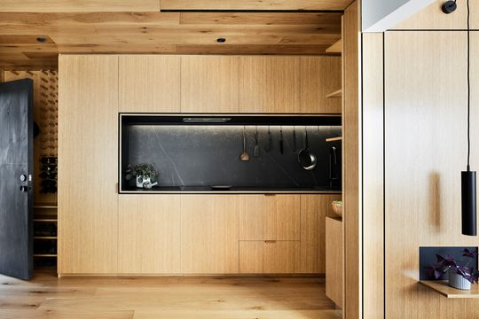
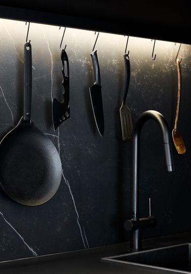
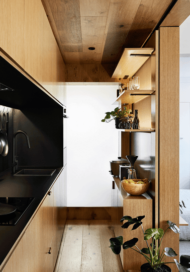
In a compact apartment, you don't expect high-quality finishes or luxury flourishes. But that's exactly what is affordable when you don't have a lot of floor area. Like the 4 metre kitchen. There's plenty of bench space to ensure the kitchen is very functional, but everything can be tucked away behind doors so it never looks cluttered.
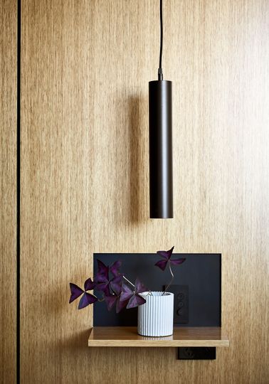
Careful design and detailing of joinery is essential in compact spaces. Jack has nailed that at Types Street Apartment. Mirrored surfaces and skirting board give the illusion of space and shelves which can fold away for a clean finish. There's also plenty of storage to hide necessities when not in use.
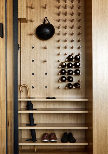
A space at the entry is flexible with shelves and pegs for kicking off shoes, storing wine, and hanging other items like coats or a helmet. There's even a clever hole cut out for a dripping umbrella. Part of the solution to small space living is to have a dedicated space for every necessity, so the home doesn't end up cluttered.
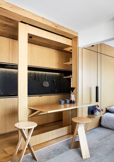
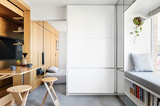
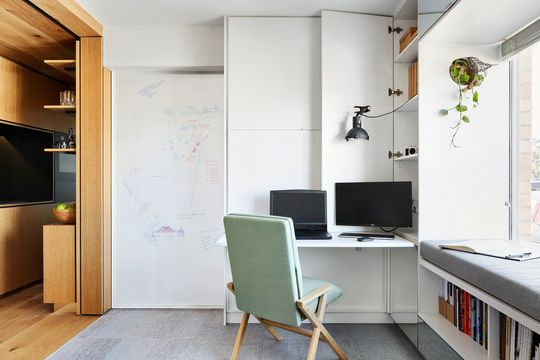
To maximise functionality in the compact space, "layering and overlapping are the key", says Jack. The perfect example of this is the dining area which slides out of the wall and then unfolds to create a table fit for a dinner party. When it's not needed, the dining table simply packs up and slides back into the wall to create more space. There's also the window seat on top of a bookshelf. And the home office which folds out of a cupboard (complete with whiteboard surface on the bedroom's sliding door).
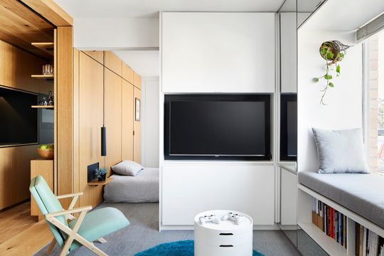
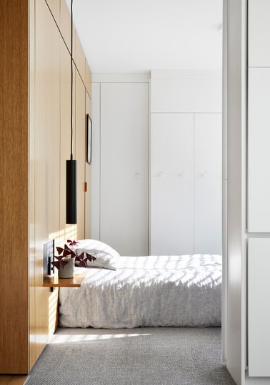
A simple palette of white and timber helps the apartment feel cohesive and warm. Where there's timber, every surface is covered in timber, making it feel like a timber box has been inserted into the apartment. Similarly, the white wraps around all surfaces, to enhance the sense of space.
Clever design is the solution to ageing, poorly planned apartments which dot our inner-city. These spaces can be given a much-needed upgrade to extend their life and improve their livability. Let's hope the tiny house movement can move into existing apartments to reinvigorate these under-performing buildings.
