Nature's Staring Role
A single tea tree on the site of this beach house became the focus of the project. The aim became to showcase nature, rather than try to dominate and control it.
Sloping sites and tight budgets are a common combination for beach houses. If it's a second home, expenses do need to be spared. And coastal terrain is notoriously sandy and undulating.
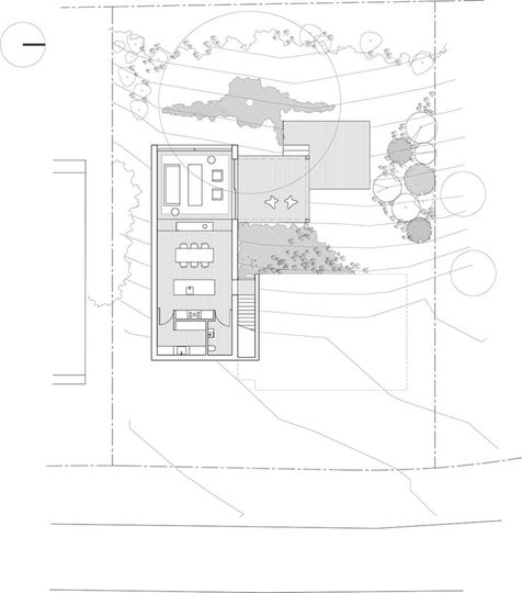
Both of these issues were tackled with a house that is at one with nature, following the slope down the site.
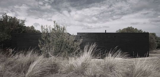
Camouflaging
From the outside this is a humble home -- an unassuming black facade is all that greets visitors. The choice of black works well to blend the home into the shadows and highlights the greens and grays of the surrounding native grasses and trees.
The facade is punctured to indicate the entrance -- a subtle cue for guests.
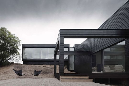
Softening Grasses
What is now an exposed dune will be planted with native grasses to soften the house's transition down the slope. It will also provide a habitat for birds and lizards -- bringing nature within reaching distance of the outdoor areas.
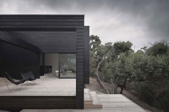
Nestled into the Dunes
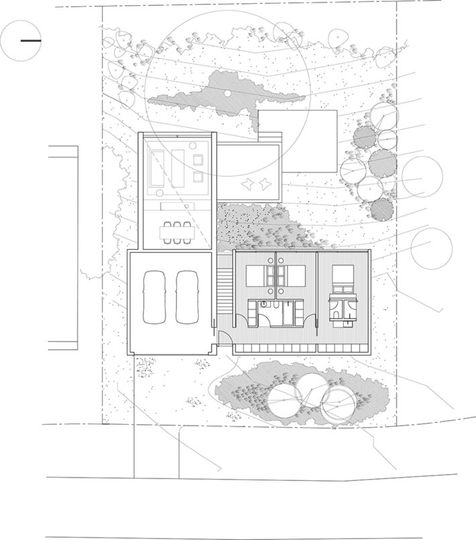
Neighboring homes are built on podiums above the dunes, with outdoor areas left exposed high above ground level. Ridge Road Residence challenges this typology by nestling into the dunes.
The result is a series of opportunities to connect with the landscape as the house cascades and unfolds down the slope. It also means outdoor areas are sheltered from overlooking and prevailing winds.
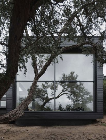
Sculptural Tea Tree
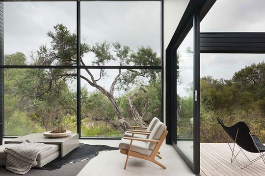
The lone tea tree on the site becomes the focus. The house is designed to frame this sculptural, twisting form and connect with it by making it the centerpiece.
Framing the View
Like a living painting, the double-height picture-frame window perfectly captures the view. A minimal, neutral interior allows the landscape to pop.
Sight-lines
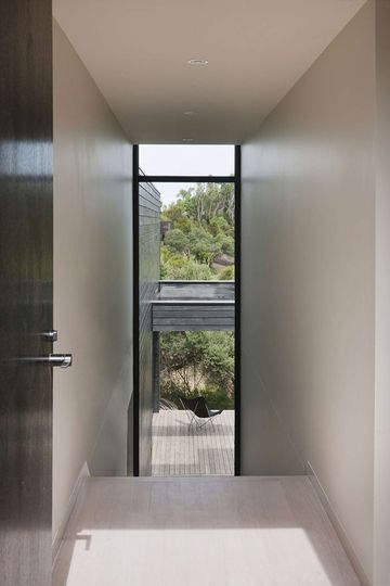
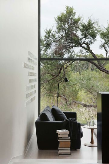
Sight-lines like this from the front entry ensure that the occupants always feel connected with nature -- after all, it's the beach they've come to enjoy.
Kitchen Wall
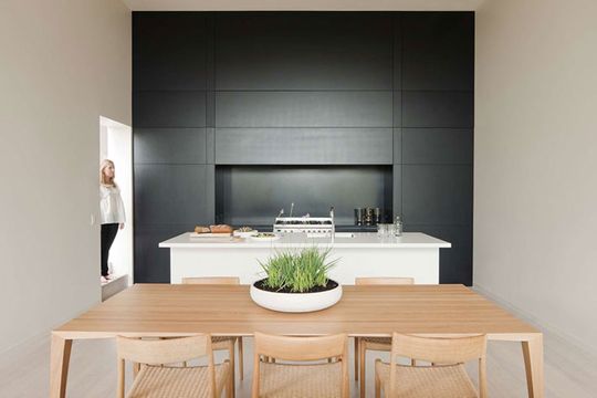
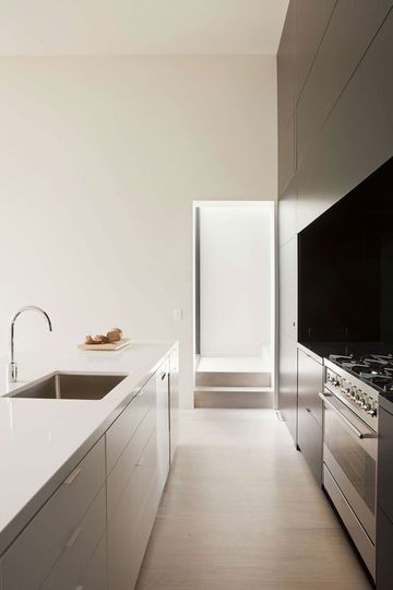
A stunning, matte-black kitchen wall is a dramatic full-stop for the open-plan living area. Despite the common perception that black makes a space feel smaller, used in this way, the dark wall makes the kitchen recede. As a result the whole area feels more spacious.
Fireplace Divider
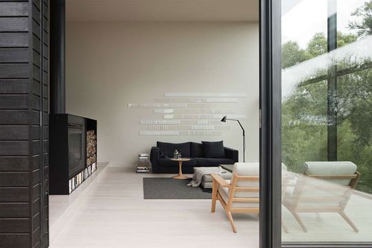
The large fireplace and built-in storage act as a divider for the large open-plan living area. While the spaces are still physically and visually connected, the lounge area feels much more cozy and intimate thanks to this partial separation.
Sometimes Good Design is Black and White
Good design can be subjective and open to debate. In this case, a monochrome home set against the stunning hues of nature proves that (sometimes) good design is black and white.