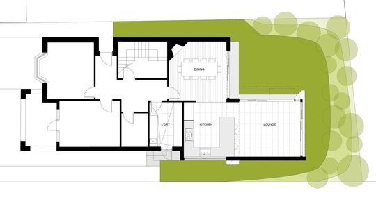
Often it's the designs that speak softly and carefully which stand out the most, as is the case with the delightful Randwick Pavilion, designed by MaSQ Architecture to sit serenely in the garden, connecting indoors and outdoors...
"Our inspiration for the project lay in the established backyard which sat sunken down slightly from the surroundings", explain MaSQ Architecture. "The brief was to add a new living room space, kitchen and accompanying dining room."
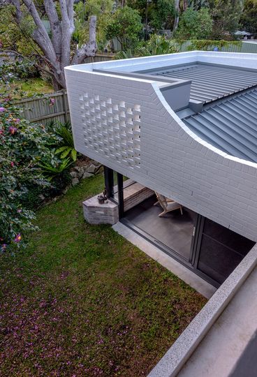
The architects created a living room pavilion, surrounded by garden on three sides. But as much as the living room connects with the garden, it also feels enclosed and protected. This idea relates to an architectural theory known as prospect and refuge. We feel most comfortable when we have both a distant view and the feeling of protection. You can imagine how early humans might have looked for a refuge where they felt safe, like a cave, yet also had a view to see if any danger was approaching. As it turns out, modern humans have that same need, so incorporating these ideas into our homes creates a sense of well-being that isn't necessarily obvious, but makes us feel instantly at ease.
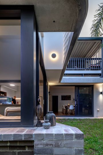
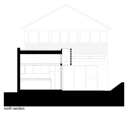
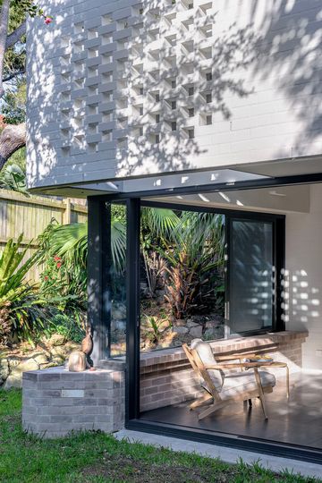
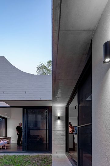
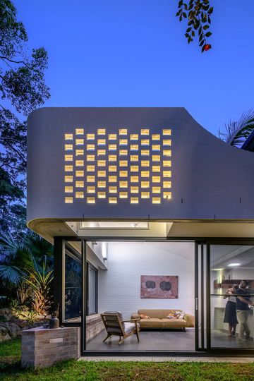
"We saw [the pavilion] as an enclosed and protected space as much as it needed to be connected to the garden. We created a brick wall that enveloped the upper level which was then suspended above glass doors and windows below." - MaSQ Architecture
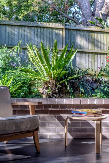
A low-level brick ledge on the northern wall of the living area creates a seat straddling indoors and outdoors. This is the opposite to the way many architects connect indoors and outdoors - with full height glazing - but as the architects explain, "with the windows fully open the space dissolves while the mass of the brick wall above provides intimacy and controls light into the space."
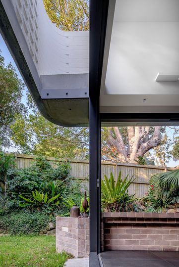
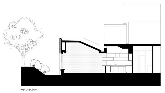
The architects also avoided using a clerestory window in this living space, preferring instead to create a sense of intimacy. The solid wall rounds the corner and then peels away to become a brick screen which helps to protect the west-facing glazing. This also helps the wall to feel lighter, more like a veil than a heavy brick wall.
"Considered as a space that inhabits both inside and outside, the pavilion can be both a place of open interaction or one of repose and protection." - MaSQ Architecture
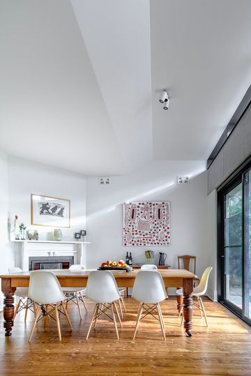
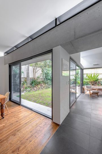
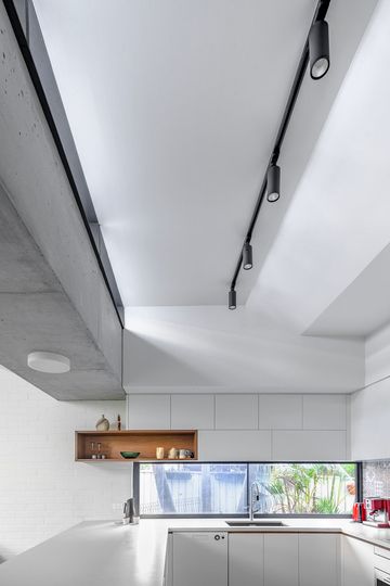
An off-form concrete box gutter hovers over the threshold between the living pavilion and the kitchen, helping to give the two spaces a sense of separation and a unique character without physically separating them. Above the gutter, a narrow slotted window brings light deep into this space and creates a stunning light effect on the ceiling. It also provides a green outlook from the kitchen.
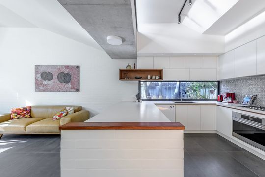
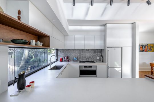
In keeping with the budget and the concept of letting the design speak softly, the material palette is restrained. "Natural and white painted brickwork, dark granite floors and off-form concrete, reflect a simple and honest application of the materials integral to the ideas behind the project."
This project has a much larger impact on this home than its simplicity may suggest. A relatively modest addition has expanded the home to utilise the entire site, connecting it visually and physically to the backyard. Often we don't need as much space as we think, provided we have a sense of prospect and refuge, we'll feel content with much less.
