When you've got a generous backyard, you want to be close to the action, not half a storey above! That was the problem with Nat's House, a 1920s home which was both dark and, with a poorly considered lean-to addition, disconnected from the garden. Studio Prineas got to work with a light-filled addition which is on the level (of the backyard)...
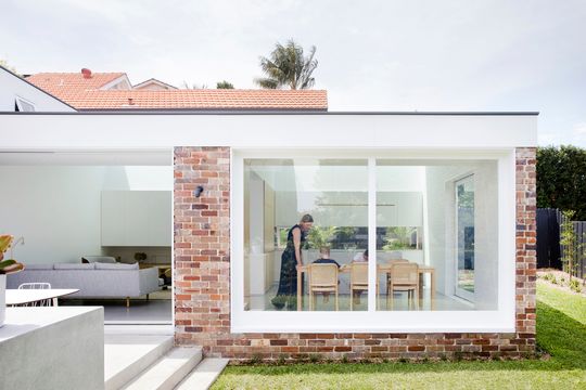
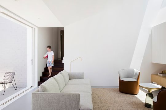
The original addition matched the floor level of the original home, so as block sloped away to the rear, the addition ended up several steps above the yard. By removing this addition and planning a new bathroom and laundry on the original level, stepping down into two defined spaces for living and cooking/eating, Studio Prineas was able to create an effortless flow between inside and out.
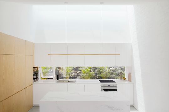
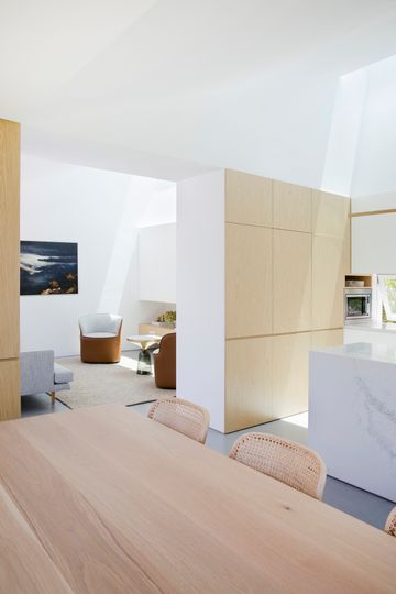
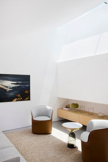
The other advantage of the lowered living areas was the opportunity for higher ceilings, creating lofty spaces. Combined with a full-length skylight along the northern side, these new spaces are filled with natural light throughout the day.
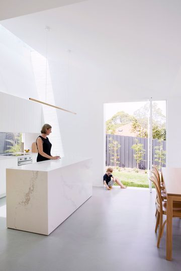
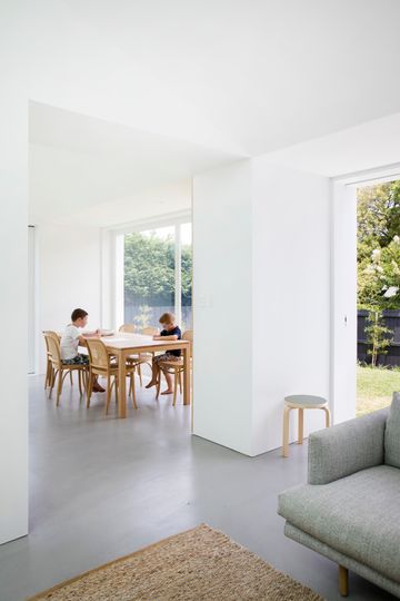
Because the addition hugs the northern boundary, its roof is designed to slope down to the south to maximise light in the garden. This has the added benefit of creating a dramatic raked ceiling in the living areas.
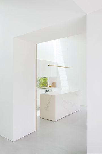
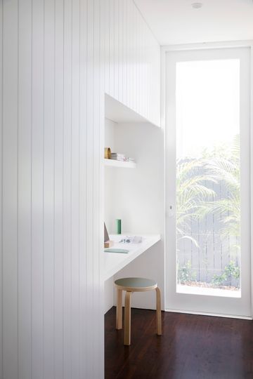
Built from recycled brick, the addition feels solid, grounded to the site. It also feels connected to the original home. Inside, textural white and grey bounce light around and add a third dimension to surfaces ensuring the home doesn't feel stark. Grooved joinery sits next to the stone and Pandomo floor, giving a surprising richness. The white scheme is picked up again outside, speckled throughout the recycled brick.
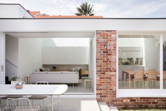
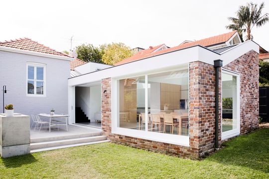
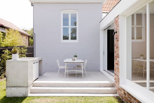
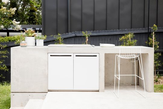
The living area opens onto a BBQ terrace via a sliding glass door which disappears into the wall, creating a full-width opening.
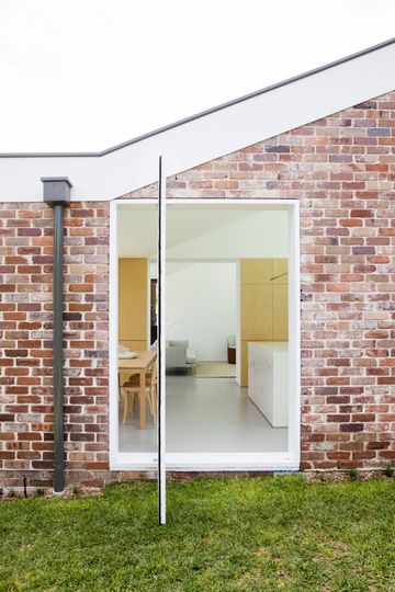
A pivoting window from the dining area is perfect for cross-flow ventilation, but can also double as a door to the backyard, creating even more options for accessing the garden.
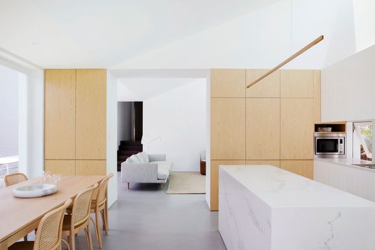
While the skylight means artificial lighting is rarely required during the day, careful attention has also been paid here. At night, LED lights hidden in the joinery illuminate the wall and raking ceiling to create a beautiful (and flattering) indirect lighting effect.
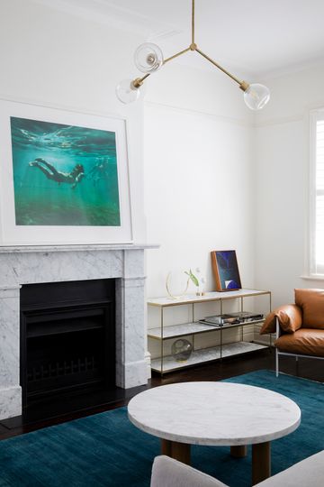
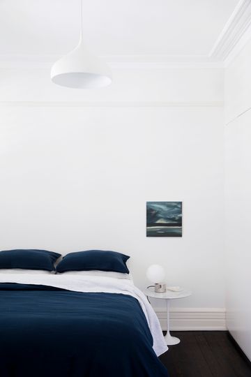
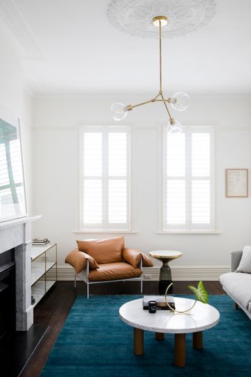
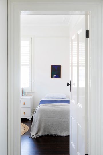
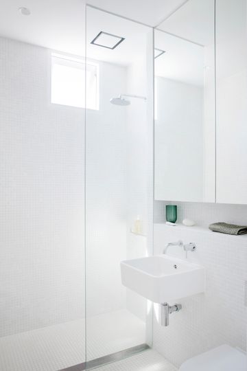
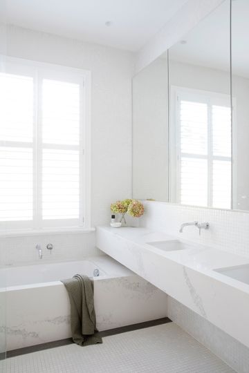
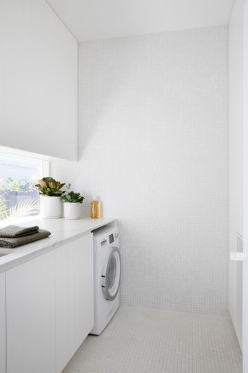
This home now enjoys a strong connection to the garden and is bathed in natural light thanks to a thoughtful addition. The careful connection to the garden enlarges the home, both visually and spatially, allowing the owners to use their whole site to its fullest.
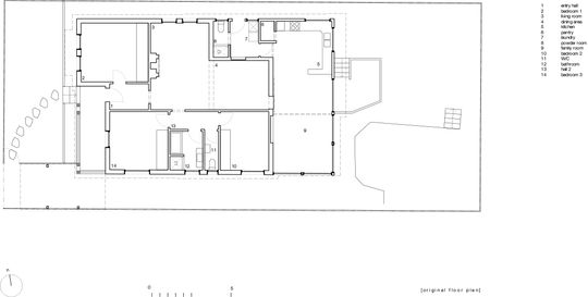
Original Floor Plan
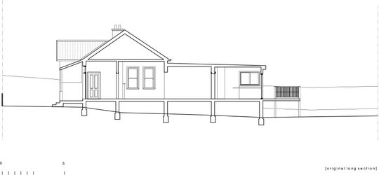
Original Section
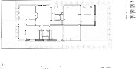
New Floor Plan
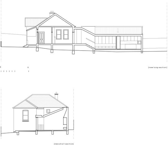
New Section