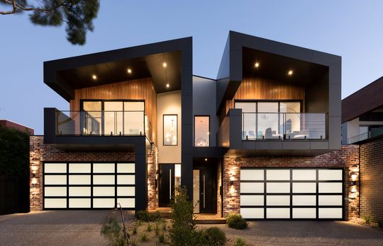
When a builder came to Little Brick Studio to design a high-quality dual-occupancy in Mornington, they jumped at the chance. "We work so hard on our designs and can sometimes be disappointed if the project doesn't get built, or we lose touch when the client chooses a builder we don't know personally," explains Amy Hart from Little Brick Studio, "So, on a project like this where the client and builder are one, it’s wonderful to see our designs come to life as they should - sometimes even better!"
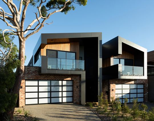
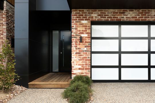
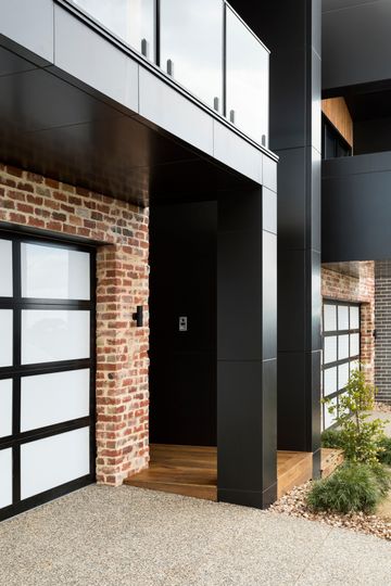
It's not often we feature dual-occupancy projects here on Lunchbox Architect and, to be honest, that's because they often don't meet the same levels of quality as this project; build to sell, not built for living. "While there are numerous duplex developments going on in the surrounding area," adds Amy, "much of it is stock standard, mirror image, pitched roof, conventional housing – a format we didn’t want to follow."
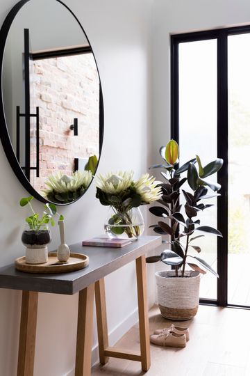
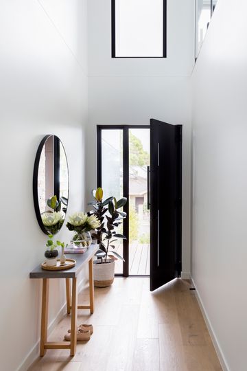
Little Brick Studio divided the generous block down the middle, creating enough space for two generous homes. One was to be a family home for the clients, the other for future sale so needed to be 'investor friendly' in both budget and style.
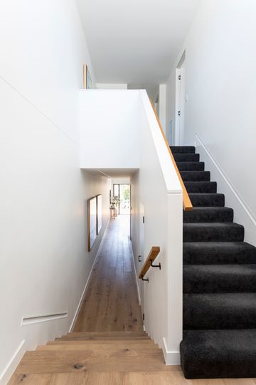
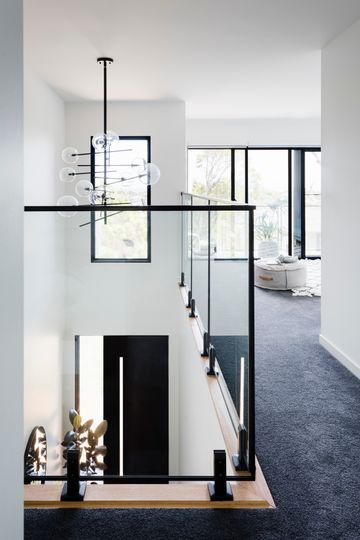
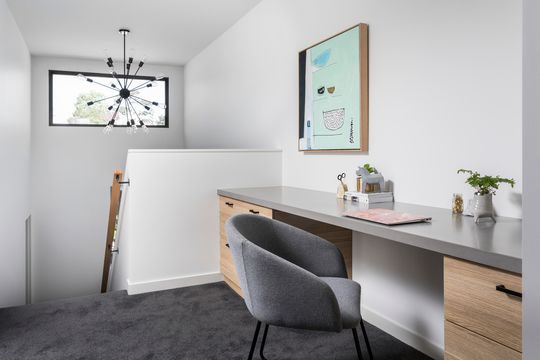
"We wanted the dwellings to have a sense of individuality whilst maintaining a consistent design theme throughout the development", says Amy. Therefore, while they look similar from the outside, each home has its own unique style and character.
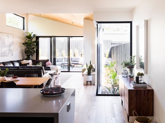
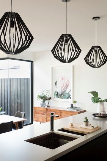
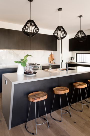
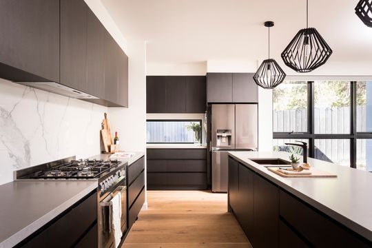
The building designers ensured the two floorplans responded to the site, surrounds, existing vegetation and bay views in the distance. The ground floor of both homes steps down in the middle, to account for a slope over the site. By keeping the second level towards the front of the homes, the step helps to create more generous volumes in the living areas, without creating unnecessary height which would impact on the neighbours.
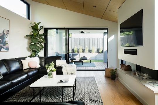
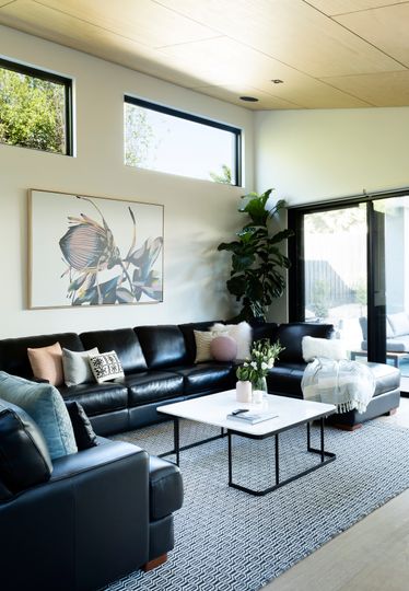
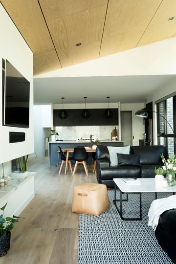
The two homes break away from their party wall to create a light court next to the living areas, ensuring plenty of natural light in these important spaces in spite of a challenging orientation. The other benefit of keeping the bulk of the second story towards the front was the ability to create raked ceilings and highlight windows in the living areas for even more light.
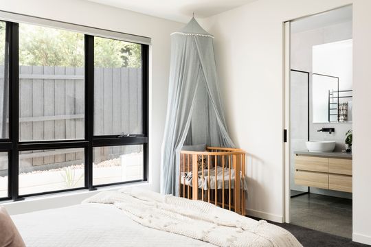
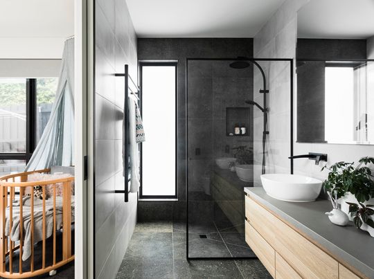
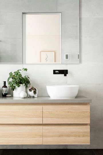
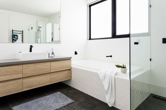
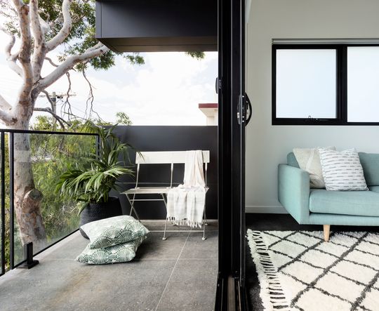
Contrasts in texture, quality products left in their raw state and a considered plan which prioritises light have created two homes that stand out from the budget-driven duplex developments we're used to seeing. This project demonstrates the potential of this type of development to achieve budget requirements while also creating homes, not just for 'the market', but for living.
