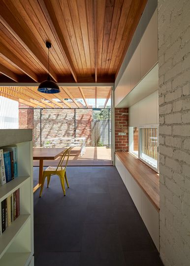
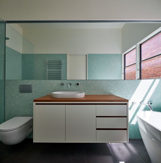
A series of courtyards weave this modern extension into the original home. A sensitive departure from the typical add-on by Architecture Architecture...
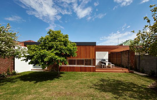
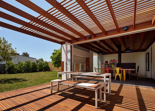
The scattered and irregular gables of this Federation house, while absent from the contemporary extension, are suggestive of the casual arrangement of courtyards that now enliven the dwelling within. Much like these gables, variation in the scale and orientation of the new outdoor spaces lend a playful dynamism to the renovated house.
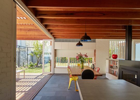
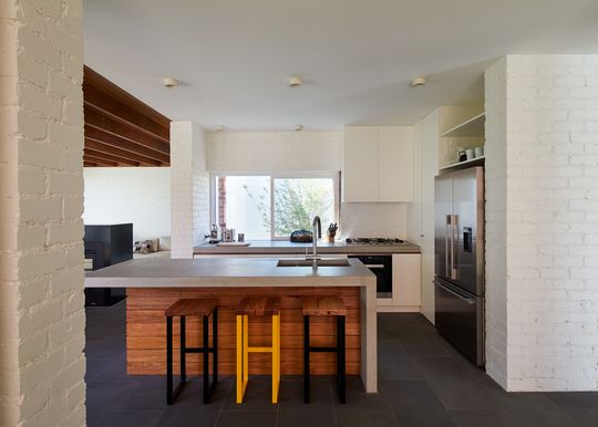
From the moment of entry, views shift and redirect between the courtyards, light-wells, decks and gardens. Natural light washes the internal space from all directions, encouraging exploration of the various living areas and retreats.
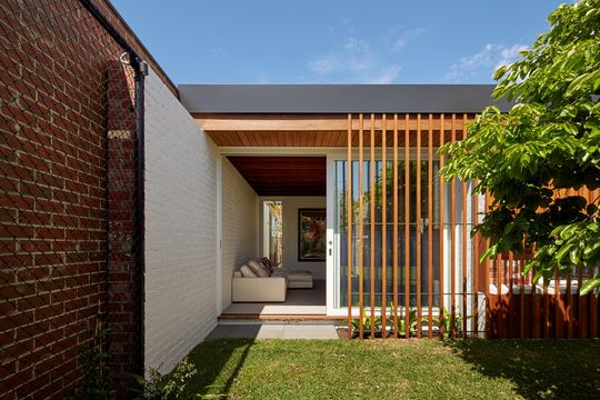
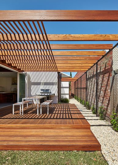
While loosely open-plan, each room is anchored and defined by its unique outlook. The courtyards extend the interior spaces, encouraging time spent outdoors as well as providing excellent solar access and passive ventilation. The ever-shifting light and views create a subtle labyrinthine quality, fluidly expanding the sense of spaciousness throughout the house.
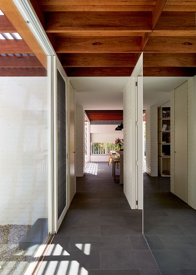
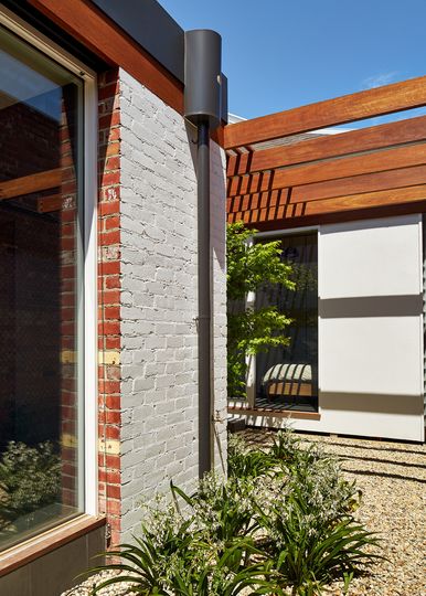
A simple, robust material palate of sustainably sourced timbers, stone and recycled brick weaves its way throughout, visually connecting the indoor and outdoor areas. Much like the house opens and closes to its surrounds, materials are revealed and concealed, betraying the structural and spatial logic of the renovations.
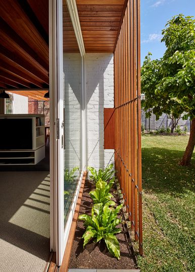
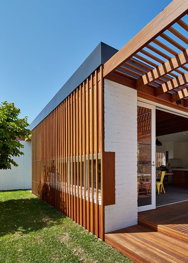
At key moments, the white-washed walls are left unpainted to reveal their red-brick origins; timber rafters are exposed and then concealed again, marking the transition between living areas; timber screens temper light and shade, then stop short, opening up to sky and garden.
