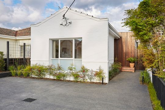
Malvern House by Jost Architects is the renovation of a small, inter-war semi-detached house. Retaining its serious face out the front, it's a whole other story out the back...
The original house had a Heritage B grading from the local council and yet appeared to have very few significant features or attributes. From the outset, this posed challenges to achieving the client’s enthusiastic brief.
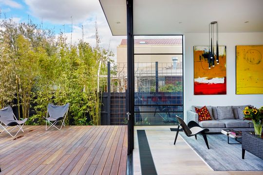
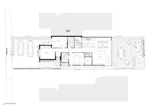
The planning restraints meant that the option of a two level rear extension was not achievable and the client’s brief had to be slightly condensed and adapted, yet still attain the functional necessities they required – master bedroom with ensuite and walk in robe, second bedroom, office, bathroom, separate laundry, kitchen with walk in pantry and a spacious open plan living and dining area.
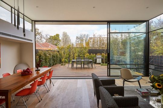
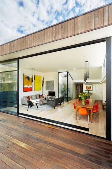
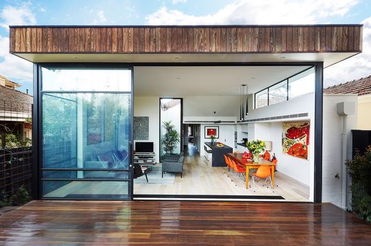
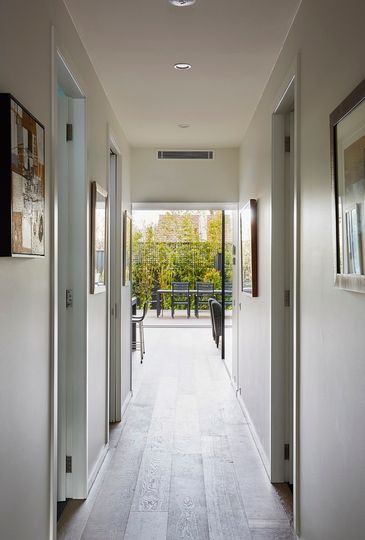
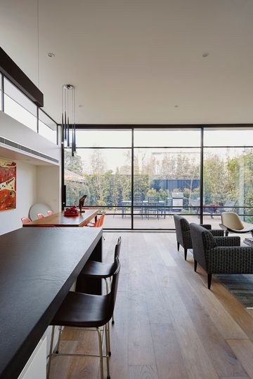
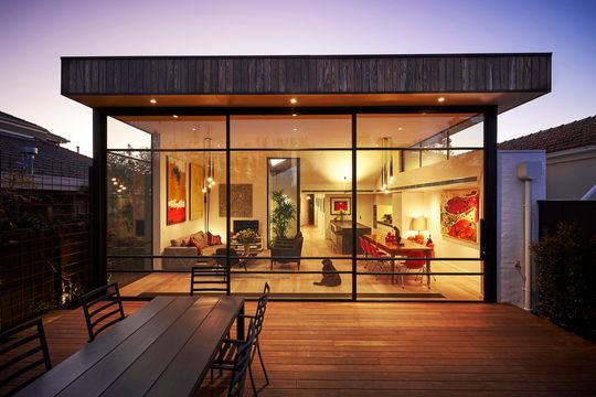
A 1980s alteration and addition was removed and replaced by a more open modern extension. One item which was imperative to the client’s brief was the view to the back garden. With a higher than usual ceiling and double stacking, glazed steel framed sliding doors, an unimpeded view was achieved. It looks like there is nothing beyond the hallway when looking from the entry with these doors open.
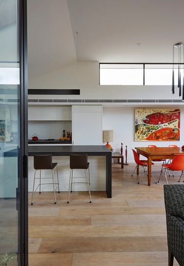
An internal courtyard provides a peaceful point of interest to the kitchen area as well as enabling cross ventilation to a room which can often end up hot and stuffy.
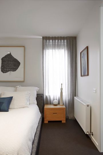
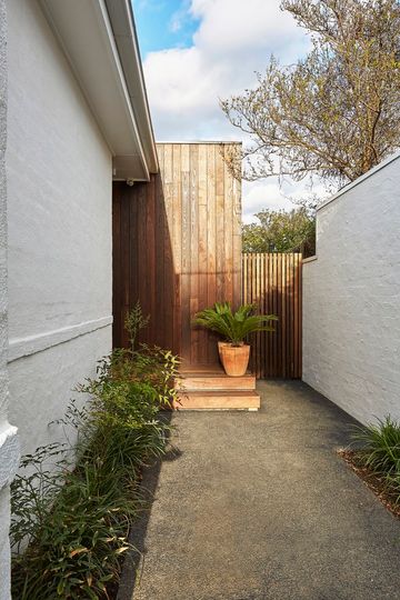
The entry and beginning of the new area of the dwelling is unassuming, satisfying the heritage requirements through being recessed from the front facade. Yet a new dark burnt ash timber wall clearly defines the location of the entrance. This contrasts the continuation of the existing white cement bagged brickwork finish to the front facade.
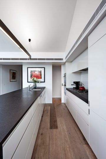
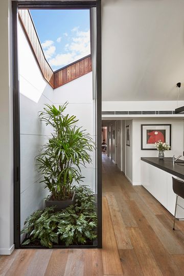
The plan is traditional with rooms accessible from a central corridor leading into the rear dining and living area where the ceiling rakes up to a substantial height. This creates an impressive space in an otherwise modestly sized area complimented by highlight windows providing controlled northern sunlight. The double stacking, full-height doors connect the space to the spotted gum deck and dense, established perimeter landscaping.
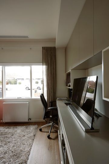
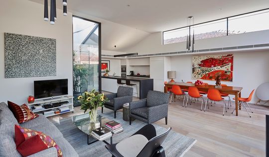
The interior finishes draw on the individual textures of the materials employed. The detail is careful and clean but controlled to sit within the budget. The detailing was also very important to both clients. One client in particular was very precise and thorough in reviewing and understanding every aspect of the project, an attribute he had acquired from a previous career that required enormous attention to detail. This kept everyone involved on their toes!
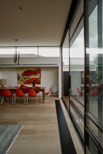
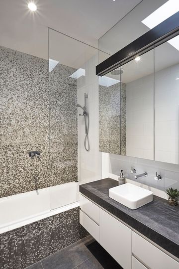
Sustainable applications included long-lasting and durable materials such as engineered timber flooring, thermally modified timber cladding, the use of zoned hydronic heating and double glazed steel windows and sliding doors. Also, the co-ordination of architectural design and structure favouring timber but at the end of the day, in terms of sustainability, the sensible application of good thermally passive design provides for comfortable living.
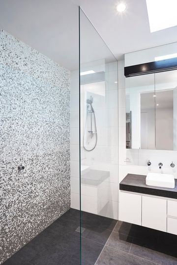
The clients love the result and it's impressive that the architect have balanced the needs of heritage controls with the desires of the client. It does, however, beg the question how broad should heritage controls be? Should we be preserving buildings with little heritage significance for nostalgia's sake, or should we be more open to creative modern approaches?
