We have a bit of an obsession with large, open-plan spaces, don't we? Don't get me wrong, open-plan living areas can feel spacious and free. But they can also be cavernous and noisy - especially in family homes. You might have experienced attempting to chat on the phone to your BBF while one child is watching TV and the other is practicing her recorder (bless her). This scenario in an open-plan space equals chaos. In designing Irwin in East Fremantle, MSG Architecture recognised the problems with open-plan living and, instead, designed a seperate break-out space for the family. The breakout space plus master bedroom suite is housed within a large white box, which effectively 'plugs' into the side of the existing family home, creating a separate space for recorder practice and a bit of room to breathe for this family...
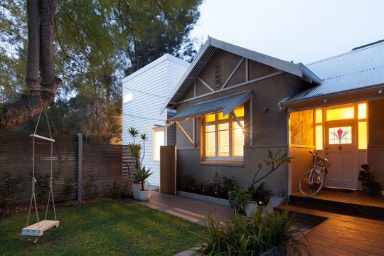
The new white box for living occupies the space of a previous garage. By moving the living area out of the existing home and into a new, dedicated space, the architects have dealt with the problems of open-plan living and created a generous kitchen and dining area big enough for the family and guests.
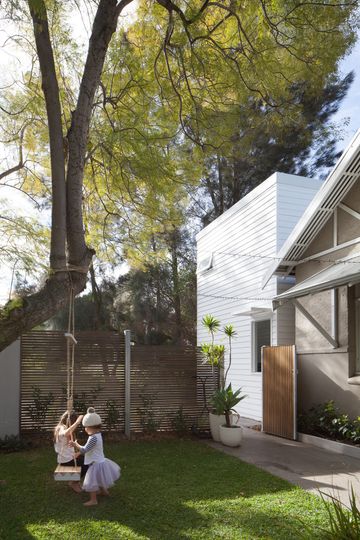
With some clever reshuffling of the spaces within the original home, there is now a logical flow between new and old. The kitchen and dining area is connected to the new lounge via a generous hall and through an existing opening. The hall is wide enough that it can also be used as a study. The two children's bedrooms are accessed off the hall, meaning this space can also act as a breakout space for the children.
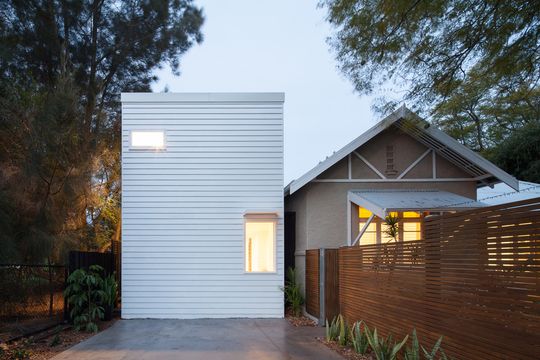
Crafted from simple, minimal materials, the new all-white addition is elegant and relates well to the existing home. Box-like and clad in weatherboards, the addition contrasts with the original rendered home, but timber details on the original are picked out in matching white to demonstrate the connection between old and new.
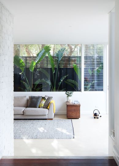
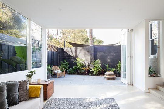
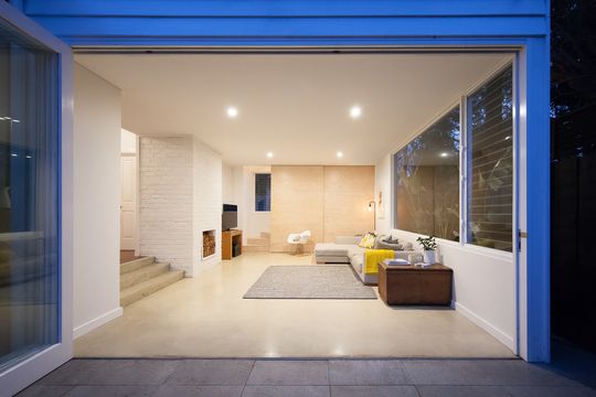
Strategic window placement opens up the addition to the most flattering outlooks, while the whole rear wall bi-folds away to dissolve into a refined courtyard space. As a result the living area feels bright and airy - and much larger than its compact footprint.
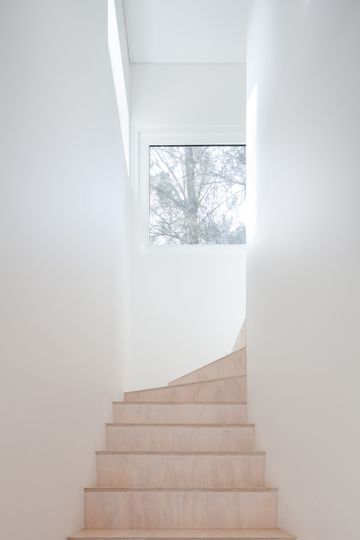
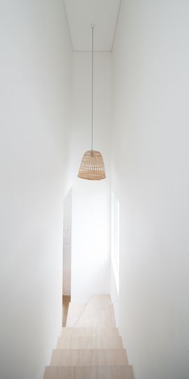
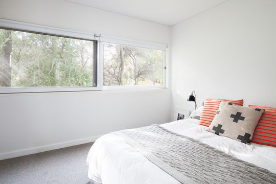
Upstairs the master bedroom enjoys separation from the rest of the home to feel more like a retreat. With narrow views to the surrounding treetops, this space feels secluded like a private treehouse.
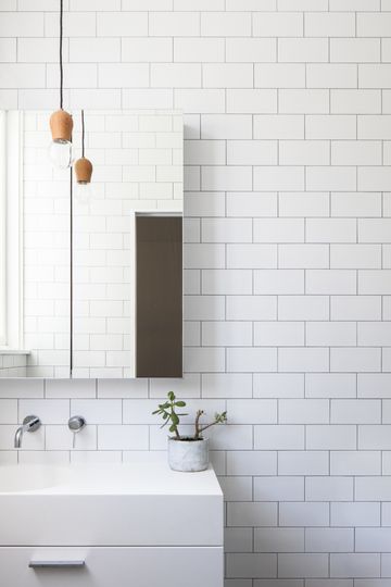
Rather than follow the common path of creating an open-plan kitchen, living and dining space, MSG Architecture have anticipated the challenges of family life - in all its messy, noisy, chaotic glory. By creating a seperate lounge and master bedroom space, still well-connected to the existing home, the architects have created a flexible and functional home. And by choosing the best outlooks and enhancing the connection to the outdoors with bi-fold doors, this compact addition feels much more spacious and generous than the reality.
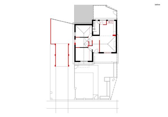
Existing Floor Plan (Red indicates demolition)
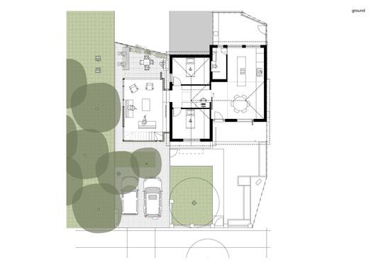
Ground Floor Plan
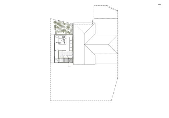
First Floor Plan