To Face the View or Face The Garden?
When you can't choose between taking advantage of stunning Sydney Harbor views and north light in one direction and an existing pool and garden in the other, what do you do?
House Chapple is a 1920s federation-style house that has been in the same family since the 1960s. The client wanted to retain some of the history and sentimentality of her house, while also updating it for modern life. And with views to capitalize in two opposite directions, it seemed she would be left with a difficult decision…
But, Tribe Studio's design carefully carved out the middle of the house to create a modern, open-plan space and get the best of both worlds (views)…
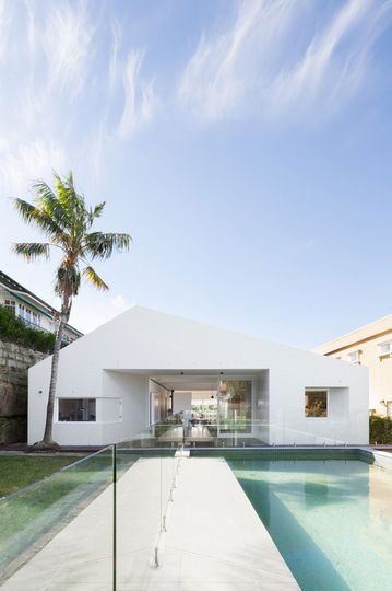
Minimalist Facade: A minimalist white facade compliments a pool in the backyard of House Chapple.
Dealing with an Unfavorable Extension
The existing house is a 1920s era home which had an unfavorable 1960s extension. Tribe Studio's approach was to leave the original 1920s facade untouched, and replace the 1960s extension with new works to the rear.
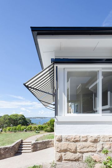
Sixties Retro: Fabric awnings on the windows of House Chapple hark back to the '60s -- an era the client wanted to celebrate.
An Elegant but Humble Home in Mosman
Part of the design philosophy of Chapple House was to capture the elegance of the original 1920s home and reinterpret that style in the new extension. An important aspect of the brief for the client was to retain the romantic elements of the home, and its sense of humility -- a contrast to other homes in an increasingly flashy Mosman.
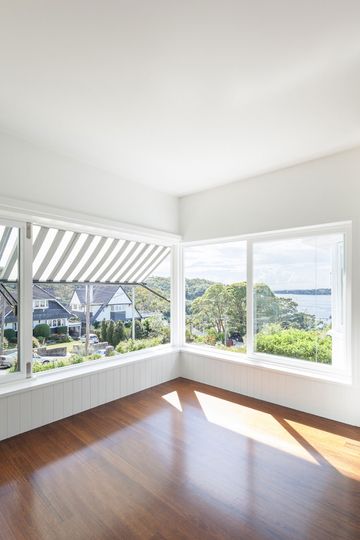
Let the sun shine in: Sun pours into the house from the sun room which also has stunning views of Sydney Harbor.
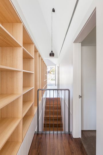
Minimal and Light: Timber shelving and minimalist details keep the interior of House Chapple minimal and light.
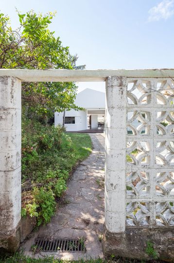
A house in the family for years: From the rear entry of House Chapple, the original concrete breeze block wall remains -- a reminder from the era when this family first moved in.
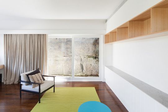
Defining Style: Built in storage, retro furniture and colors inspired by limestone in the area define the style of House Chapple.
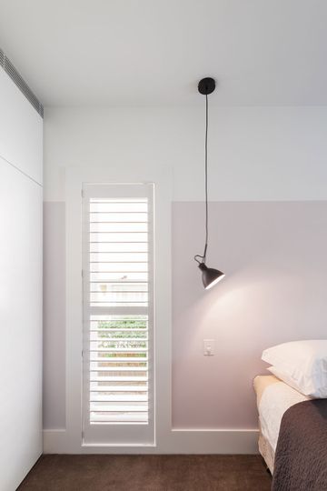
Inspired Lighting: A simple reading lamp hangs from the ceiling in the bedroom -- a fun choice of lighting.
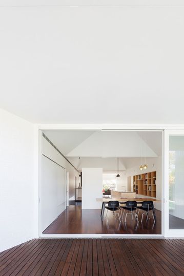
Opening Up: The center of House Chapple has been opened up to create lines of site from the harbor to the garden.
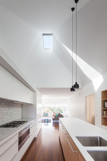
Sculptural Ceiling: A sculpted ceiling is highlighted by a single north facing skylight which lets light deep into House Chapple.
Sculpted Ceiling
After creating an open plan space in the center of the house, it was important to funnel light into this area. Sculpted, pyramid-shaped voids in the ceiling with skylights at the top solves this problem with dramatic flair. The sculpted ceiling lets in light and creates a stack effect to promote ventilation in the home.
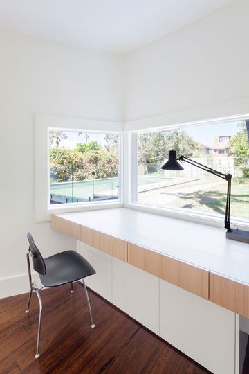
Study Time: A built in desk in House Chapple's studio overlooks the garden and pool.
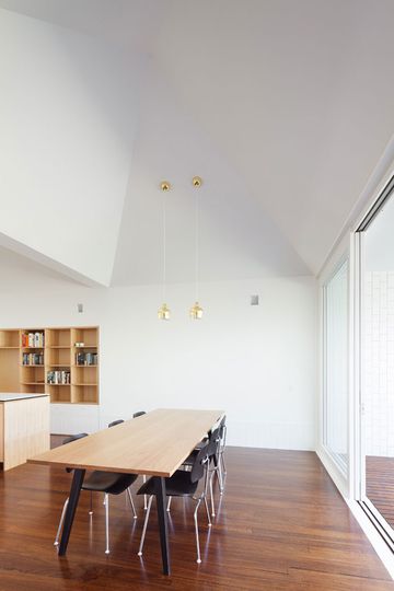
Show Stoppers: Timber floorboards and sculpted ceiling are the show stoppers in House Chapple's dining area.
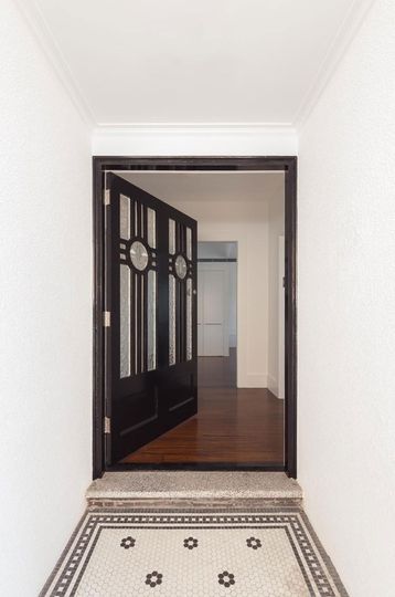
Original Details: The original 1920s front of House Chapple has been maintained, including this gorgeous door and entry tiling.
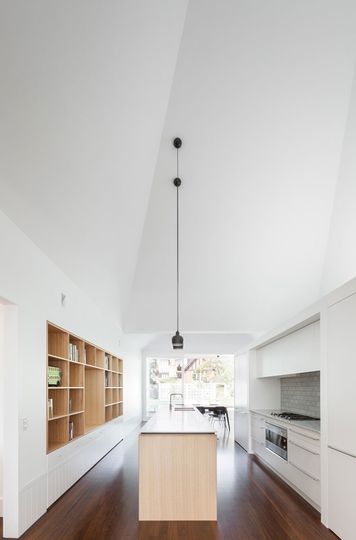
Lines of Sight: Generous lines of sight through House Chapple make the home feel spacious and light.
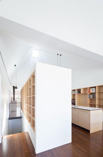
Storage Aplenty: House Chapple features built in storage throughout to make the most of the space.
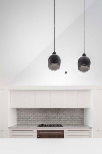
Texture Making: House Chapple's white kitchen has a textured dove gray tile splash back to inject texture and variety.
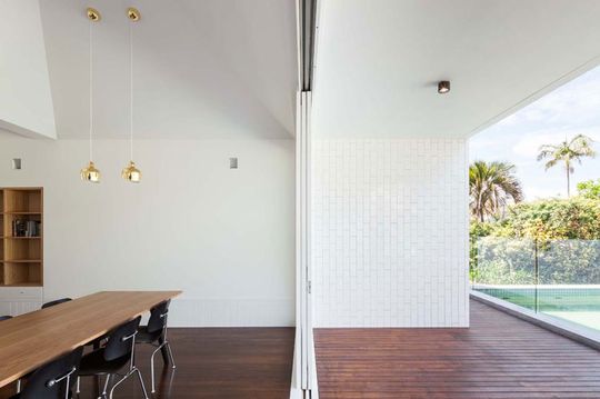
Transitioning: A seamless transition from the dining area to the deck area is created by using matching materials inside and out and a huge sliding glass door.
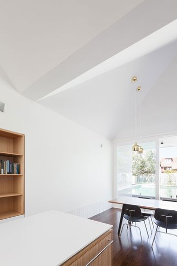
Defining Space: The ceiling folds and bends overhead to define the various spaces in the open plan living area
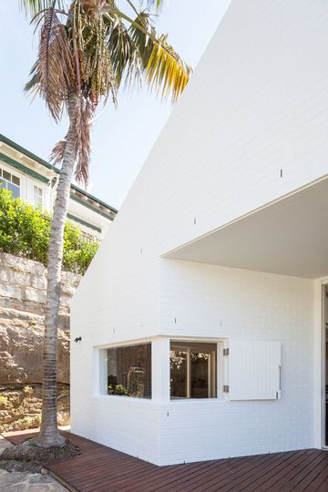
Painted Brick: Outside, House Chapple's painted white brick matches the original, while also creating a sense of retro glamor.
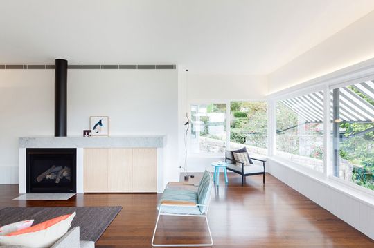
Sunroom: House Chapple's lounge area enjoys plenty of sunlight thanks to the original wrap around glass
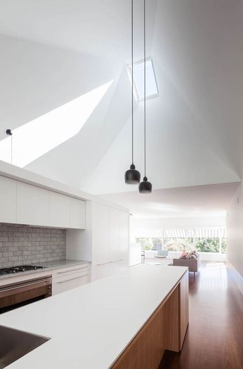
Bouncing Light: House Chapple's north facing skylight over the kitchen lets the sun in, which is then bounced around the pyramid-shaped ceiling
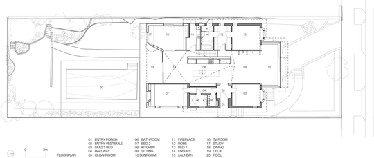
Plan: The plan of Chapple House shows the central part of the house which has been opened up to access views and light from front to back
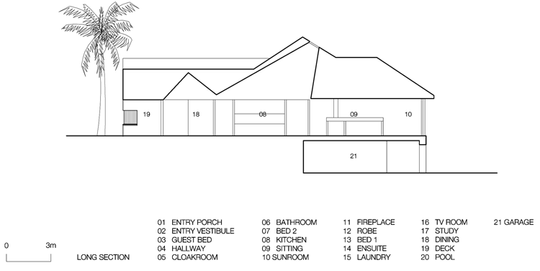
Section: In the section of Chapple House you can see the sculpted ceiling in the kitchen and over the dining area
Modest Extension, Massive Gains
For what is ultimately a modest extension, House Chapple has gained a lot. By opening up the central part of the house, and leaving more private rooms around the outer edge, the house now has access to views, light and garden access from the one space. This new, open-plan living area feels light and plight thanks to the dramatic sculptural ceiling which works hard -- letting in light, ventilating the space, defining zones of living and, of course, looking great to boot.
It just goes to show that even simple ideas, well executed, can transform spaces. For a modest extension, this house is enjoying massive gains to the quality of life for its owner. Thanks to this thoughtful alteration and addition, perhaps this family can now enjoy living in this stunning part of Sydney for another 50 years…