Houses are often described as welcoming, or friendly, but very rarely to they actively greet you with a cheery 'Hello'! Then there's Hello House in Richmond, Melbourne — designed by OOF! Architects. Rather than leaving a blank boring facade on the long side of this corner block, the architects have inscribed the word 'HELLO' to surprise and delight passers-by as they round the corner. Don't worry though, this isn't a cheap gimmick designed to disguise a stock-standard extension. Hello House is a creative, but cost-effective renovation which proves it's just as friendly inside as out…
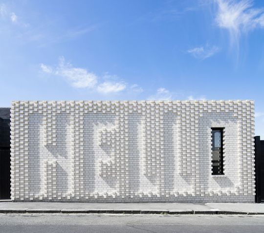
HELLO!
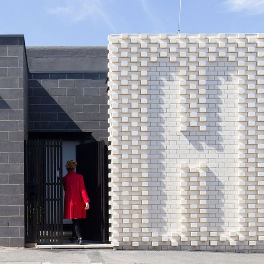
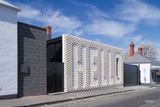
The Hello House is a two-bedroom Victorian-era home and creative studio. Of course it's hard to miss the most unique aspect of the home — the word 'HELLO' is emblazoned across its new white brick facade to greet the neighbourhood.
Existing Building
The existing building, like many single-storey Victorian houses, had what many would now consider a 'back-to-front' layout, with the bathroom and laundry at the rear of the property that made the back garden inaccessible to the living areas. It also meant that light and air didn't penetrate into the centre of the home, making it dark and uninviting. The front of the house was originally a shopfront – although there had been many incarnations since – with large windows facing directly onto the street.
Making Conversation
Many renovated Victorian homes follow a standard format — an inward looking home with a modern extension to the rear. The Hello House could have been one of these typical extensions, but luckily the clients were interested in exploring the idea that their project should be more than just a private home. The clients were trusting, passionate, creative and fun. They are people who are interested in ideas, but not 'bling'.
Architects often talk about how a design relates to its neighbourhood, or the 'conversation' it makes with its surroundings. In this case, Hello House literally starts a conversation with the cafe-goers across the road.
"Sitting on a corner opposite the local cafe, the area is a hub of activity for the neighbourhood, a sort of mini-civic centre. Rather than using the house as a tool to shut themselves off, we thought it could be a way to be part of the 'village' they loved. Our conversations led to the most distinctive feature of the home, the 'Hello' wall, designed collaboratively with Melbourne artist Rose Nolan."
Value in Craftsmanship
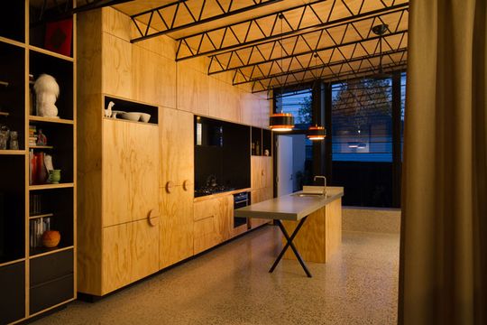
The budget is used wisely in this project, "One of the things with this house is that – while we may have spent more money on things like the Hello wall and the joinery – it wasn't a question of buying flashy, shiny materials and expensive designer furniture; we used commonly available materials, but paid skilled people to put in the extra time and thought to treat the materials with craft", explains architect Fooi-Ling Khoo.
Materials
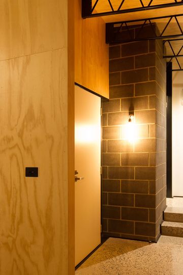
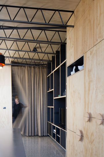
The materials OOF! chose to use are more commonly associated with low budget industrial structures — ordinary materials like plywood, brickwork and industrial trusses. But OOF! craft these humble materials in such a way to make them extraordinary. There is an investment in ideas and craft rather than 'stuff'.
Aim of the Design
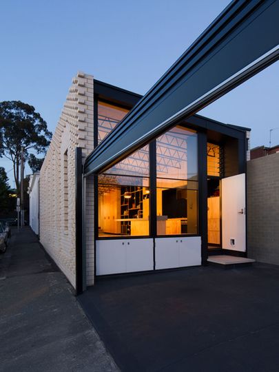
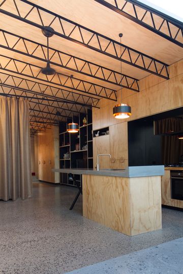
The main aim of the design was to create a liveable modern house with the living, kitchen and dining spaces at the rear of the property, maximising light and creating a sense of open spaciousness on a small site. This inspired the rear open-plan space, with full height glazing at each end, high ceilings and a minimal materials and colour palette. Externally, the architects were keen to make a building that would resonate with the surrounding neighbourhood and offer a positive contemporary approach to living within the heritage rich fabric of the inner city.
Resting Time
Due to a change in circumstances, the design process was stalled for over 5 years! This allowed the architects to reconsider what elements were really necessary. The Hello wall may not have come about had it not been for this 'resting' time for the design.
Hello House
"The thought was that we would contribute something to the surrounding ‘brickness and blockness’ of the area. So we started off thinking it could be a beautiful brick or block, with a colour or glazed brick, but it just didn’t quite cut it. So we looked at textured brick work, then started playing with ideas of what that pattern could be, could it be an image or could it actually be words that say something? Then Rose Nolan, who was working with us, suggested “why don’t you just say ‘Hello’”." — Fooi-Ling Khoo (Oof! Architects)
Rather than blending in or blanding out of its heritage-ous neighbourhood, Hello House is a slightly loud but friendly new face in the street.