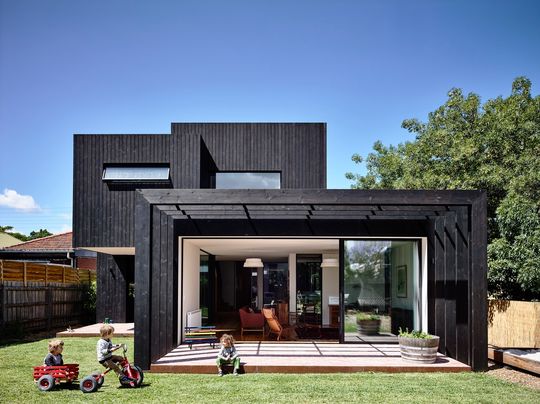
An elegant and restrained timber addition provides the perfect modern living space for a family of five (plus two energetic dogs). The home, in Melbourne's Northcote was a dilapidated 19th Century home with a warren of back-room additions. OLA Studio's solution removes the ineffective addition and replaces it with a double storey open-plan addition in brooding black timbers. It is a restrained and elegant solution that transforms the home and backyard space for 21st Century living...
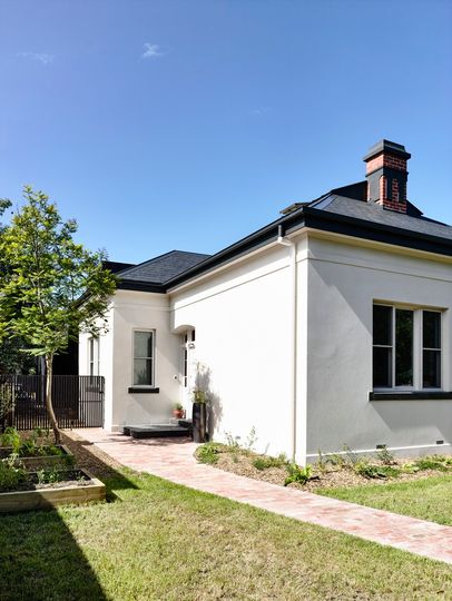
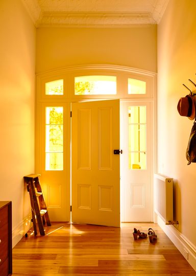
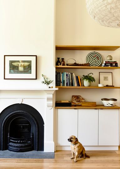
The original part of the home has been sensitively restored and left intact, with only a slight reconfiguration of the rooms to provide an additional bathroom and powder-room.
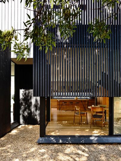
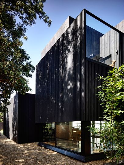
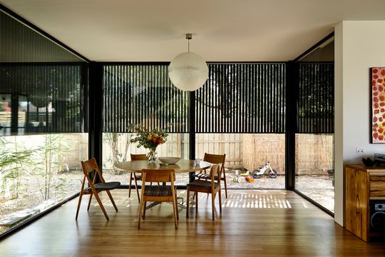
"The original house is one solid form with all rooms contained within a single volume, and on a high level when considering how to add to what was already there, a conscious decision was made to approach the design with architectural contrasts and similarities." - OLA Studio
These constants and similarities begin with the use of timber to contrast with the masonry of the original. Black timber battens soften the extension and help it to receded. From the street the choice of black means the two-storey extension blends in with the original slate roof to feel more at home. The timbers are pulled apart and spaced to provide dappled light for the dining area, but are placed to minimise views towards neighbours and focus instead on green space surrounding the home.
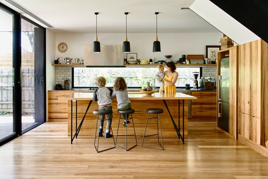
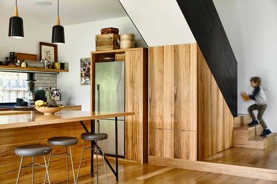
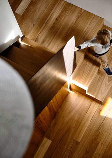
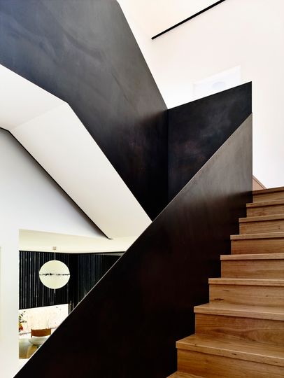
Like the original home, the new addition is a rectilinear form, but laid out more loosely. Overlapping and intersecting spaces define the various living zones. This creates a sense of intimacy in the open-plan space. It also deals with some of the criticisms of open plan living, such as noise and the feeling of being in a cavernous space. Ultimately this plan helps the new space to feel more similar to the original, while still feeling light-filled and modern.
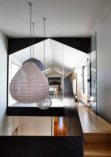
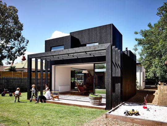
From the outside the home appears like a set of stacked boxes, but inside these boxes feel like part of the one space. This treatment of the facade helps to break up the building, so it doesn't feel oppressive from the backyard.
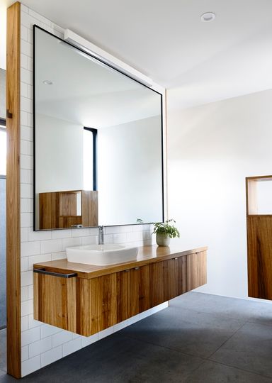
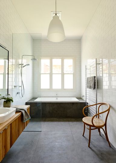
"Similar in scale of footprint and mass, and both reserved and devoid of unnecessary detail, the two buildings sit side by side with a calm air of confidence and presence within their landscape."
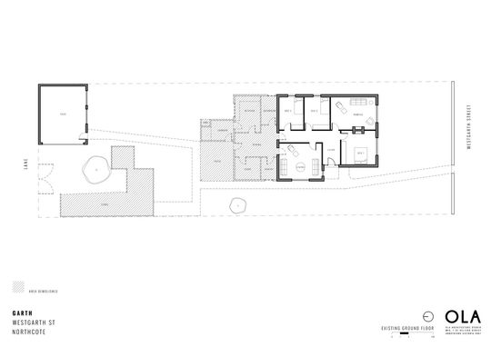
Above: Existing Floor Plan (Hatched area indicates extent of demolition)
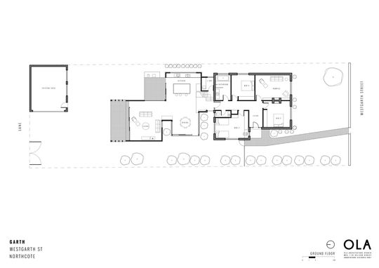
Above: Ground Floor Plan
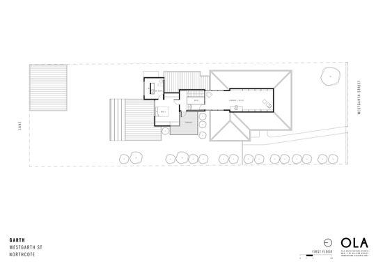
Above: First Floor Plan
This is a restrained approach for an addition, but one which feels fitting for the original 19th Century building. Thankfully, old and new can live in harmony at Garth House.
